Have you ever imagined how different Apple stores may look if they were constructed following the ethnic architecture of each country? Well, designer Shail Patel did just that, imagining how these global retail shops would look in light of local architectural traditions utilizing the buzzed-about artificial intelligence software MidJourney.
©Shail Patel
Apple Stores Concepts
To begin with, the various shops demonstrate the AI’s acquaintance with multiple building styles from different parts of the world and other generations. And then, they go even further by imagining what a “tech showroom” would look like in the same architectural style. We can certainly take the findings as food for thought.
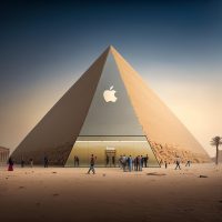
1) When Apple Stores Meet The Pyramids

©Shail Patel
You can’t dismiss the concept of an Apple Store shaped like a pyramid, even though the idea is getting clichéd. It exudes an air of mystique, elegance, and majesty. Although it may be too large for a single store area, the pyramid’s minimalist shape perfectly matches Apple’s design approach.
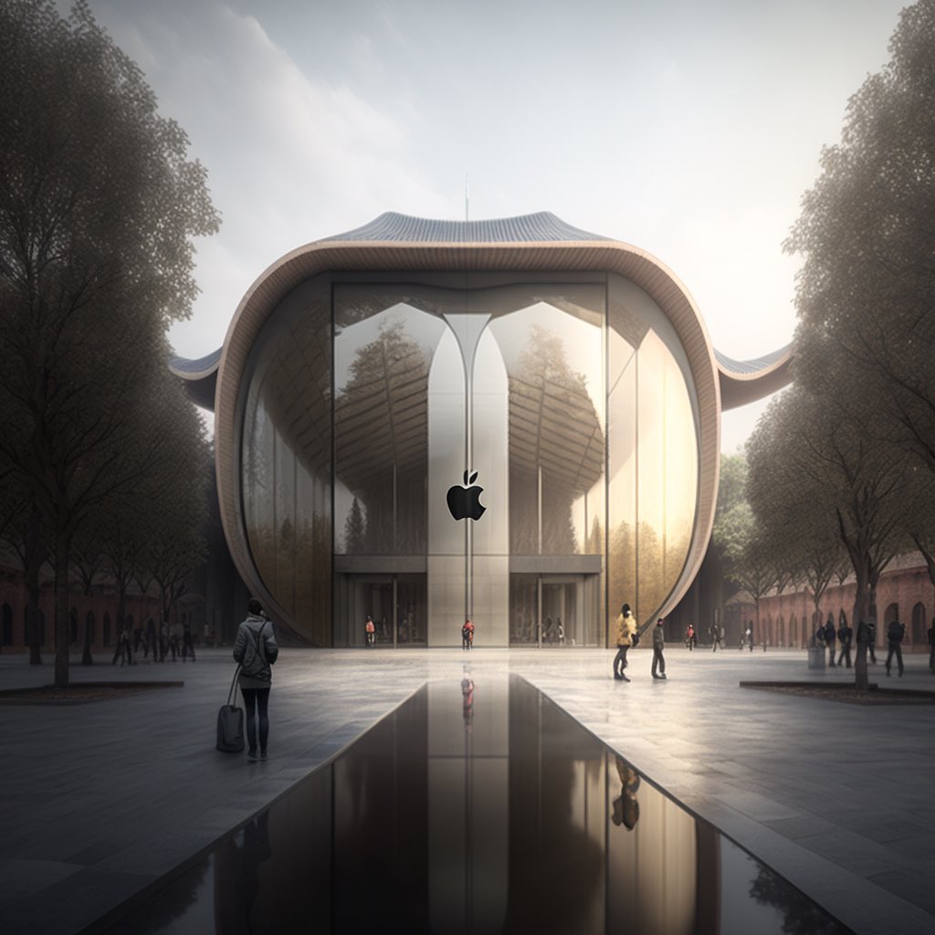
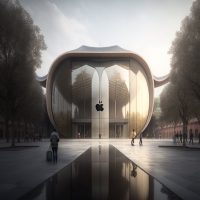
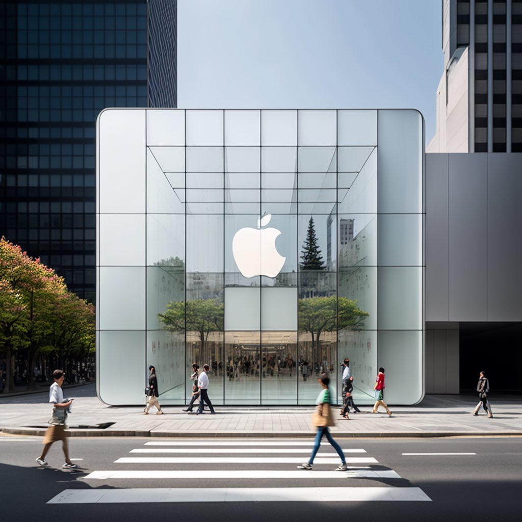
2) Apple Store Meets Japanese Architecture
©Shail Patel
This Apple Store draws inspiration from Japanese architecture, even down to the curving roof characteristic of many Japanese landmarks and structures. The store as a whole evokes a Zen-like calm that is consistent with Apple’s approach to design. And before you say anything, we will use the word “Minimalism” several times, so please bear with us.
3) A Brutalism Touch
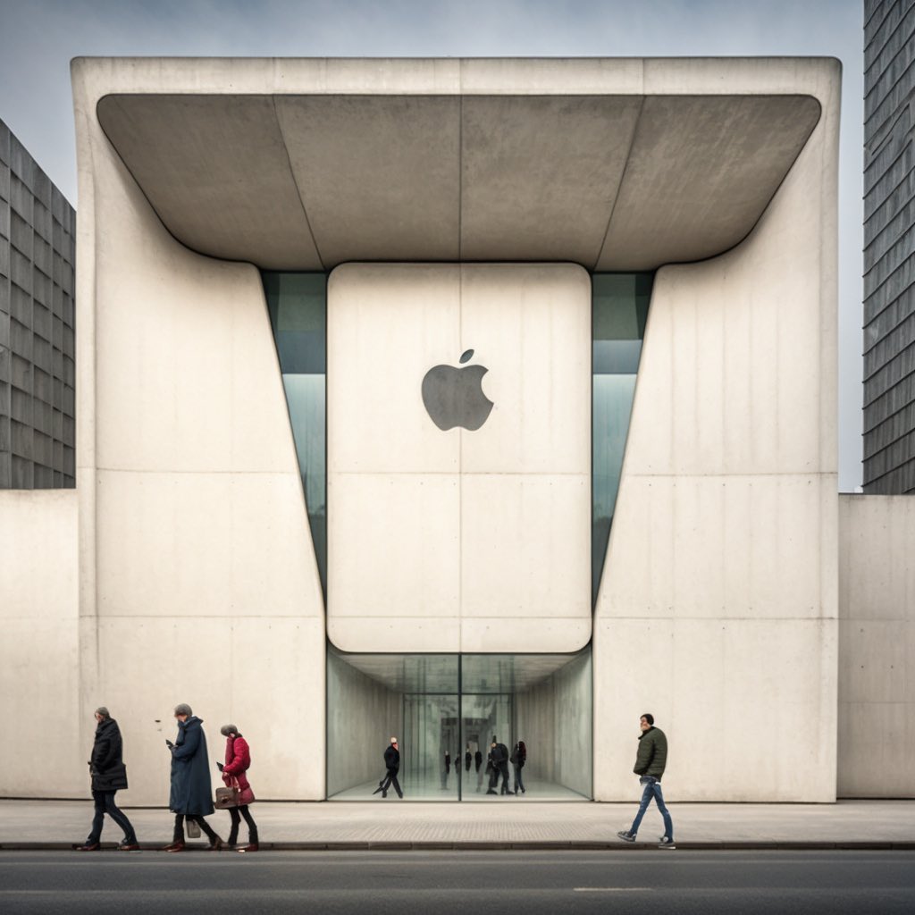
©Shail Patel
Brutalism emerged in Europe after World War II to revive and rebuild the devastated landmass. The Brutalist style features ample concrete panels and geometric designs, intending to make buildings appear massive and imposing rather than tiny and snuggly.
The Apple Store, in a similar vein, has a large concrete exterior structure and makes strategic use of glass. Though the interiors are likely to be spacious and well-ventilated, the passageway leading from the front door to the interiors is very narrow and has a relatively low ceiling.
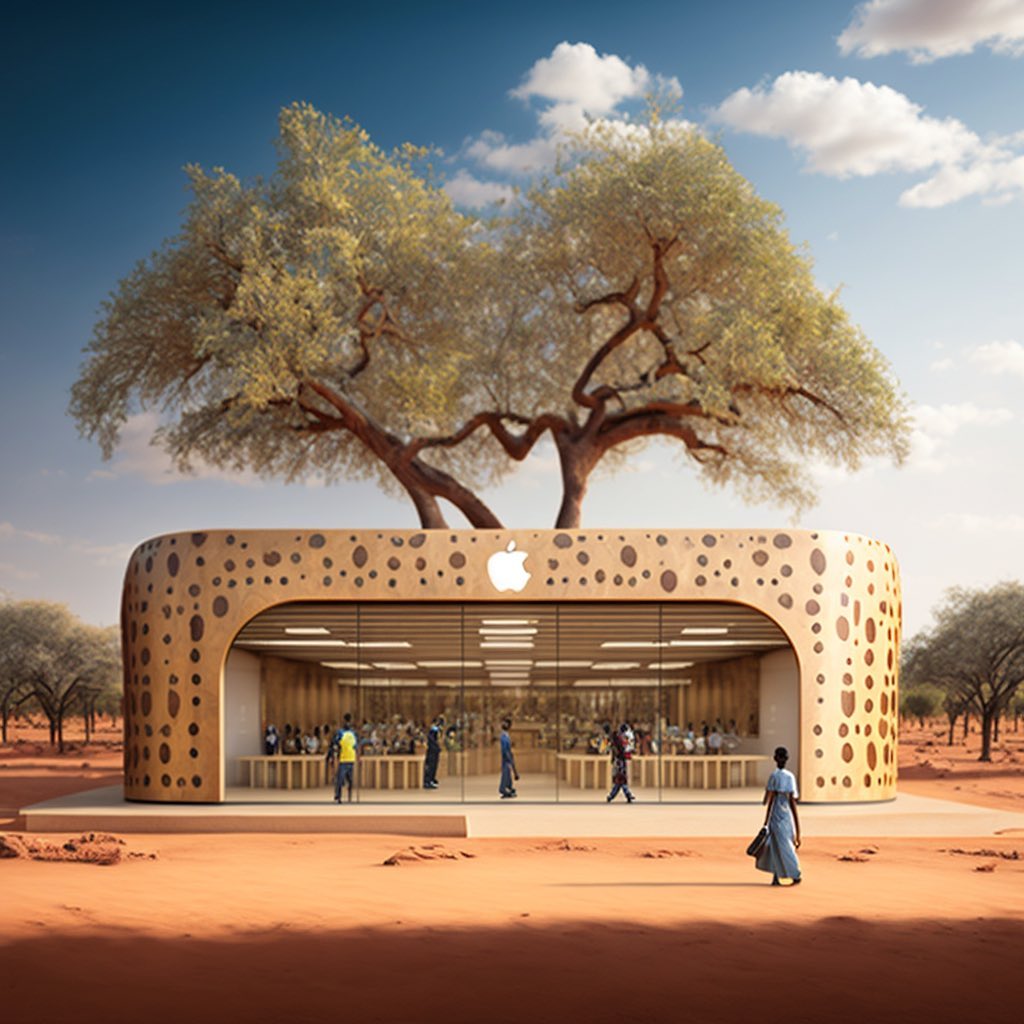
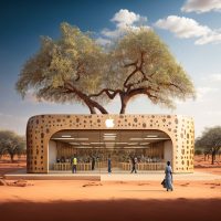
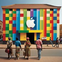
4) An Apple Store in the Heart of Indigenous Sudano-Sahelian Africa
©Shail Patel
Simply put, this one is stunning in its simplicity. It’s earthy but warm, demonstrating how Apple stores’ design can blend seamlessly with the terracotta and mud-based aesthetics of the Nubian and Sudano-Sahelian worlds.
This architectural design is prevalent in some regions of Egypt and Sudan, distinguished by its use of local materials and sophisticated geometric designs. The glass front displays a pleasant, earthy, and woodsy interior, and the Apple logo carved further into the mud façade frame adds delicacy.
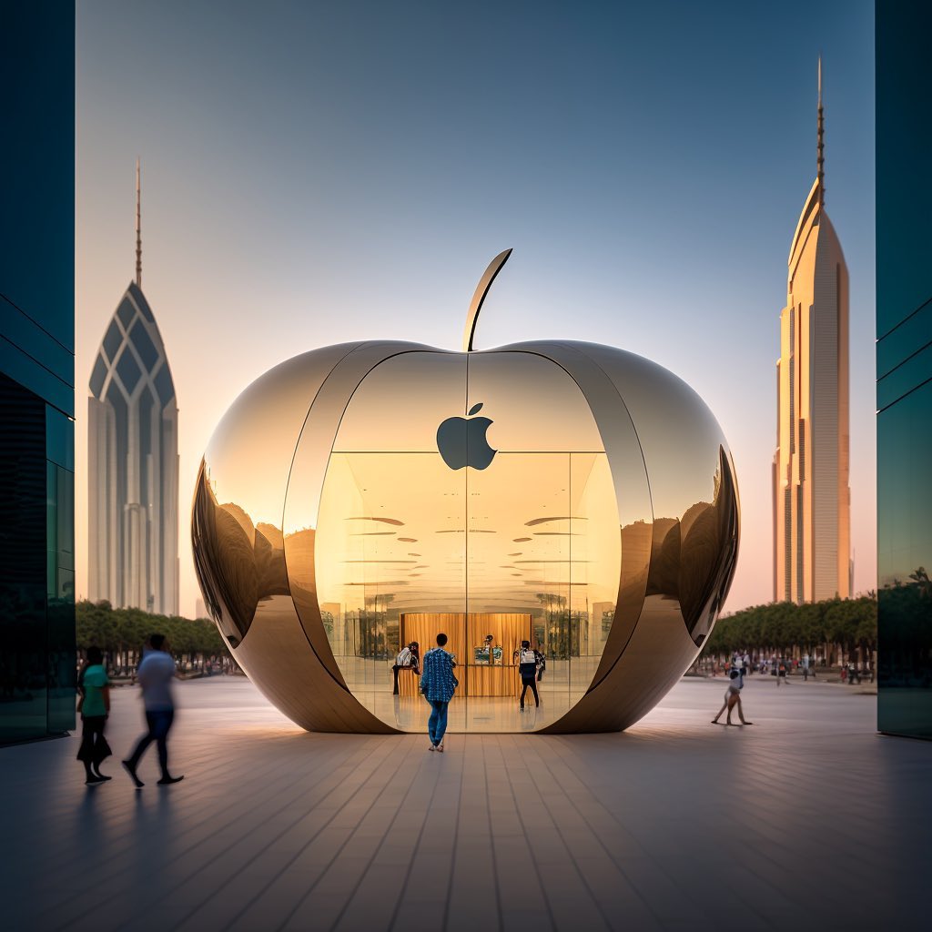
5) New York’s Apple Store and a Piece of Novelty Architecture
©Shail Patel
This shop, dubbed “The Big Apple,” is most likely located in New York, ” and has the best storefront design ever. It is so peculiarly beautiful, eye-catching, and distinctive that not even Apple would dare to replicate it. Because of this, we can use AI to envision how Apple stores would look like. The store is easily recognizable from afar due to its resemblance to a giant golden apple with a stem rising from the top.
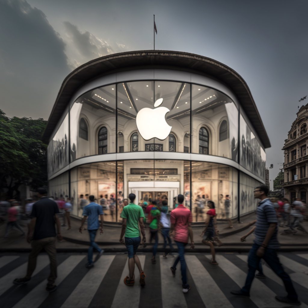
6) Renaissance Flair in an Apple Store
©Shail Patel
The glass frontage is an excellent fit for the Renaissance Revival aesthetic of this visionary shop. The store’s towering ceilings and arched pillars give it an air of luxury, and the large glass front adds to the effect. The store’s central location makes it convenient for shoppers from all directions. Additionally, the Apple logo becomes a prominent feature, drawing customers in for a closer look or even a casual scan.
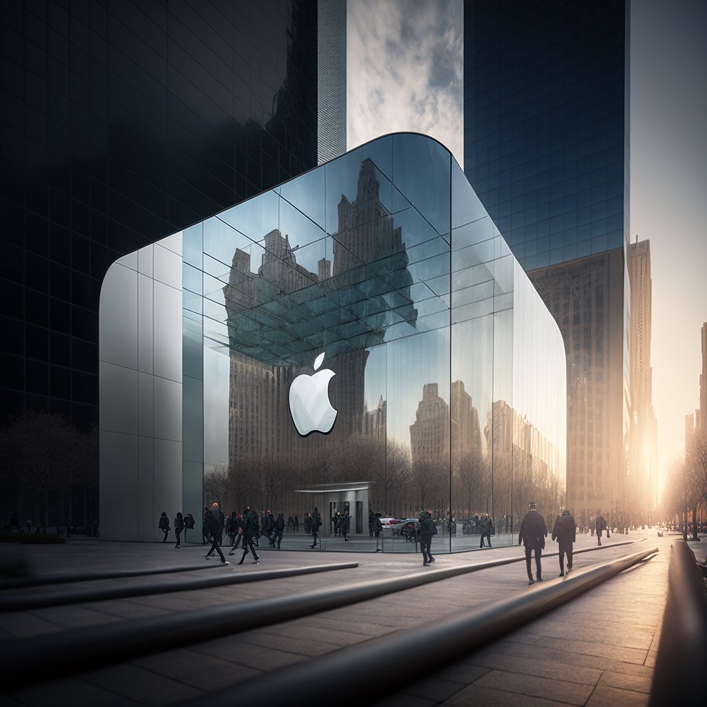
7) A Fusion Between Apple Stores and European Modernism
©Shail Patel
Finally, we visit an Apple Store in Northern Europe, where Art Deco and Modernism, two distinctly European architectural styles, blend in a harmonious retail environment. The store is entirely made of glass, yet it has different aspects in all the right places, accented with gold, echoing the surrounding art deco architecture, and the building itself seems to float a few feet above the ground, putting it a cut above the rest.
-
- ©Shail Patel
-
- ©Shail Patel
-

- ©Shail Patel
-
- ©Shail Patel
-

- ©Shail Patel
-
- ©Shail Patel
-

- ©Shail Patel
-
- ©Shail Patel
-

- ©Shail Patel
8) Apple Store Combines with South African Aesthetics
©Shail Patel
You can’t miss this Apple store, thanks to its dazzling-hued exterior. The store’s brilliant use of color is a nod to the custom of the Ndebele inhabitants, who lived in the area painting exquisite murals on their homes’ exterior walls. The bright paint job makes the storefront pop against the neutral backdrop of the city.
9) An Apple Store Embracing Urban Minimalism
©Shail Patel
What we have here is the pinnacle of minimalist portrayal. The storefront’s glass façade and square shape resemble an Apple product. The interiors are kept white to represent Apple Stores’ preference for cleanliness, while the exteriors are of flat glass panels that reflect the surrounding buildings creating the appearance that they merge smoothly into the background.
-
- ©Shail Patel
-
- ©Shail Patel
-
- ©Shail Patel
-
- ©Shail Patel
-
- ©Shail Patel
-
- ©Shail Patel
-
- ©Shail Patel
-
- ©Shail Patel
-
- ©Shail Patel