Headquarters of Yasha Group
Resonant Magnetic Field
It is not merely an office building
For enterprises, the headquarters building should be able to create a resonant magnetic field between the corporate culture and the place, and become the “second home” of workers to help enterprises shape a unique “sense of belonging” and “cohesion”. For cities, given the fact of emerging tycoons in the current era and the construction of extra huge headquarters building in succession, the headquarters building has the potential to become a new type of “urban complex” if it can ensure its own operation while giving back to urban life.
It took GOA 7 years to customize such a headquarters building for Yasha Group since 2012. Yasha Group is a well-known enterprise in domestic decoration industry with business covering the design and construction of exterior wall and interior decoration. If you want to know something more specific of this company, the primary characteristic is its constant and clear aesthetic tendency and persistent pursuit of professional engineering technology. In the process of construction, Yasha’s corporate culture as a core factor deeply influenced the complete process of the project from conception to details, and the architects took office space and urban life into account. The final work can be said to be the result of the resonance of these two factors.
Photography by © Schran Image
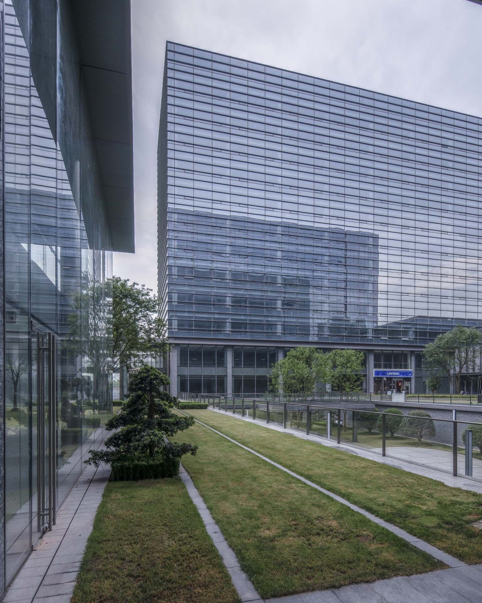
A Game of Stacking Boxes
Richness under Simple Order
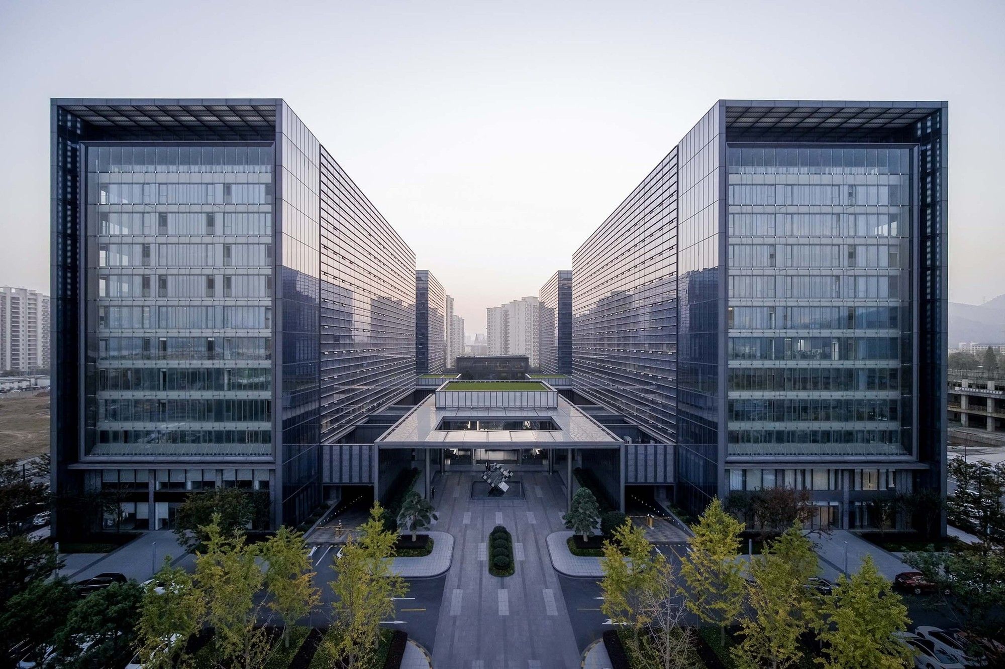
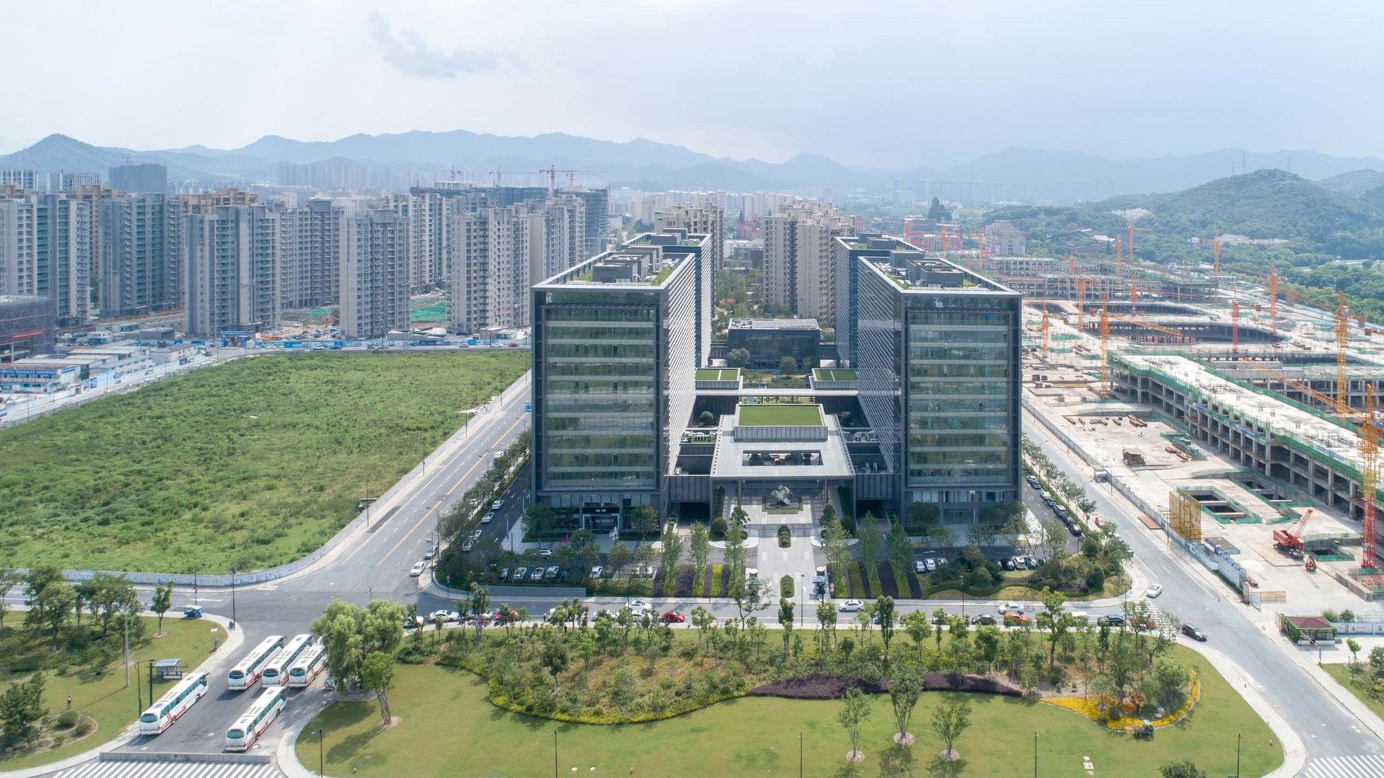
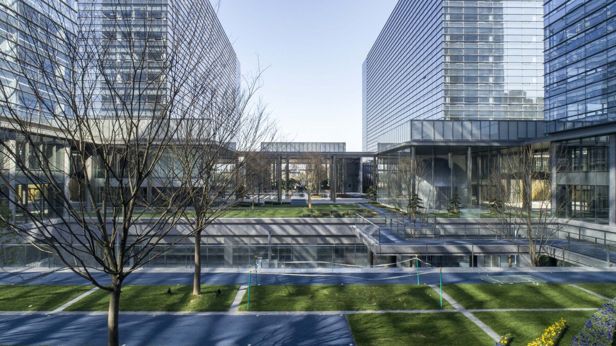
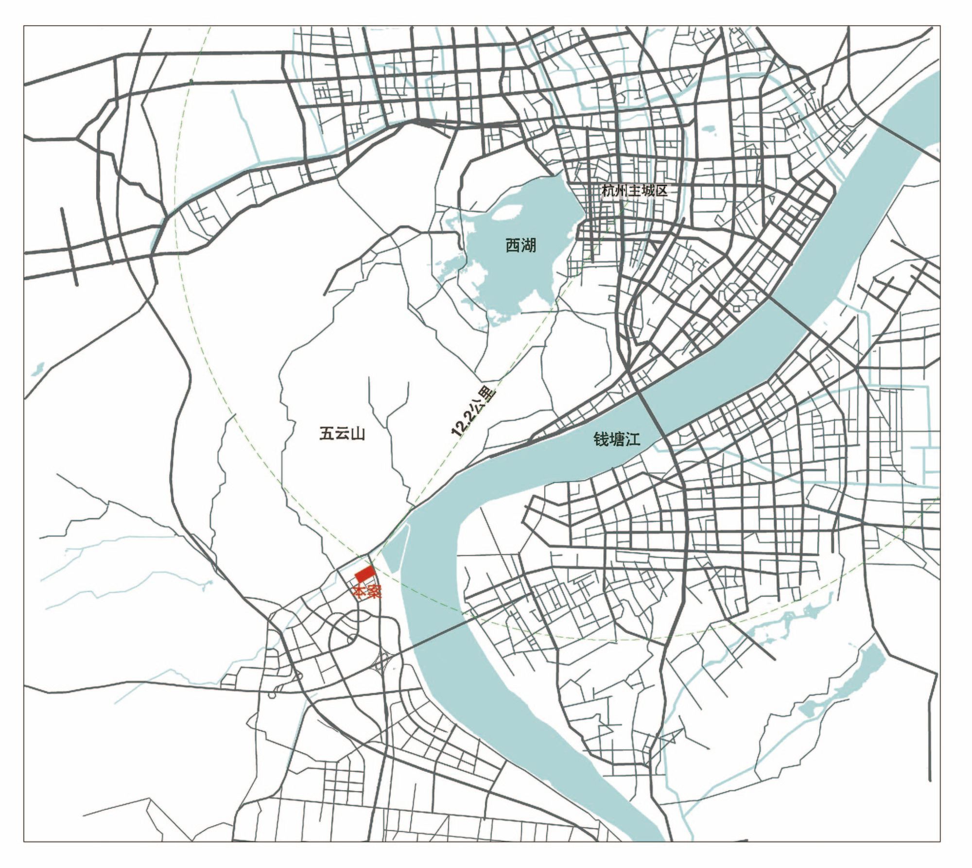
The site, 10 kilometers away from the downtown of the old city of Hangzhou, is in an area with great potential for development. It is a rectangular flat land with an aspect ratio of approximately 1:2 and total area of about 35,400 square meters. In the future, it will be a brand-new exhibition area, but at the beginning of the project design in 2012, there was no construction around the plot, which was a typical land for new town. After a period of exploration in the direction of design, understanding that the fundamental demand of the owner is not to pursue the unique appearance of the office building per se, but to create a premium and stable space atmosphere with plain design”, the challenge facing architects gradually looms large. Since simpleness, symmetry and stability turn out to be boring, then, how to make space more interesting under a simple and stable plane?
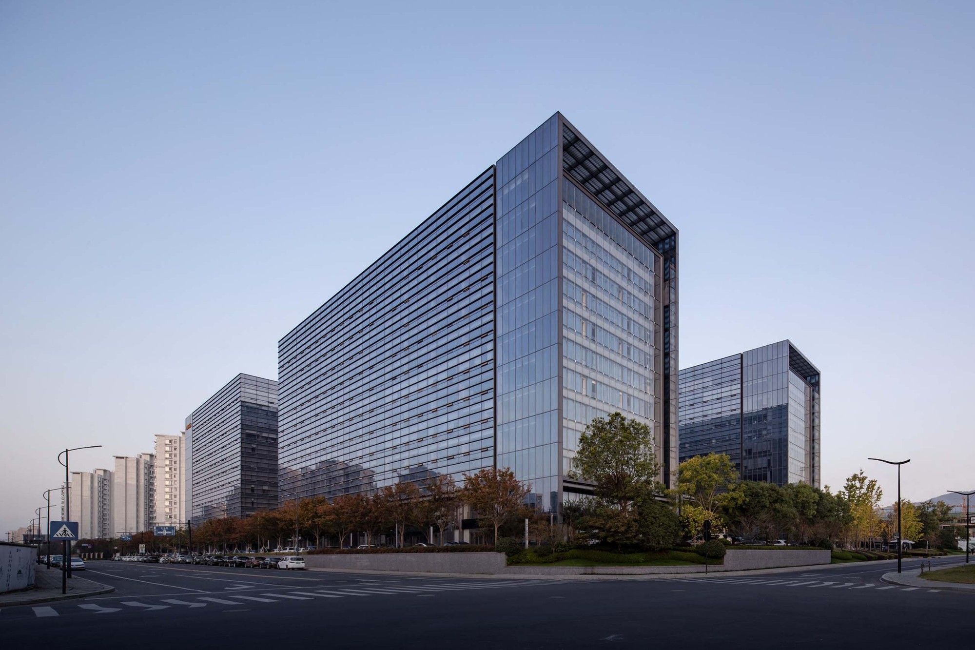
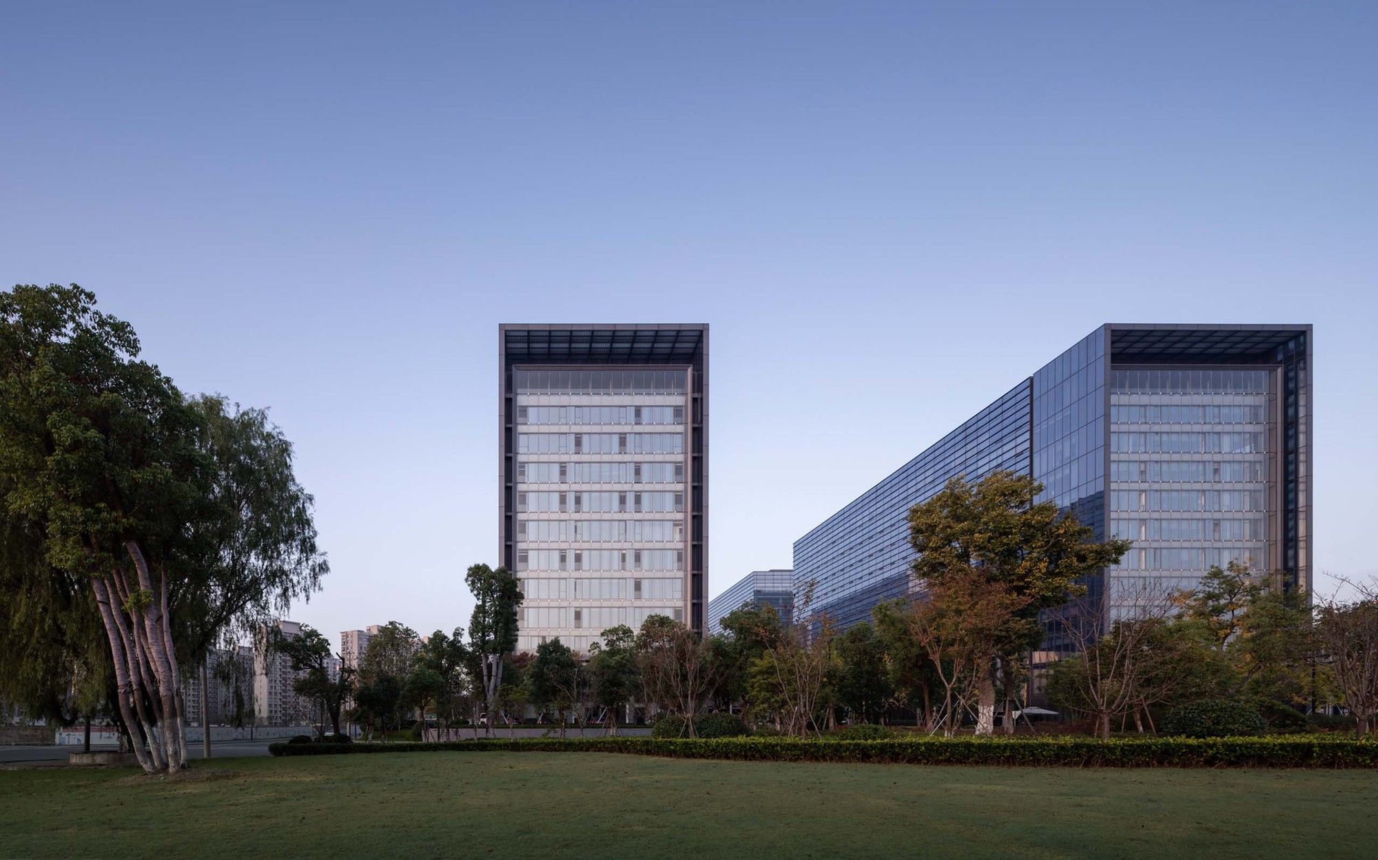
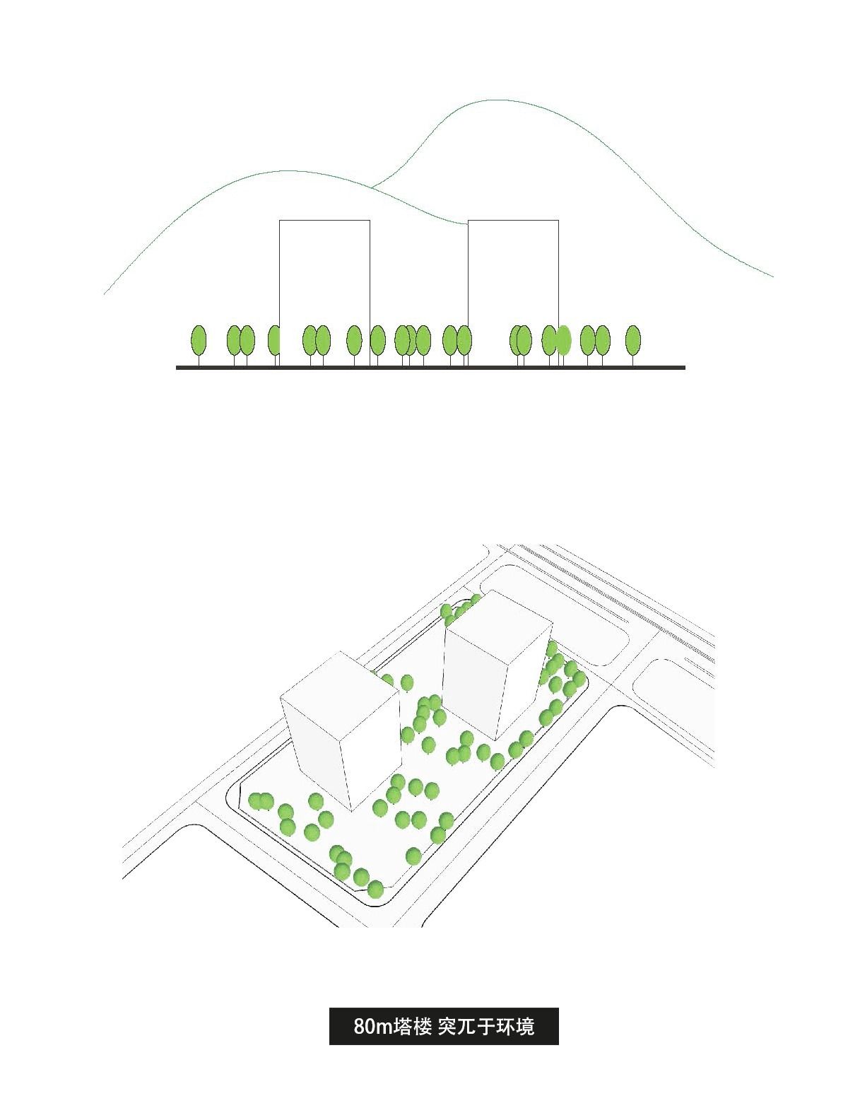
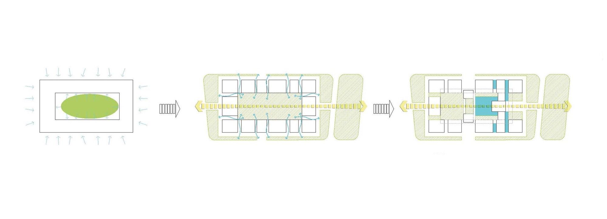
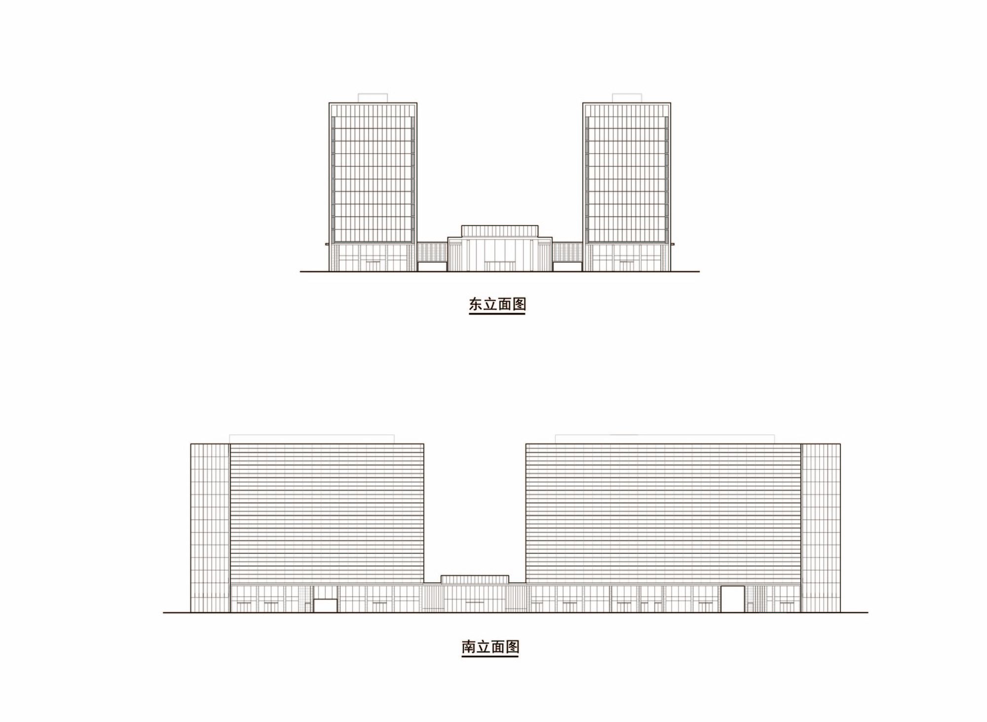
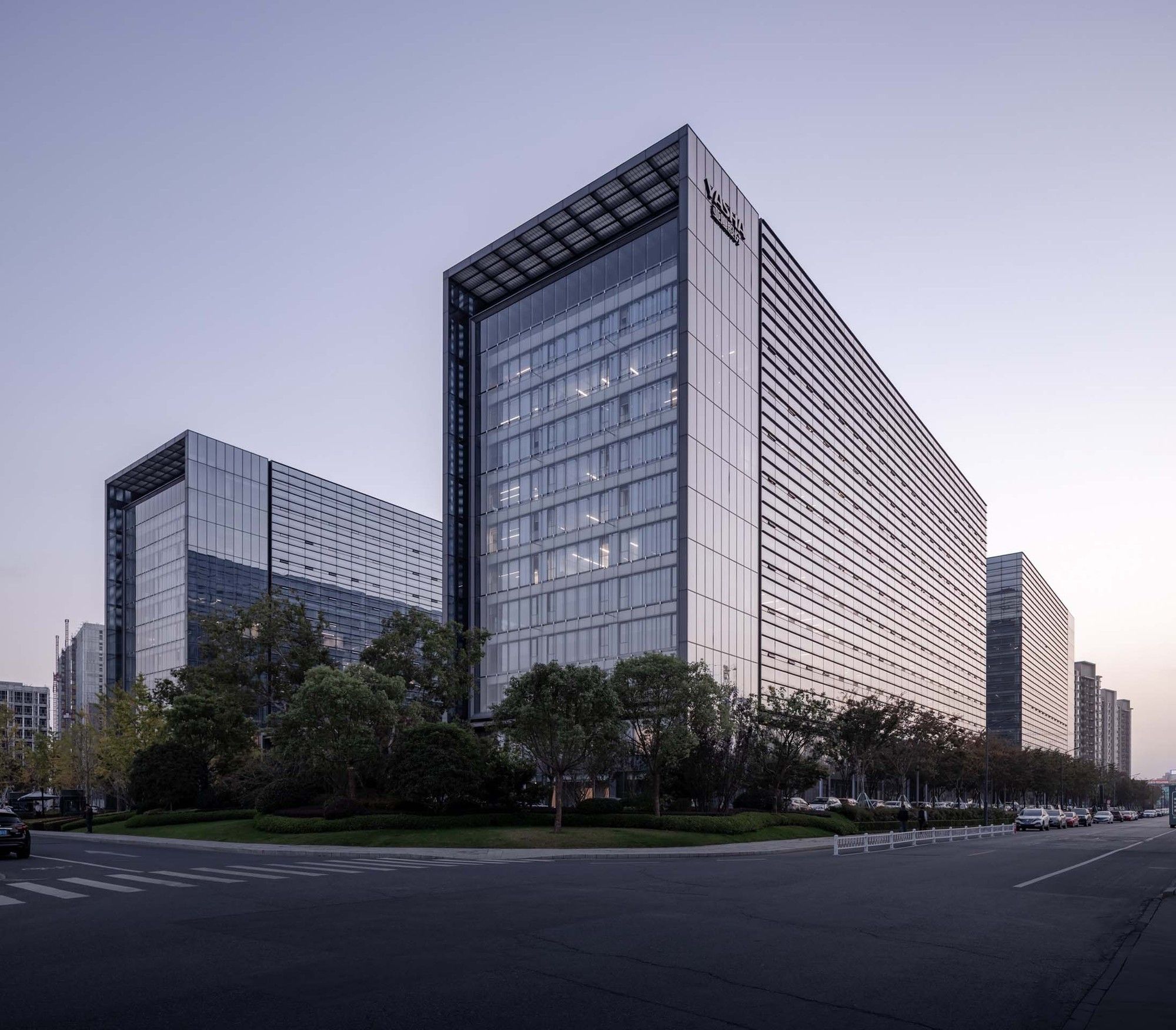
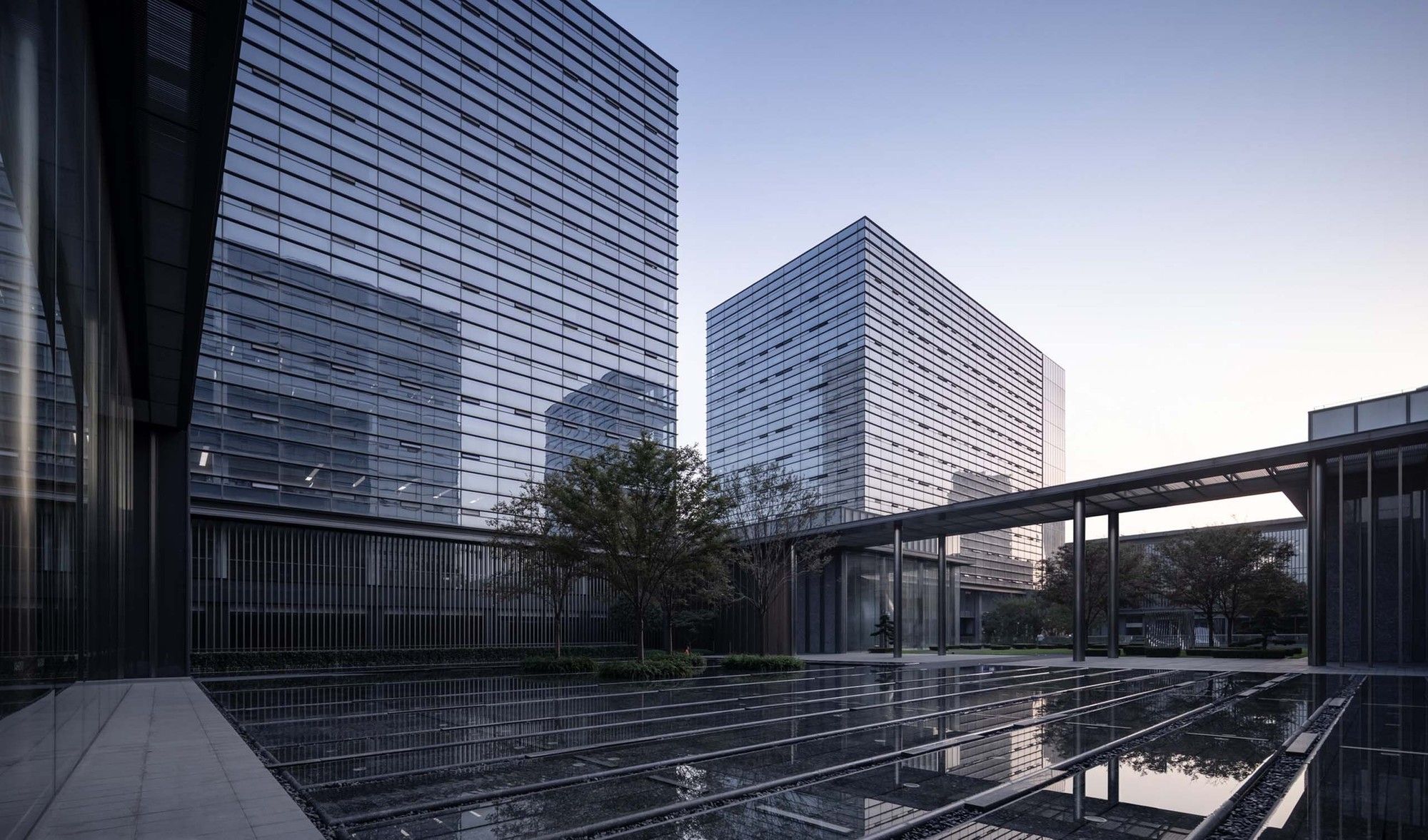
First of all, the architects compared the line of sight to the mountains on the site, and determined the volume to be four 12-story 50m towers. With this volume framework, both internal and external spatial relations are smooth. The plane of each office tower was almost a complete rectangle, and the volume was symmetrical on the short side of the site, while the long side was cut into two unequal sections according to the requirements of capacity of each tower.
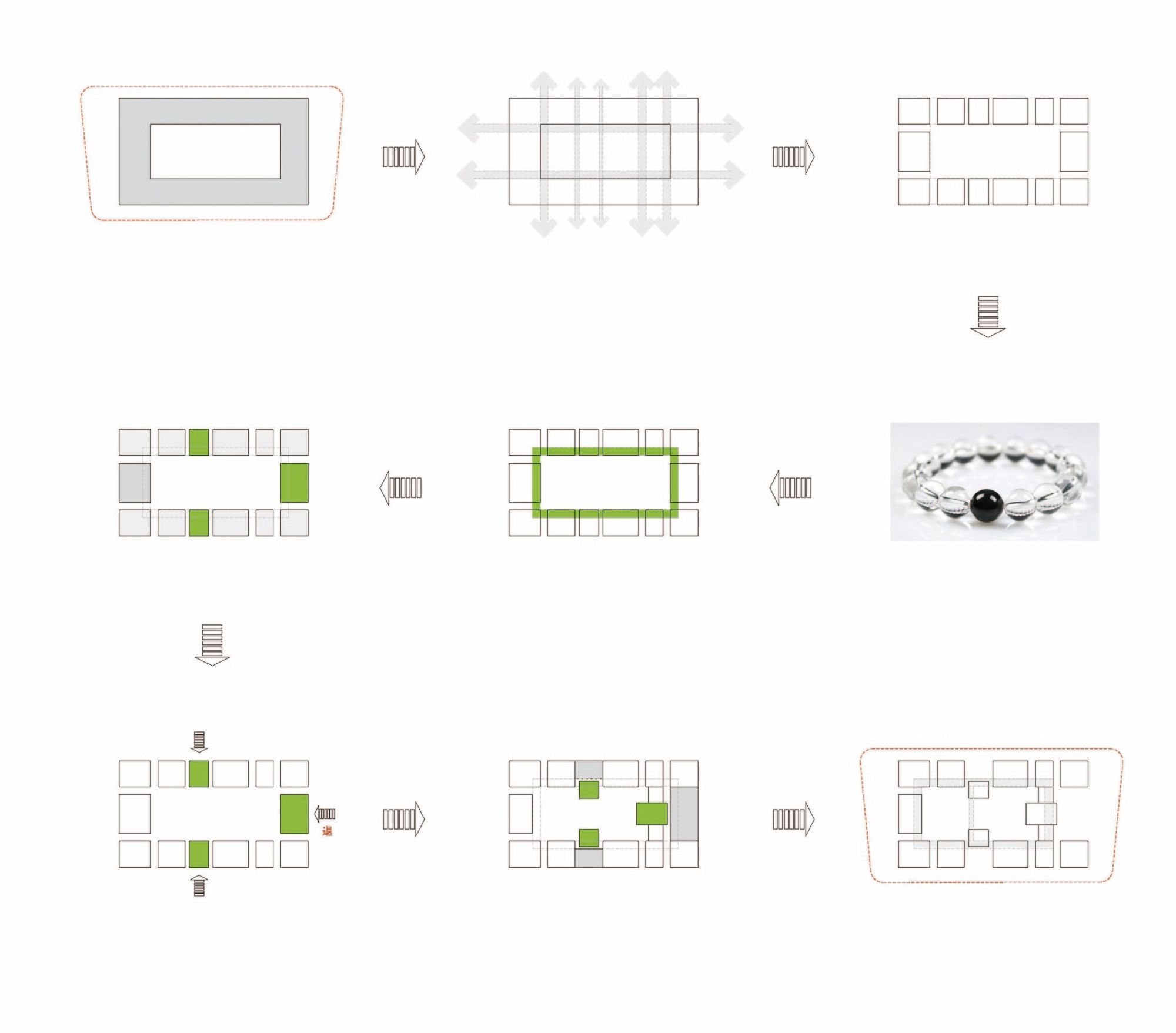
The simple structure contains great possibilities
when the elements are set as extremely simple square boxes, the overall richness of the space can be expressed diversely depending on the logical relationship between the boxes and the hierarchy of the spatial structure. The definition of the six interfaces of the boxes brought different spatial attributes, while the definition of the interfaces between the boxes made the relationship between them diversified. In this way, the seemingly open-and-shut design has evolved into a game of stacking boxes that eventually evolved into towers, ground courtyards and sunken courtyards, entrance canopies, and overpasses and so on, forming a bright and rich spatial sequence. Therefore, the initial challenge of the design will be solved accordingly.
Photography by © Schran Image
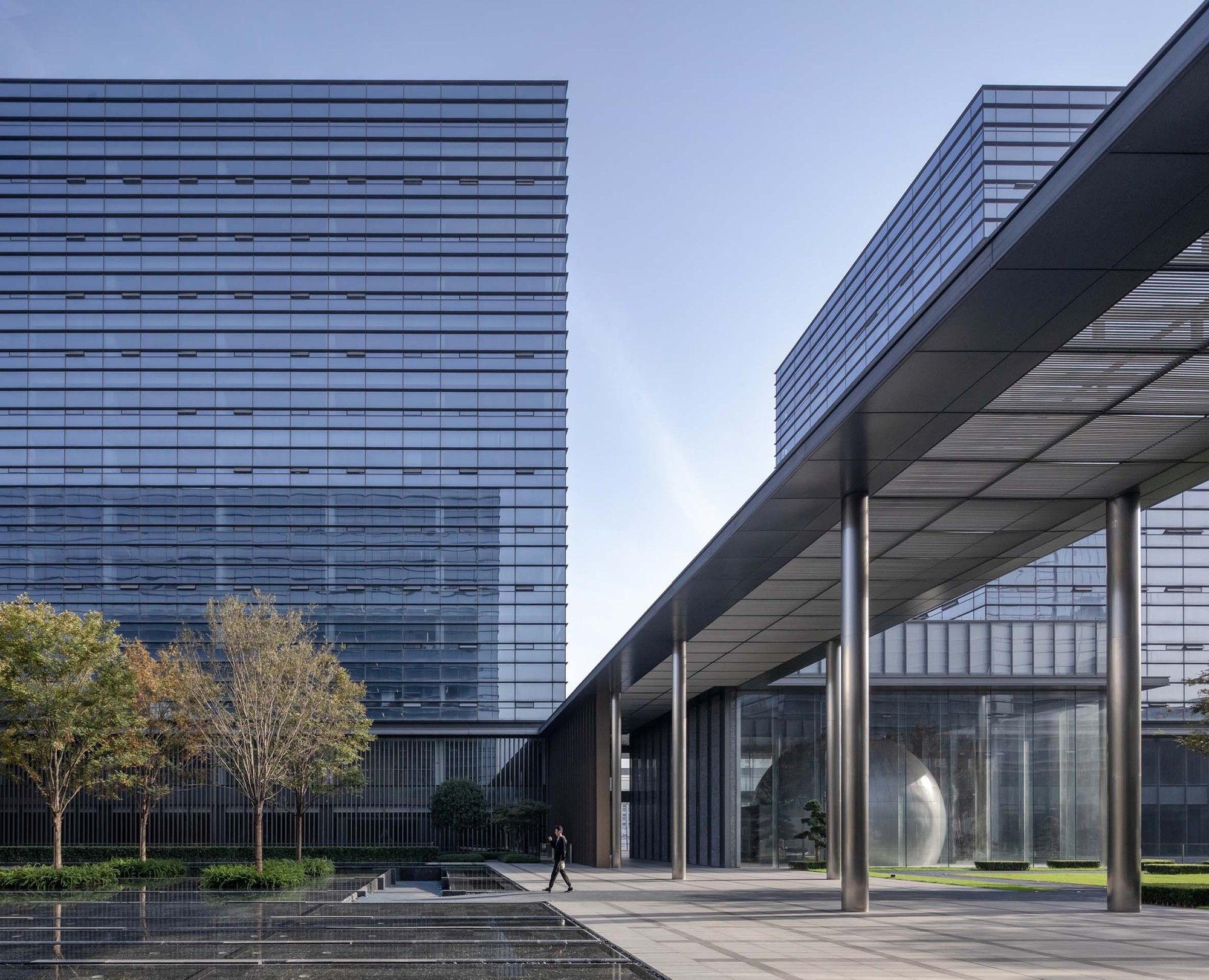
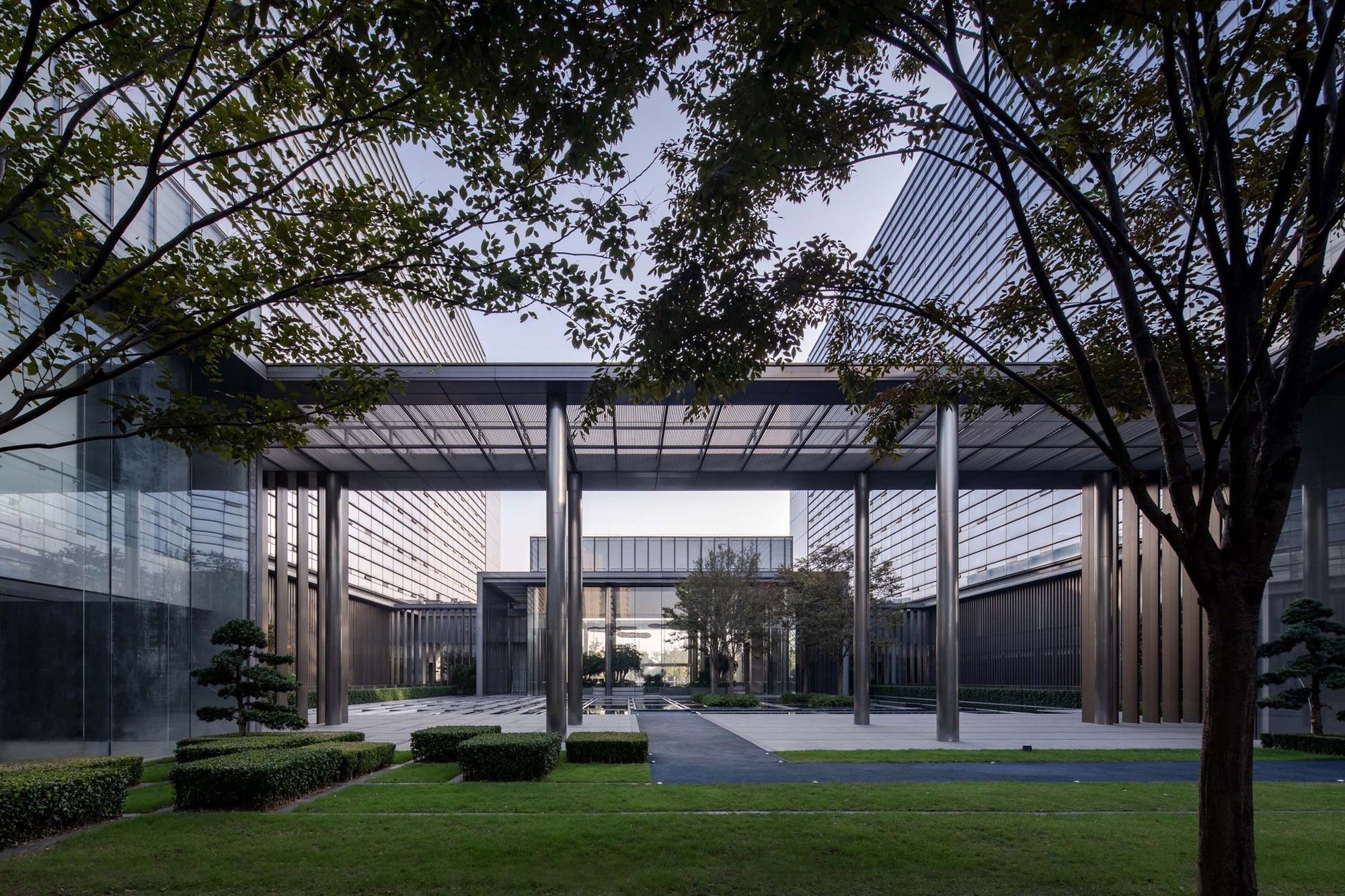
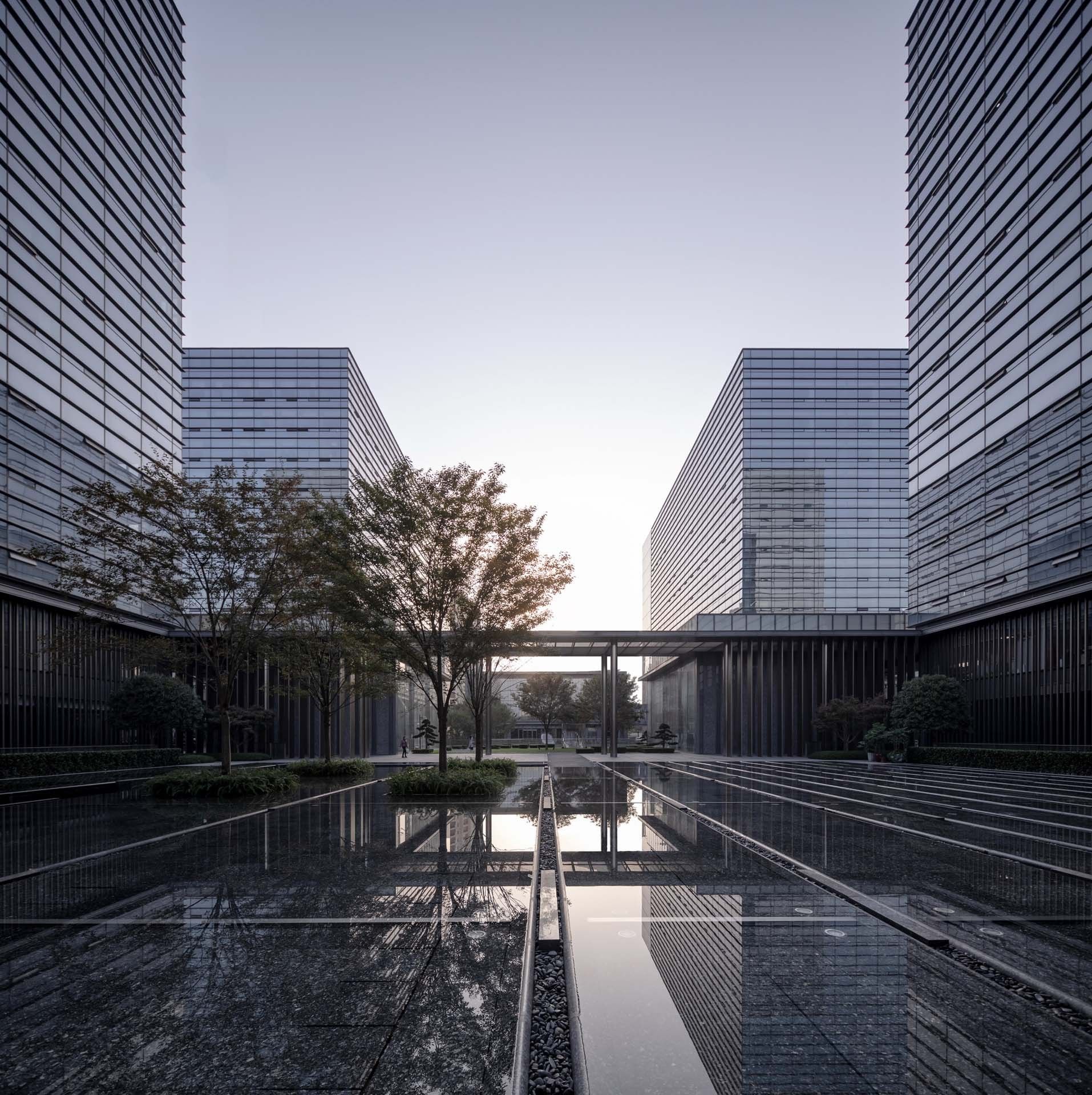
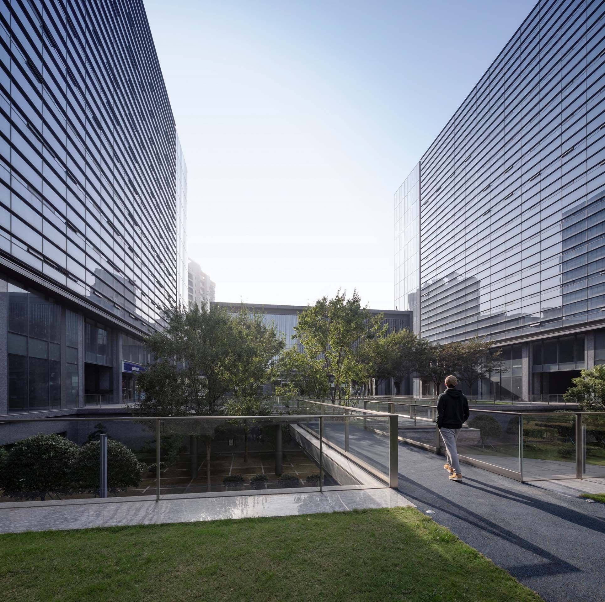
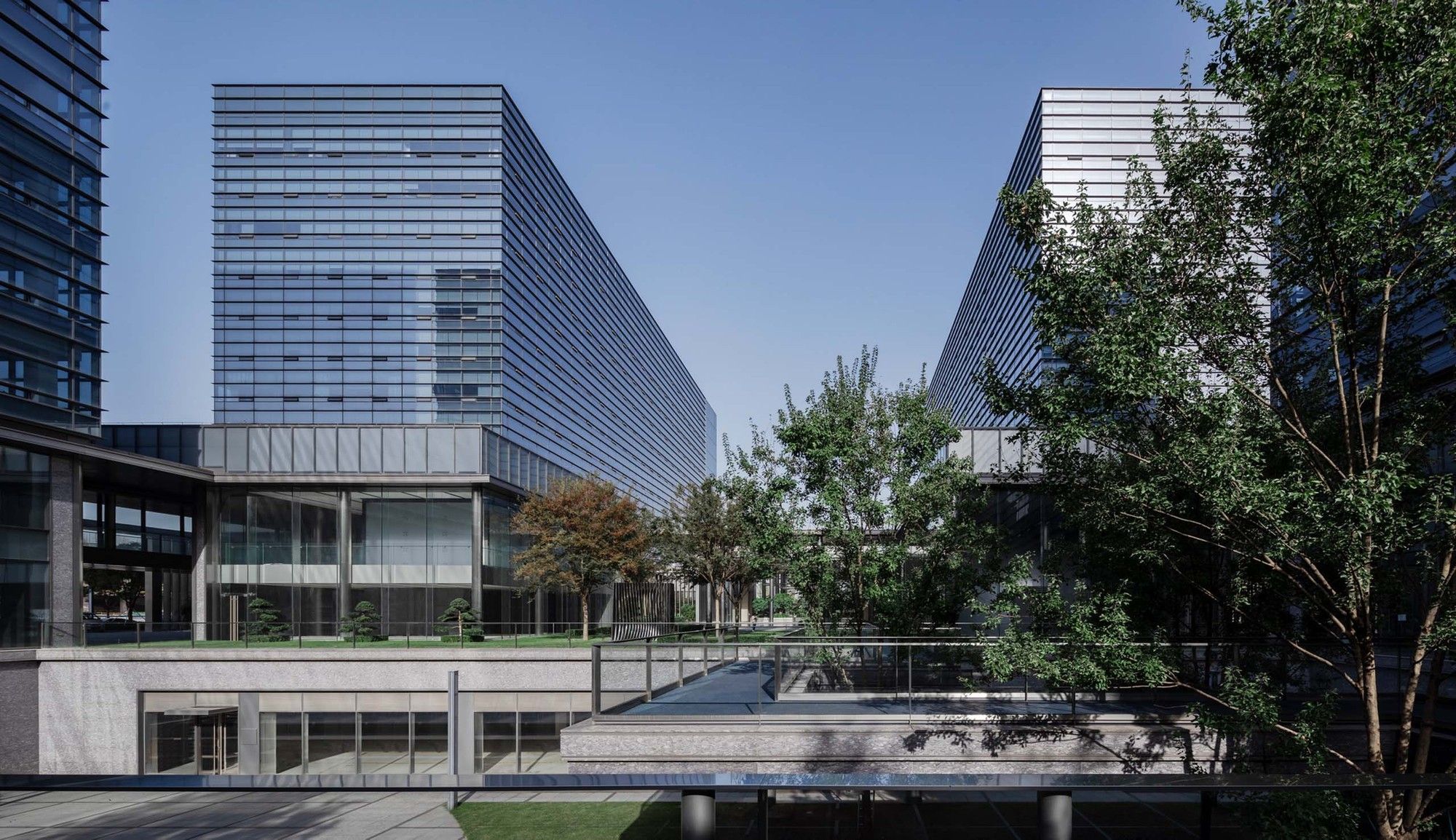
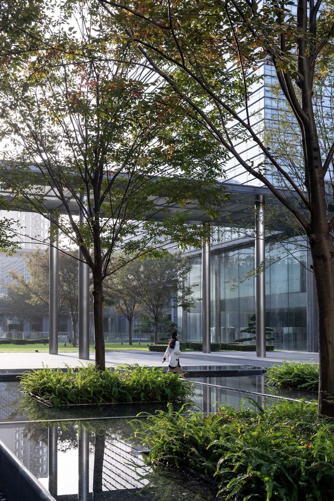
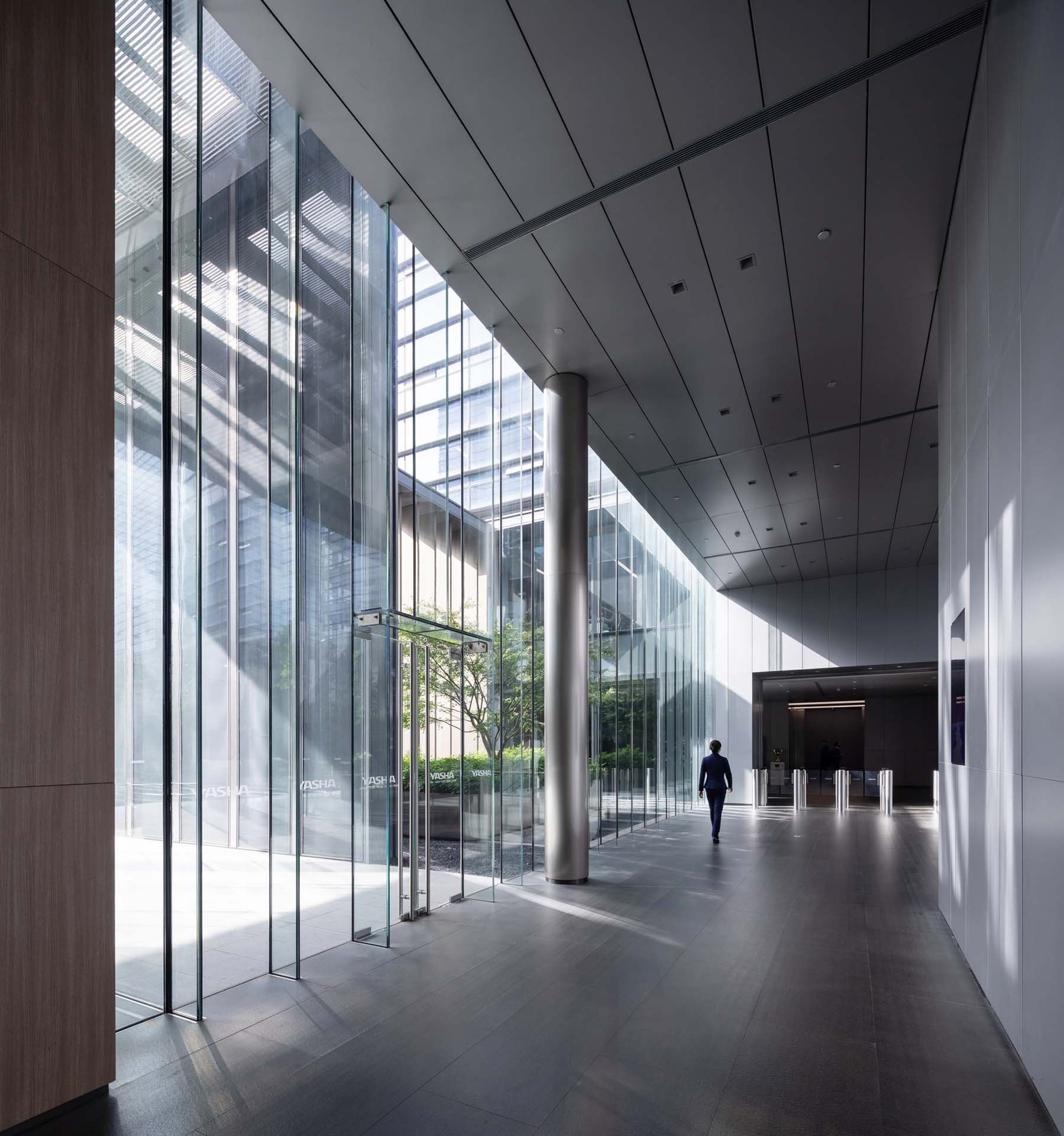
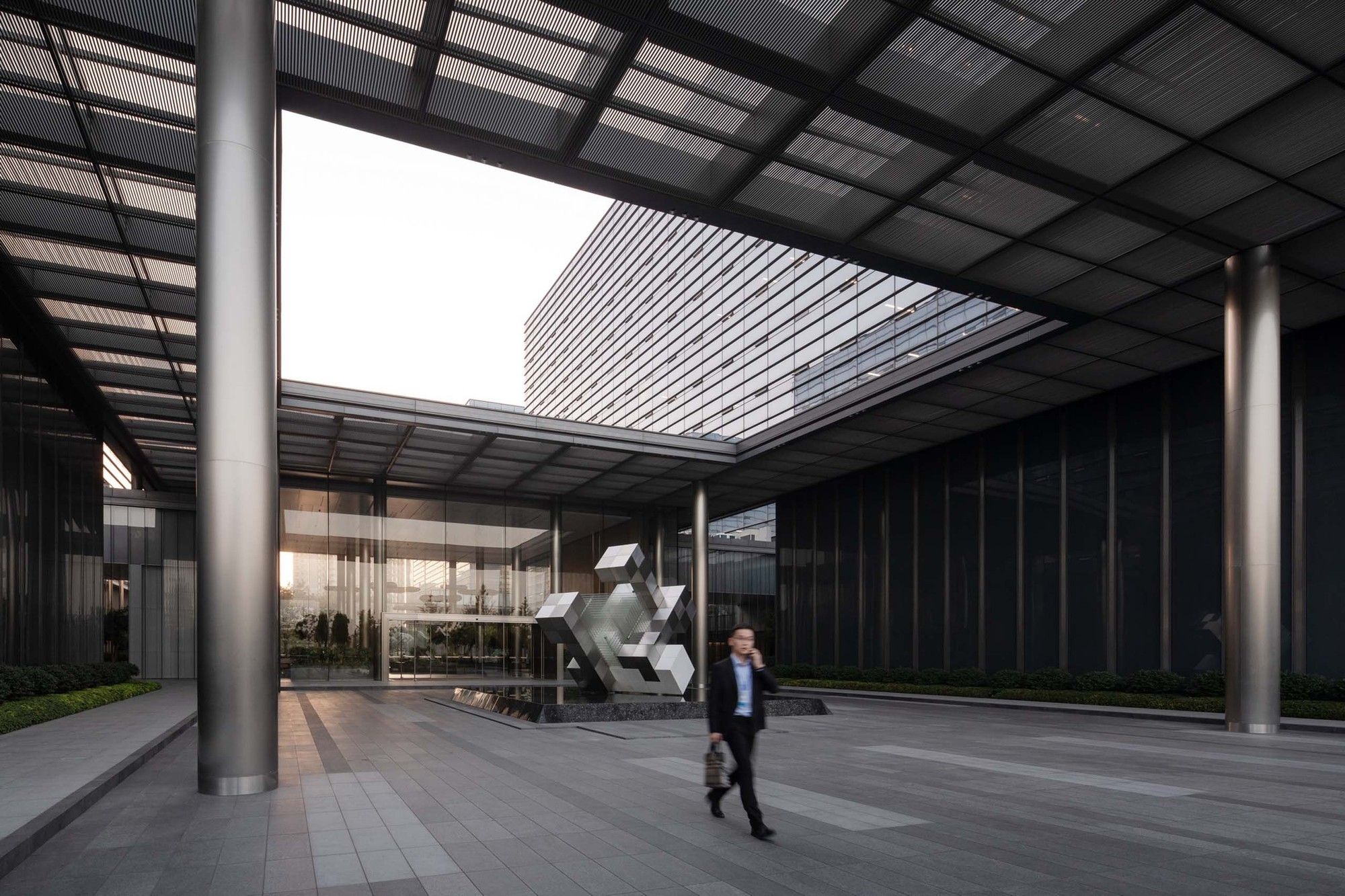
Semi-open Garden
Balancing urbanity and privacy
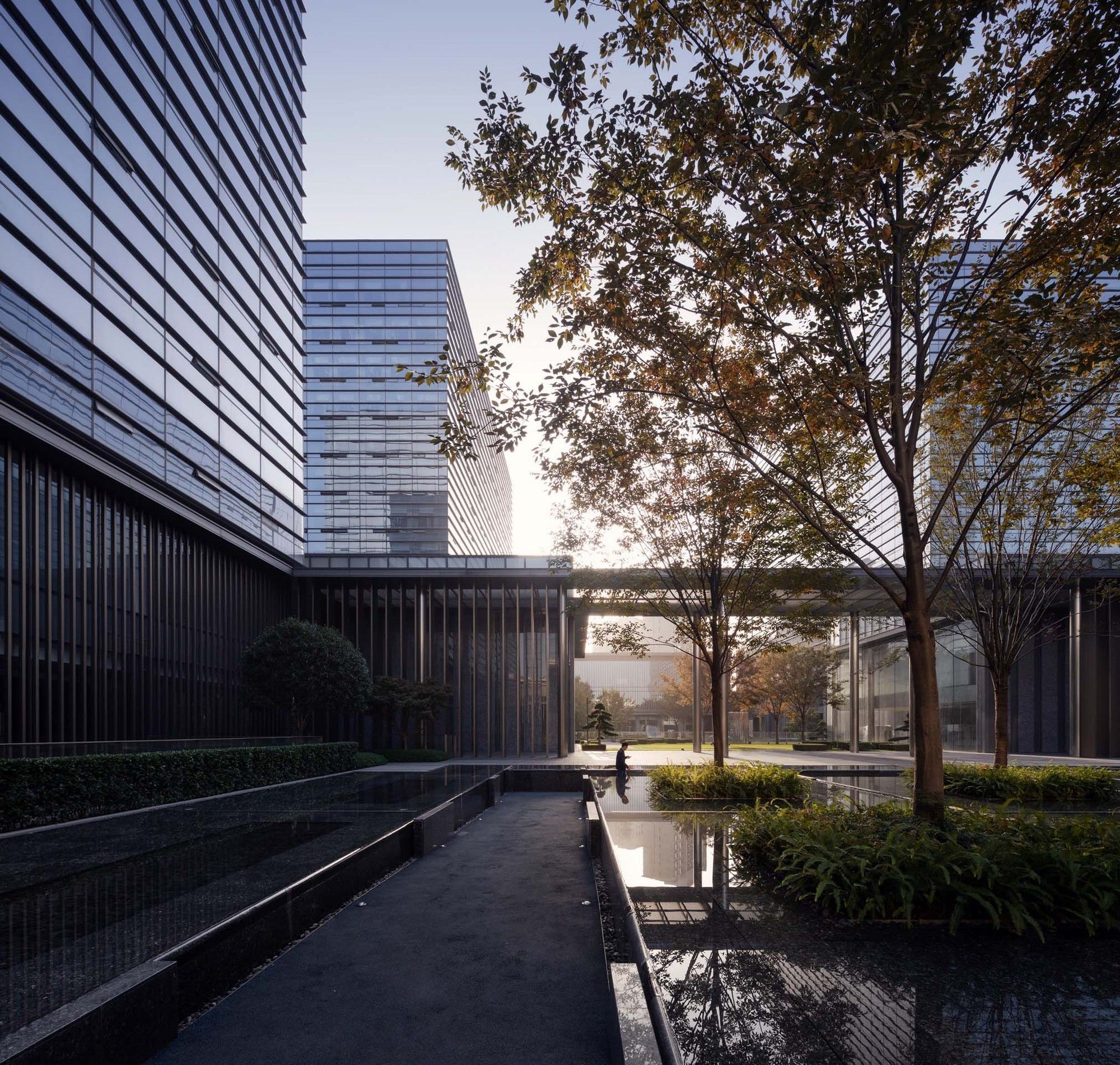
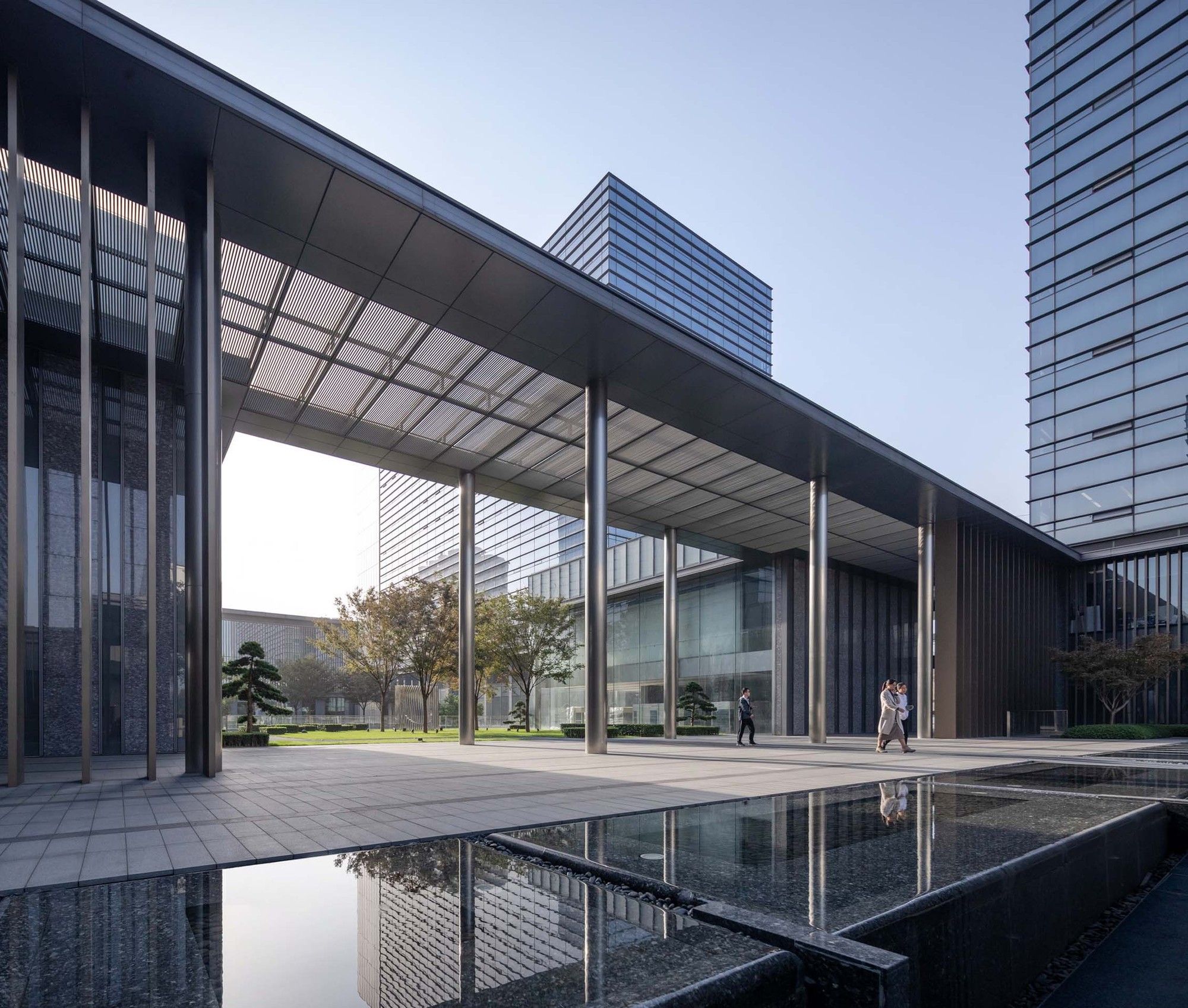
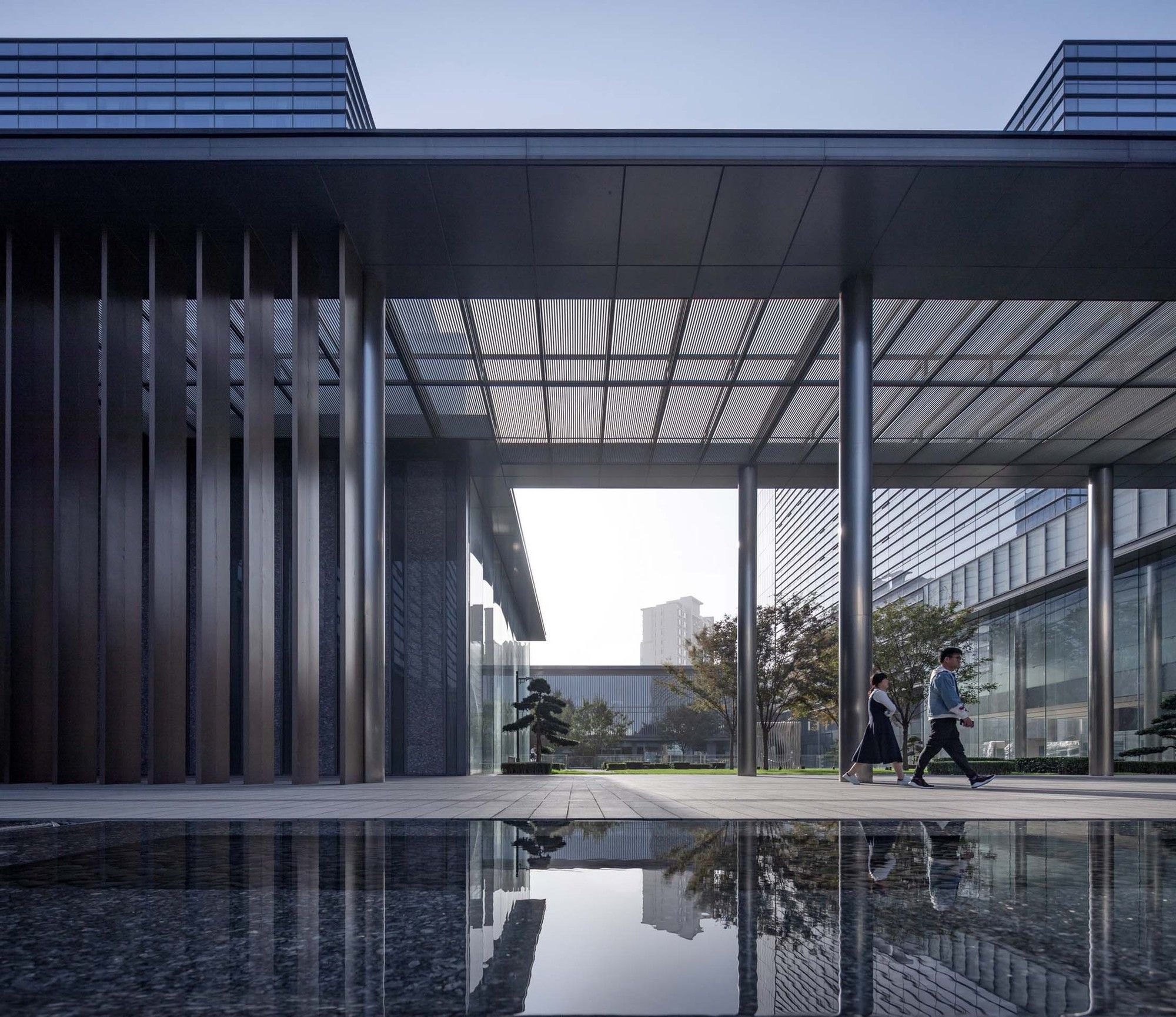
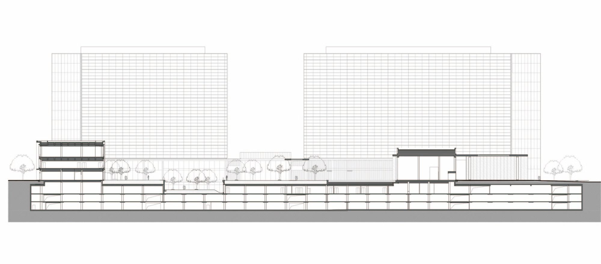
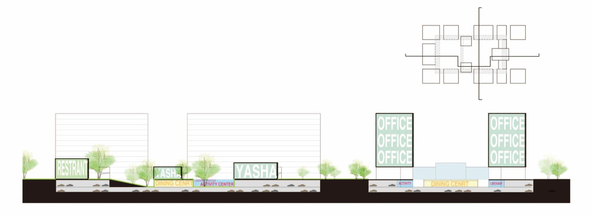
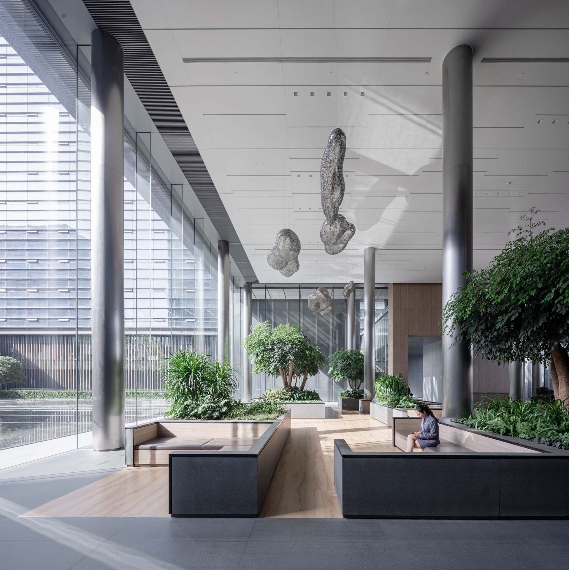
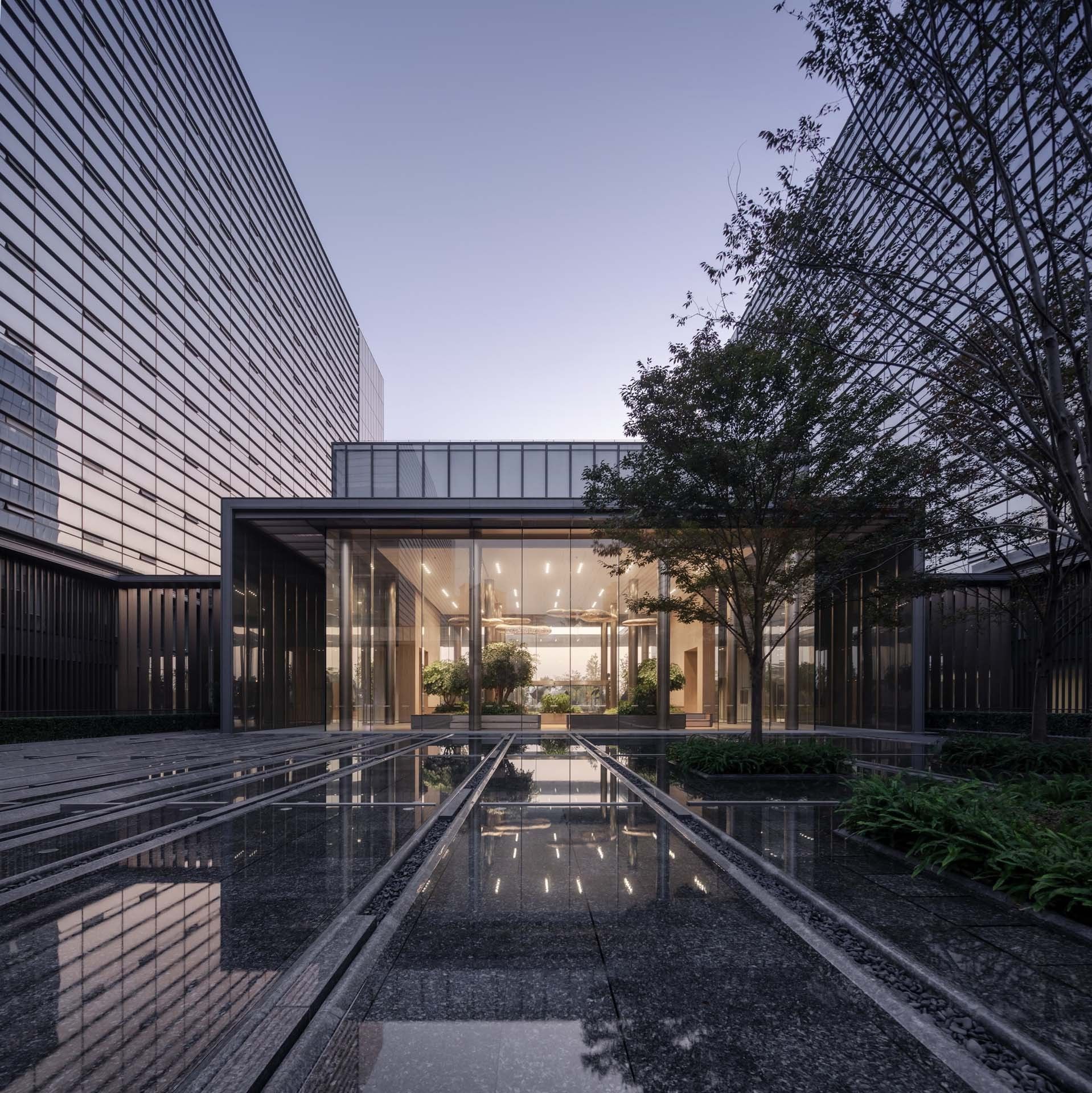
At its inception, the architects planned a diverse function plan based on the dialogue with the business owner, envisioning the park to become “a space with its own strong sense of territory, but being open to the city.” The architects hoped that the headquarters can accommodate some visitors while providing activities for its own employees, so as to maintain the vitality of the underlying business located at the boundary of the park, and to promote the development of the new town in the region while helping the building blend with the outer city. As the design progressed, however, this idea was contradicted with the owner’s strong demand for managerial controllability. After balancing, “visibility and unreachability” became a compromise choice. The architects managed to achieve a sense of “connection” by enhancing the perception of people’s sight.
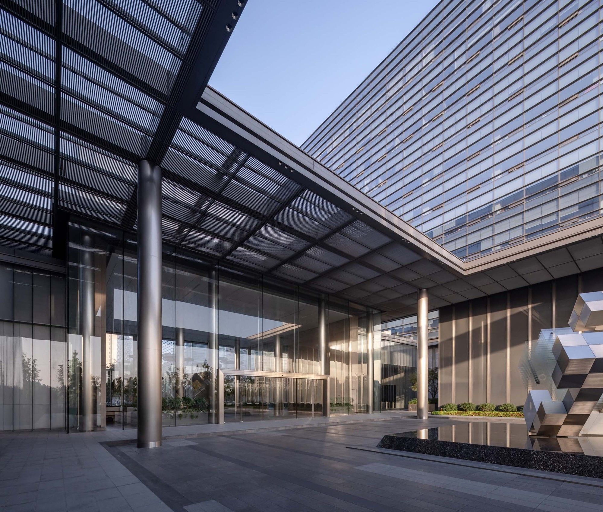
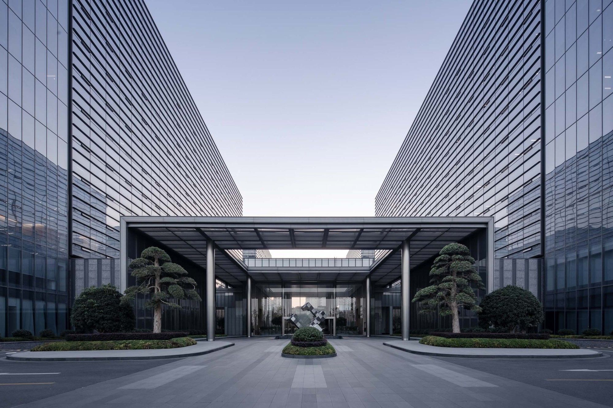
The originally open and travelable ground-floor courtyard became a “semi-open” garden. Several passages that divide the volume of podiums were set up with a landscape water system or a sinking space, although the accessibility was limited, the sight was unobstructed. There are gray spaces with a ceiling on the border, and passerby can see the interior of headquarters through the glass.
Photography by © Schran Image
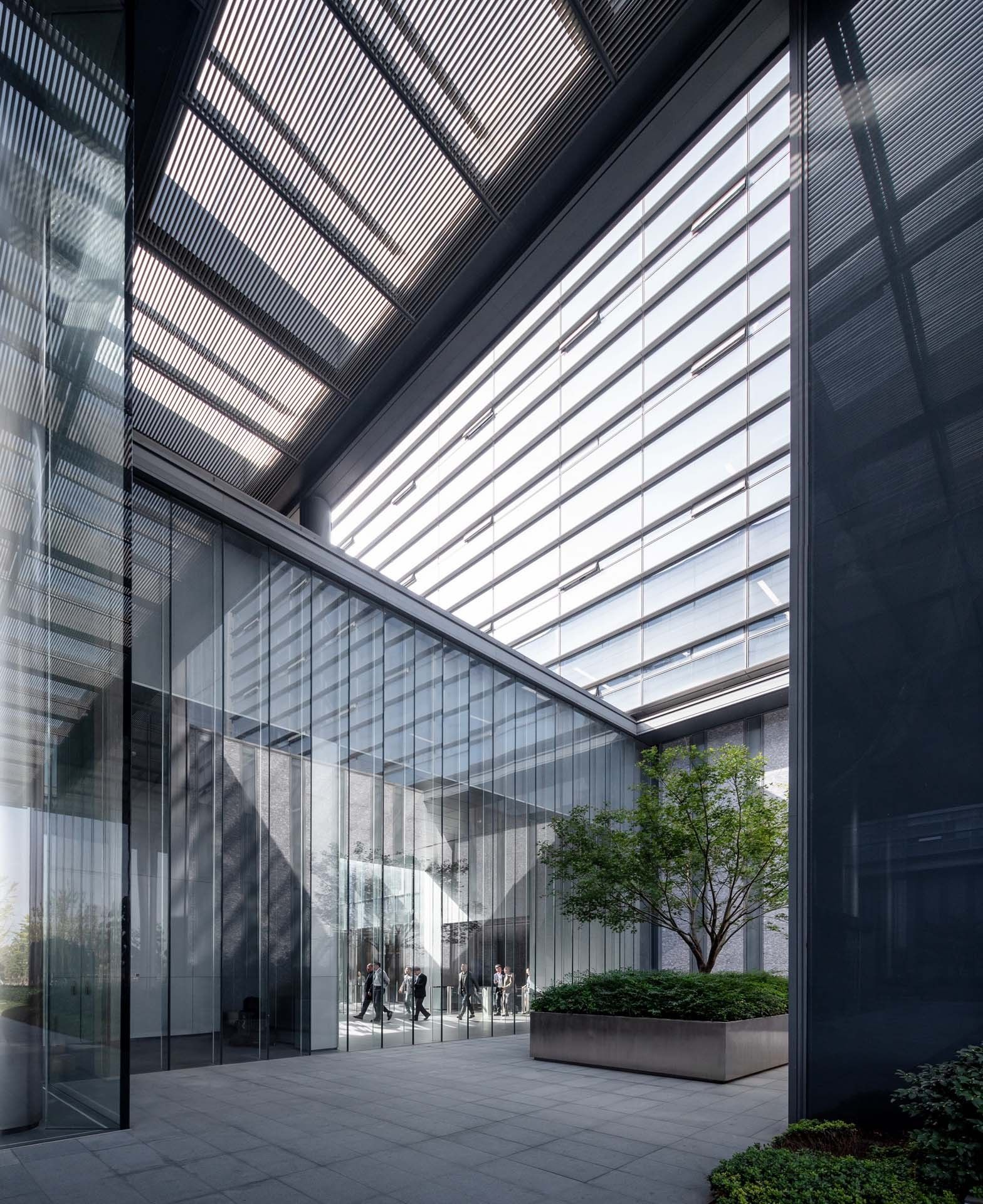
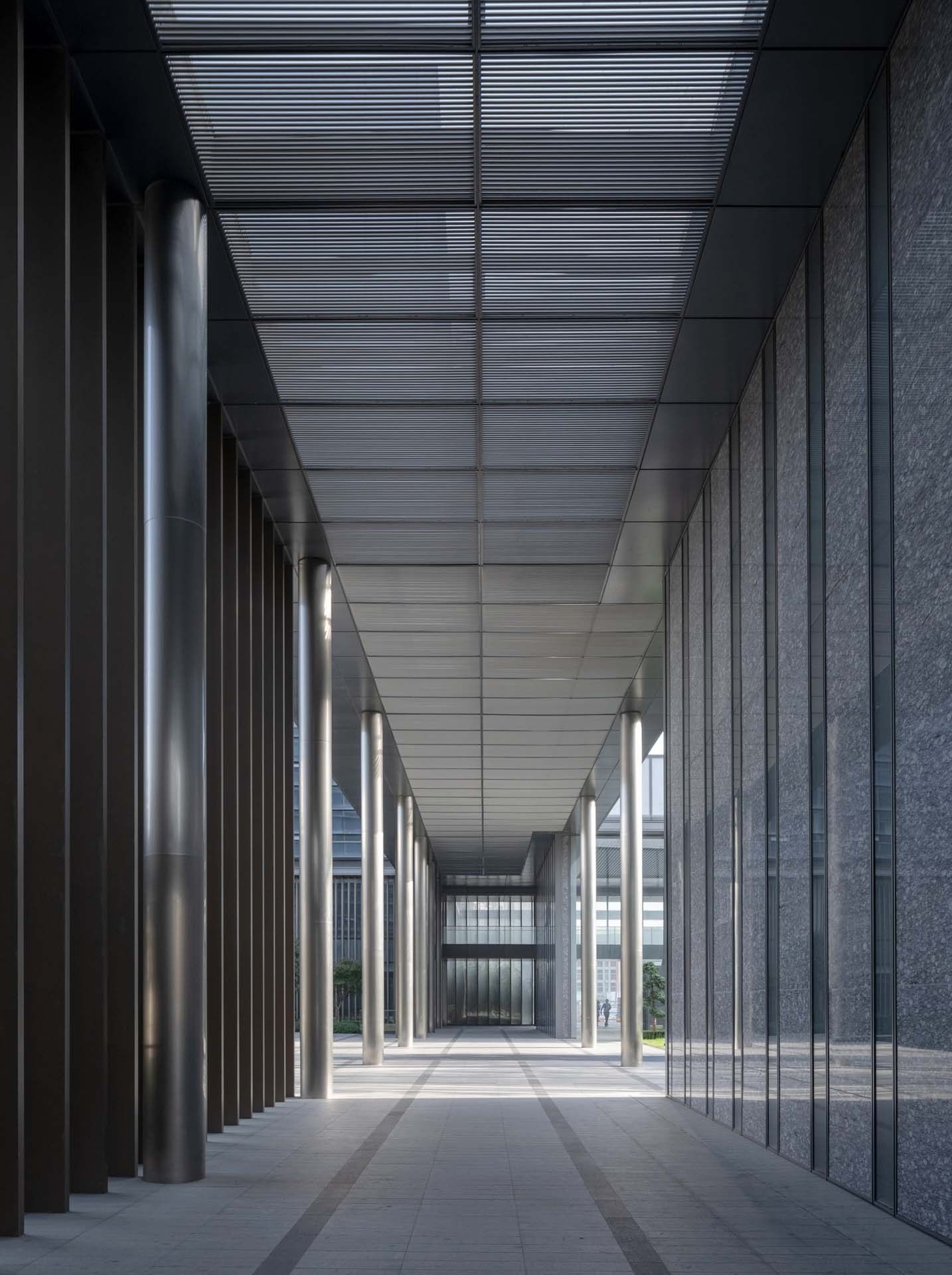
Flat Building Skin
Basic attributes were superimposed to create a delicate texture
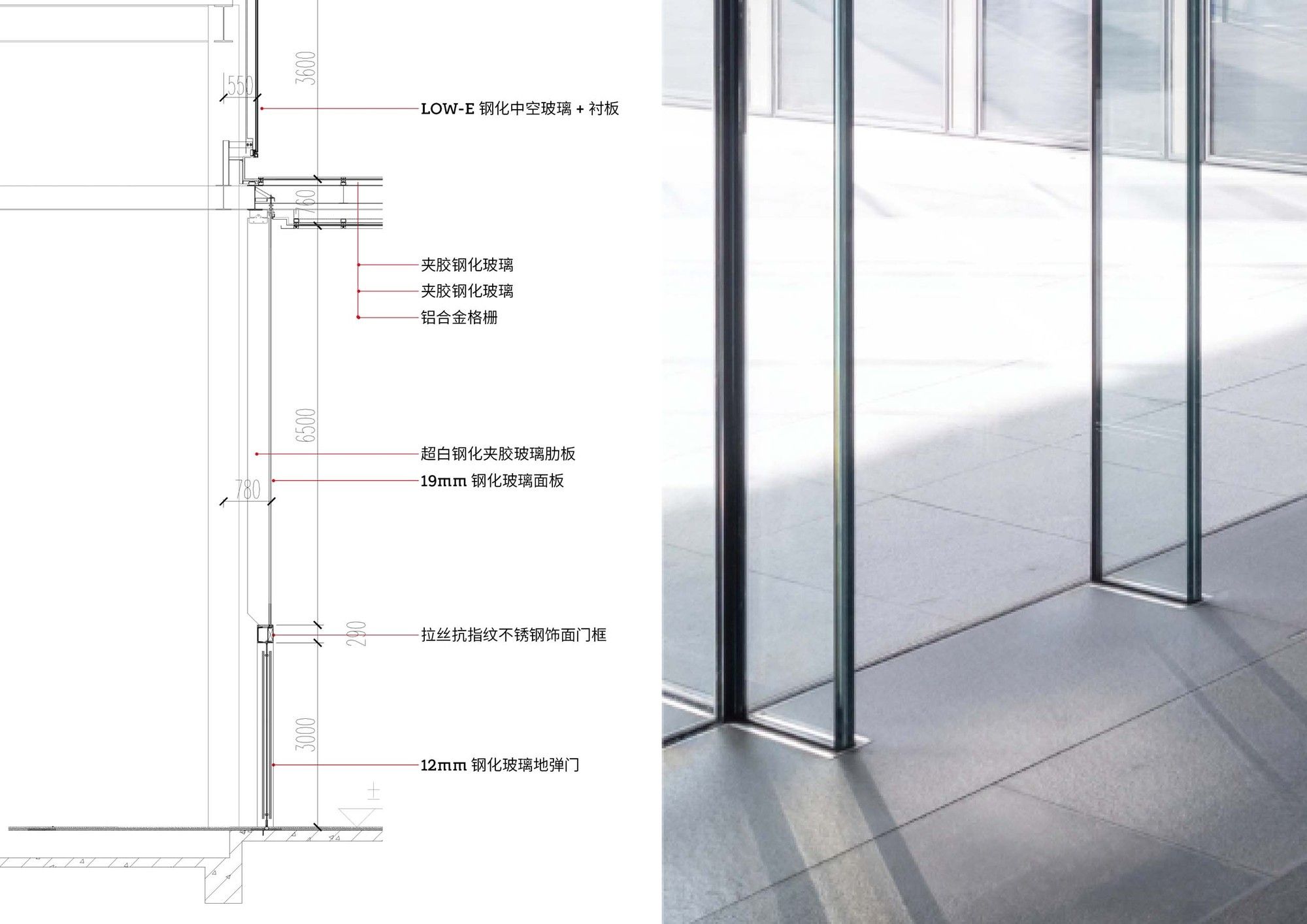
The building facade continued the concept of “simpleness and richness”, and the completely “flat” but exquisite facade fit the corporate image. The basic attributes of facade are usually simply understood as three settings of transparency-translucency-opacity; however, these three basic attributes can be combined with factors such as materials, colors, and textures to bring infinite forms.
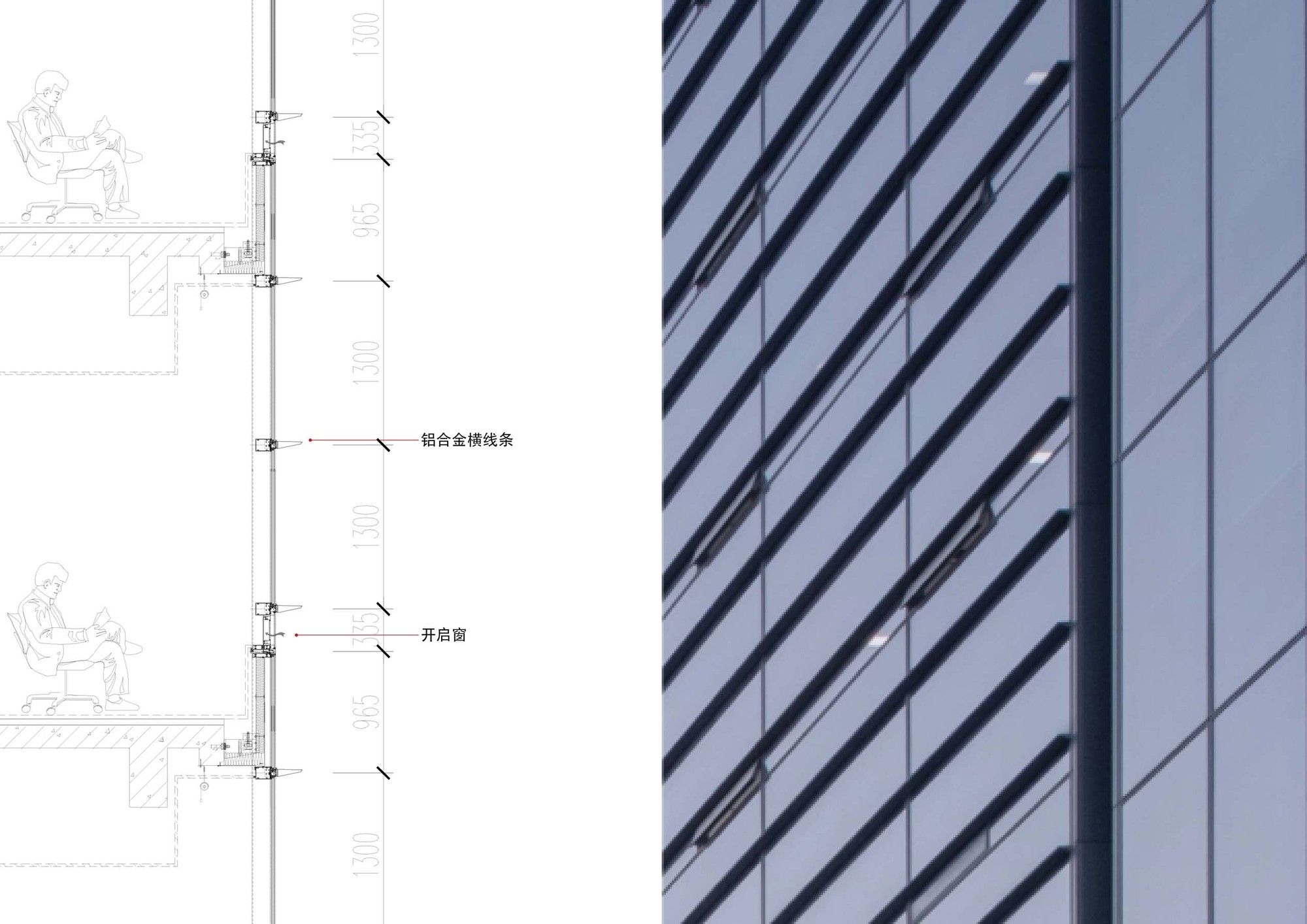
The curtain walls of main building with the height of 3.9m were divided into units with a height 1.3m. They expressed themselves by horizontally protruding lines and hidden vertical lines only divided by thin metal strips 25mm in width on the glass surface. According to the space requirements, the facade of the podium adopted fully transparent and ultra-clear glass, opal or gray glass, gray or champagne metal grille, gray granite curtain wall and various stainless steel surfaces. All materials were spliced with each other in extremely small linear structures, in order to keep the shape simple and convey the delicate texture of the building skin.
Photography by © Schran Image
The ventilation of glass curtain wall had always been one of the problems that puzzled architects. On the one hand, natural ventilation can be energy-saving and environmentally friendly, which is in line with the psychological needs corresponding to the traditional Chinese concept of human settlement; on the other hand, poorly arranged window sashes will impact the facade of the curtain wall, so it was a big challenge for architects to achieve minimalist building. From the perspective of ergonomics, the architects arranged the window sashes at a distance of about 60cm from the indoor floor, so that people can feel the natural wind when working in the office. At the same time, the architects studied a variety of ways to hide the window sashes, considering the use of perforated aluminum plates to cover them, and made a 1:1 model. However, in the final implementation, the owner still chose more traditional window sashes.
Thanks to Yasha Group’s profession and high standards in exterior wall decoration, many exquisite operations have been implemented in this project, such as a printed glass surface with a height of 11m and width of only 0.4m, and a cable curtain wall with the height of 38m. On the other hand, some structural dimensions that need to be weakened, including the hooks of small-unit curtain walls, the joints of glass-ribbed curtain walls, and floodlighting lamps, were all controlled within a limited size.
Photography by © Schran Image
“Integrated” design thinking ran through the project. The architects fully considered the unified counterpoint relationship between the design results of architecture, landscape, interior in their creations. The alignment of the building skin division was the most basic and difficult part under this goal. All divisions were based on the virtual axis and designed with the same modulus unit. Take the position control of the surface of the curtail wall as an example: if there was a change in the position of the surface due to structures, they would make partial changes on the last piece without adjusting the division modulus of the large surface. The unification of principles and benchmarks allowed architects to achieve most of the vertical lines in the complex process of multi-disciplinary cooperation.
Reviewing the design process of this project, the role of the architects is like that of “tailors”. Under the established conditions, they constantly sought the resonance between the deal design and the users’ needs, and finally presented itself in a relatively tolerant attitude in the backdrop of city. The topic that the architects tried to explore under the constraints of the project – openness of the headquarters to the city – though was not fully implemented, but the course of it was a real and transferable experience.
Photography by © Schran Image
Project Info:
Architects: goa
Location: Hangzhou, China
Area: 180000 m²
Project Year: 2017
Photographs: Schran Image