

©papik.pro
What is a vanishing point in architecture?
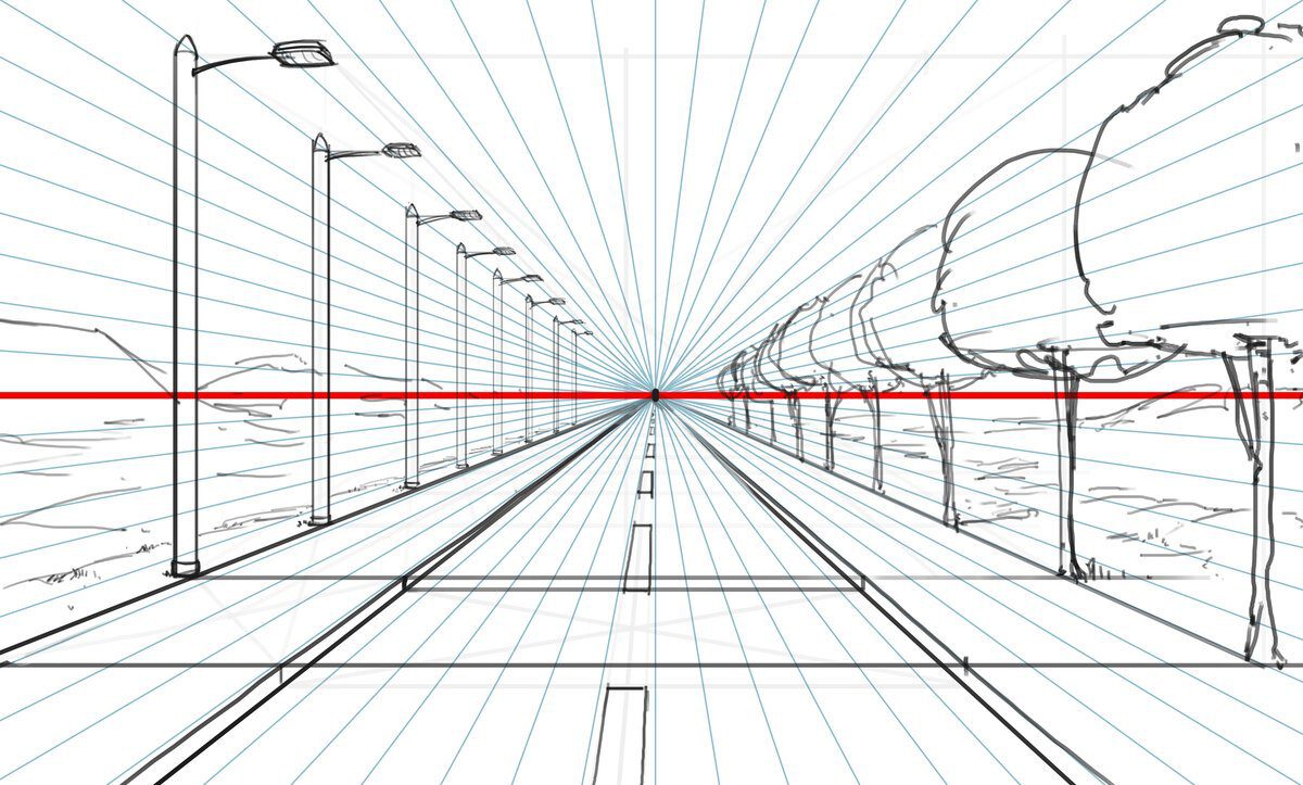
A vanishing point is the place in a drawing where lines that are actually parallel in real life appear to converge.
That distinction matters, and a lot of explanations get it backwards. The lines aren’t parallel in your drawing — they meet. They’re parallel in the world. The vanishing point is simply where your flat sheet of paper has to put them so the drawing matches what your eye reports.
It goes by other names — convergence point, point of convergence — and it lives on the horizon line, at your eye level. Not the building’s eye level. Yours.
Here’s the mental model that makes everything else click: every set of parallel lines pointing in the same direction gets its own vanishing point. The left wall of a building has one. The right wall has a different one. A road cutting diagonally across the site has a third. Once you’ve internalised that, perspective stops being a set of rules to memorise and becomes something you can reason your way through.

©jooinn.com
Take it away and the drawing falls apart. Objects float at ambiguous distances, scale becomes unreadable, and the viewer can’t tell whether they’re looking at a corridor or a flat pattern. Depth in a two-dimensional drawing is not a decorative effect. It’s information.
Railway tracks are the cliché example for a reason — they’re the clearest thing most people have physically stood on. The rails never get closer together. Your eye insists they do. The vanishing point is the exact spot where your eye wins the argument.
The three ingredients of any perspective drawing
Every linear perspective drawing, from a napkin sketch to a competition-winning render, is built from three things. Get these right and the rest is detail.
The horizon line
©Thevirtualinstructor
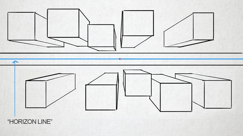
An imaginary horizontal line sitting at the viewer’s eye level. It’s not the skyline, and it’s not the ground — it’s your eyes, projected sideways across the page.
©Thevirtualinstructor
Where you put it decides the emotional register of the whole drawing. Low horizon, around 1.6 metres, and the building looms the way it will when someone actually walks up to it. High horizon and you get a controlled, planner’s overview. Drop it to ankle height and even a modest house becomes monumental. Architects choose this deliberately; students often place it in the middle of the page by accident and wonder why the image feels inert.
Vanishing points
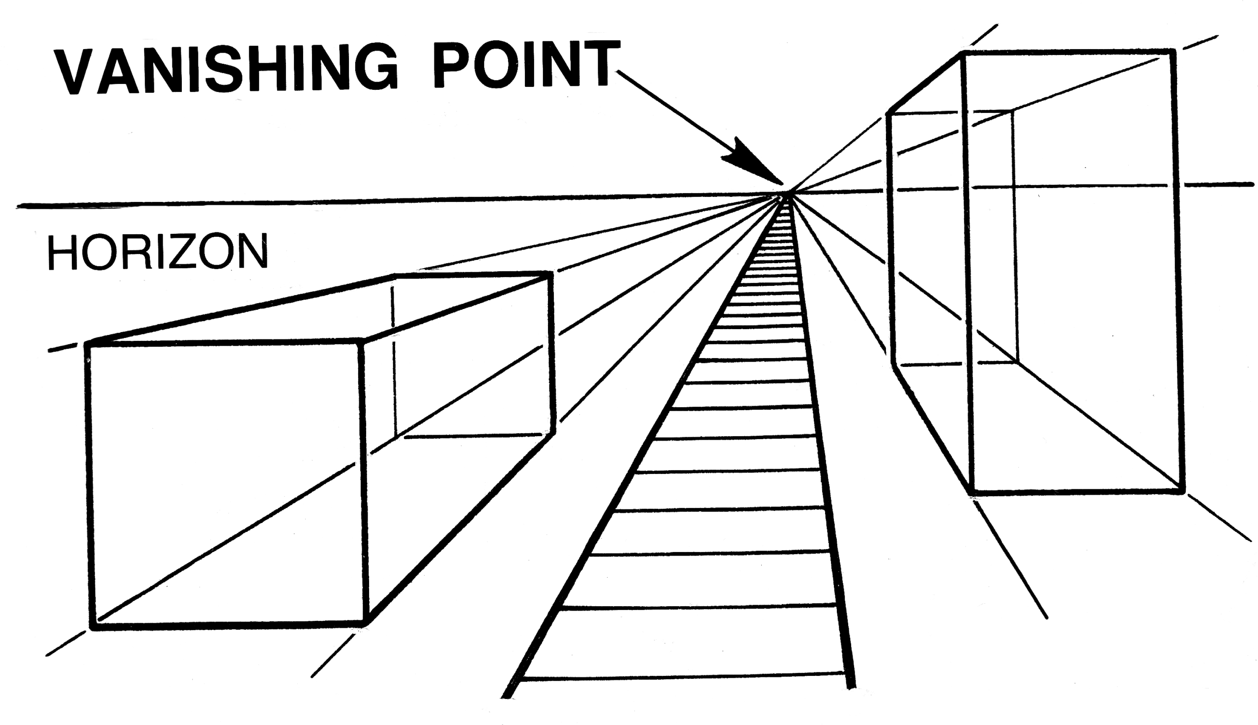
The points on that line where receding parallels converge. Note the correction here, because it’s a common slip: it’s the lines going away from you that meet at a vanishing point, not the horizontal ones sitting flat across your view.
Orthogonal lines
©commons.wikimedia.org
The receding lines themselves — the ones drawn from each corner of your object back towards a vanishing point. They’re the diagonals that carry depth. Everything else in the drawing hangs off them.
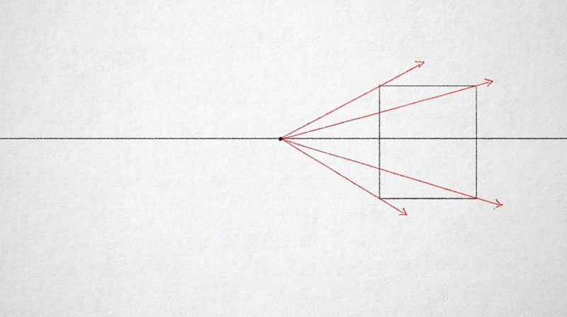
©Thevirtualinstructor
Who invented the vanishing point?
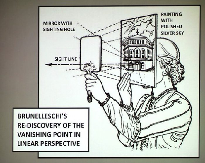
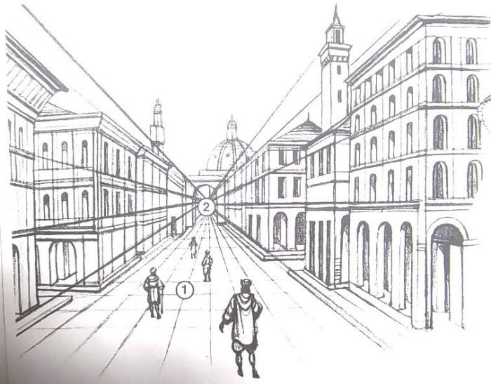
The short answer is Filippo Brunelleschi, in Florence, in the years around 1413–1420. The longer answer is better, because what he actually did was closer to a magic trick than a maths lecture.
©Luísa Vergette
Brunelleschi painted a small panel of the Florence Baptistery in correct one-point perspective, then drilled a peephole through it at eye level. He stood in the doorway of the cathedral opposite, held the painted side facing away from him, looked through the hole, and raised a mirror in his other hand.
What he saw in the mirror was his painting. Then he dropped the mirror, and what he saw was the actual Baptistery — in the same position, at the same scale. He’d even silvered the sky area of the panel so real clouds drifted across the painted building. Onlookers reportedly couldn’t tell which was which.
He wasn’t making art. He was running an experiment, and proving something no one had been able to demonstrate before: that three-dimensional space could be projected onto a flat surface by rule, not by feel.
What happened next
- c. 1427 — Masaccio’s Holy Trinity. The first monumental painting to apply the system with full rigour, in Santa Maria Novella. The orthogonals descend from the painted ceiling coffers to a vanishing point at the base of the cross, set precisely at a standing viewer’s eye level. Contemporaries were convinced the church wall had been physically opened up. Masaccio very likely worked directly with Brunelleschi on the geometry.
- 1435 — Alberti’s Della Pittura. Leon Battista Alberti wrote the rules down, describing the picture plane as a window you look through, and made the method teachable to anyone who could read.
- c. 1474 — Piero della Francesca’s De prospectiva pingendi. Extended the system to complex solids and figures.
- 1525 — Dürer’s Underweysung der Messung. Took it north of the Alps, complete with woodcuts of the mechanical drawing devices artists were using.
So the widely repeated claim that architects only adopted perspective in the 19th century is simply wrong — off by roughly four hundred years. Perspective was standard professional equipment across Europe from the 1400s onwards. What the 19th century added was mass printing and formal architectural education, which spread the technique to every drawing office rather than every studio.
Brunelleschi went on to build the dome of Florence Cathedral, which is a fair claim to being the greatest engineering feat of the age. If you want the wider context of where he sits among the discipline’s defining figures, our guide to the most influential architects in history covers him and the generations that followed.
How do architects create vanishing points?
©Adobe
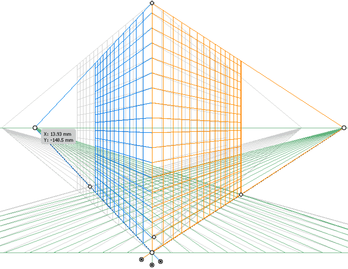
In practice, the sequence looks like this — and it’s worth doing by hand a few dozen times even if you’ll spend your career in software.
- Draw the horizon line first. Decide the eye height before anything else. This is the decision everything else inherits.
- Place your vanishing points on it. One, two or three depending on the view you want. Push them further apart than feels natural — more on why in a moment.
- Establish the nearest edge of the object. In two-point, that’s the vertical corner closest to you. Its height sets the scale for the entire drawing.
- Run orthogonals from every corner back to the appropriate vanishing point. Lightly. You’ll erase most of them.
- Cut the depth. Decide where the far edges sit and drop verticals to close the form.
- Check against a known dimension. Put a 1.7-metre figure in the scene early. If the figure looks wrong, the perspective is wrong, and you’ll spot it before you’ve inked forty windows.
That last step is the one experienced hands never skip and beginners almost always do. A human figure is the cheapest error-checking device in drawing.
The types of perspective, and when to use each
One-point perspective
©Weebly.com
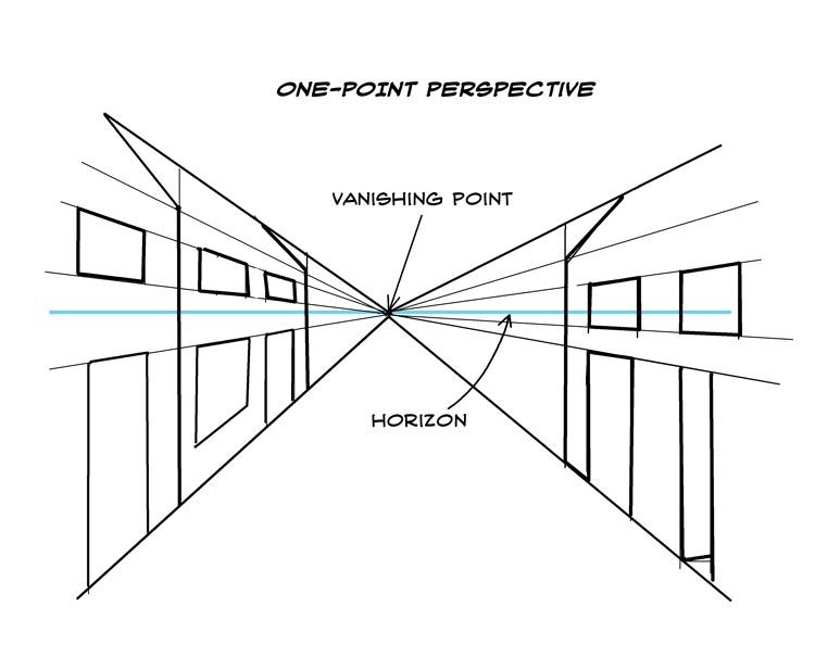
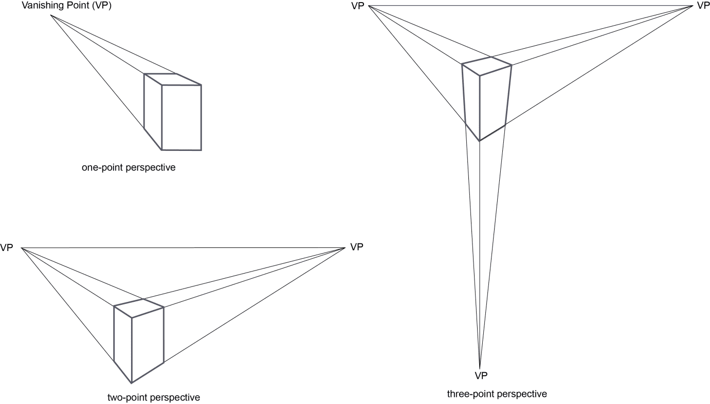
One vanishing point on the horizon. The front face of everything stays parallel to the picture plane — squares stay square — and only the receding surfaces converge.
Use it for: corridors, streets, galleries, nave interiors, anything where you’re looking straight down the length of a space. It’s the natural choice for interiors because it’s calm and symmetrical, and it gives the viewer a strong sense of being centred in the room.
Watch out for: its own tidiness. One-point is so orderly it can read as static. If a scheme’s appeal is its asymmetry, one-point will flatten exactly the quality you’re trying to sell.
Two-point perspective
©learn.foundry.com
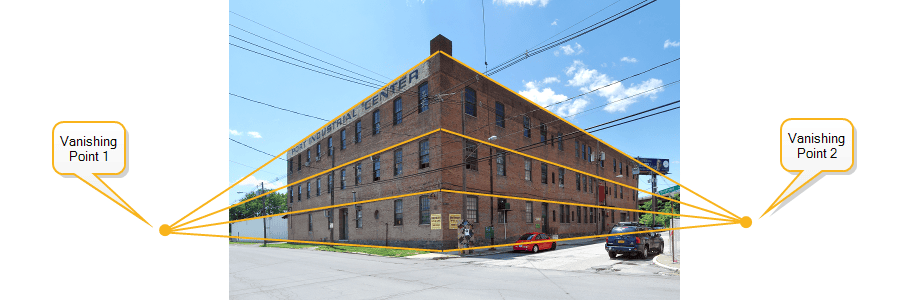
Two vanishing points, one to each side, usually well off the edge of the page. You’re standing at the corner of a building, so both visible walls recede — one to the left point, one to the right.
The rule that matters here: vertical lines stay vertical. They don’t converge. Only the two horizontal sets do. That’s what makes two-point the workhorse of exterior architectural drawing — it shows mass and depth while keeping the building standing up straight.
Use it for: exteriors, corner views, street-level approaches, almost any presentation drawing of a whole building.
Two-point is also where most people’s drawings quietly go wrong, usually because the vanishing points end up too close together. If yours keep coming out looking bent, this simple trick for solving two-point perspective problems is worth five minutes of your time.
Three-point perspective
©unmisravle.com
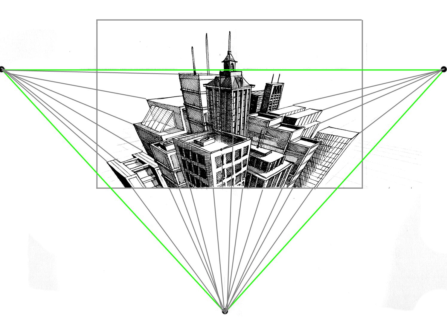
Everything from two-point, plus a third vanishing point above or below for the verticals.
This is what happens when you tilt your head. Look up at a tower and its vertical edges converge towards a point in the sky; look down from a rooftop and they converge towards one underground. Add that third point and you get drama — height, vertigo, scale.
Use it for: towers, worm’s-eye views, aerial views, anything where the point of the image is how tall or how far down.
Use it carefully. Three-point is the easiest way to make a competent drawing look like a cartoon. The further out you push that third point, the subtler the effect — and subtle is usually what you want for a client presentation.
©curriculum.catholic.tas.edu.au
Four- and five-point (curvilinear) perspective
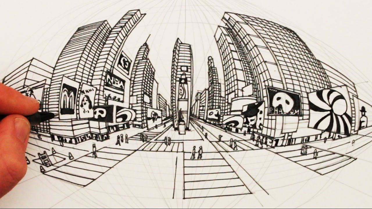
Beyond three, the straight lines themselves start to bend. Four-point places vanishing points at the compass positions around a circle; five-point adds one in the centre, so vertical lines bow towards the top and bottom points, horizontals bow left and right, and only the lines running straight into the picture stay straight.
The result is a fisheye. It’s not a gimmick, either — it’s arguably more accurate than standard perspective, because your retina is curved and straight-line perspective is the approximation. The system was formally codified in 1968 by André Barre and Albert Flocon in La Perspective curviligne.
Four- and five-point (curvilinear) perspective
A useful rule of thumb borrowed from photography: if you’d reach for a 16mm lens or wider, curvilinear is the honest choice. If you’d reach for 24mm or longer, stick with straight lines. In practice, most architects will encounter this in VR walkthroughs and 360° panoramas rather than on paper.
Multi-point perspective
Here’s the thing nobody tells beginners: the real world is almost never a two-point situation.
A textbook two-point drawing assumes every object in view shares the same two sets of parallels. Walk down any actual street and that assumption dies immediately. The building on the corner sits at 30° to its neighbour. The road bends. A pitched roof has its own pair of points above the horizon. A hexagonal pavilion has three sets of walls and therefore three pairs.
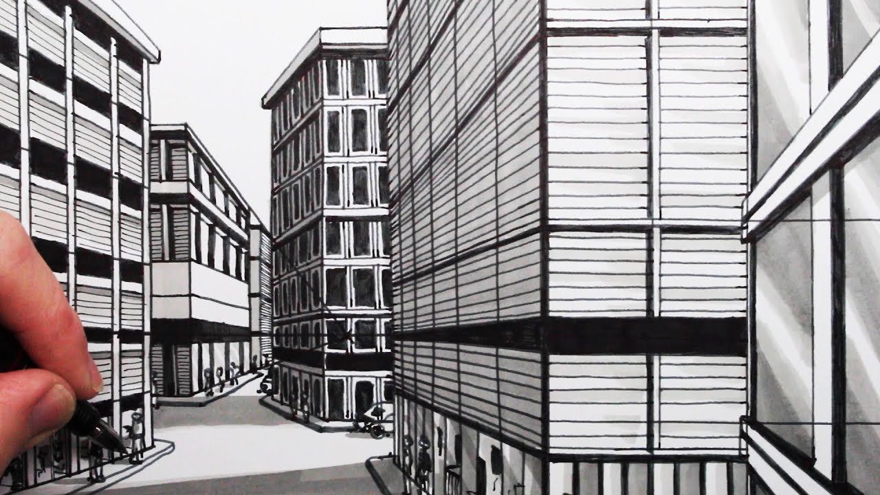
Every one of those gets its own vanishing point. A drawing of a real streetscape might have eight, and that’s normal, not a mistake. What stays constant is the horizon line — one eye level for the whole scene, no exceptions. Everything else multiplies as needed.
Why do my perspective drawings look distorted?
This is the single most common problem, and it has one dominant cause: your vanishing points are too close together.
The fix comes from a concept called the cone of vision. Human beings see clearly within roughly a 60° cone — 30° either side of where you’re actually looking. Beyond that, your peripheral vision goes soft and your brain quietly stops taking it seriously.
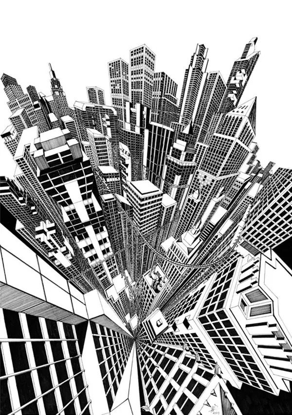
Building perspective drawings look distorted
Linear perspective doesn’t have peripheral vision. It projects everything with equal rigour, including the parts you’d never actually perceive that way. So when you cram both vanishing points onto your sheet of paper, you’re forcing the drawing to represent a field of view far wider than a human eye handles — and the edges stretch and warp. The construction is technically correct. It just looks wrong, which in a client presentation is the only thing that counts.
Three practical fixes
1. Get the points off the page. This is the classic studio move: tape a larger sheet of scrap to the table on both sides of your drawing paper, mark your vanishing points out there, and run your orthogonals in from the scrap. A pin and a length of thread works even better than a ruler — pin at the vanishing point, pull the thread taut, draw along it.
2. Draw wide and crop in. Set up your grid on a much larger sheet with very distant vanishing points, then compose your final image in the central region and crop. You get the undistorted sweet spot of the “lens” and throw away the stretched edges.
3. Learn to eyeball it. Experienced hands estimate vanishing point positions without constructing them, and they’re right often enough. This is a skill built on having done it properly a few hundred times first — not a shortcut around the geometry.
As you get more drawings behind you, you’ll start reverse-reading your own work: glance at a sketch, see where the points must be, and correct by eye. The scrap paper becomes unnecessary. Most people get there faster than they expect.
What’s the difference between linear and atmospheric perspective?
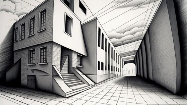
Linear perspective handles geometry — lines, convergence, scale. Atmospheric perspective (also called aerial perspective) handles everything else.
As distance increases, air scatters short-wavelength light. Distant objects go paler, cooler, bluer, and lose contrast and detail. It’s why far-off hills look hazy and slightly blue rather than simply small.
via nevadaart.org
For architects this is the most underused tool in the box. You can construct flawless geometry and still produce a drawing that reads as flat, because everything sits at the same tonal weight. Push your background buildings lighter and lower in contrast, keep your foreground crisp and dark, and the same drawing suddenly has air in it. Two minutes of work, enormous difference — and it applies just as much to a rendered image as to a pencil sketch.
How do vanishing points work in CAD and photography?
Here’s where a 600-year-old idea becomes a button you click.
Every 3D application ships with a virtual camera, and that camera constructs vanishing points exactly the way Brunelleschi’s panel did. But there’s one setting worth understanding properly, because it’s the difference between an amateur render and a professional one.
In SketchUp it’s called two-point perspective. In 3ds Max it’s vertical shift. In Enscape and several other renderers it’s two-point or architectural two-point. What it does is force vertical lines to stay vertical, even when you’re looking up at a tall building — collapsing the third vanishing point back to infinity.
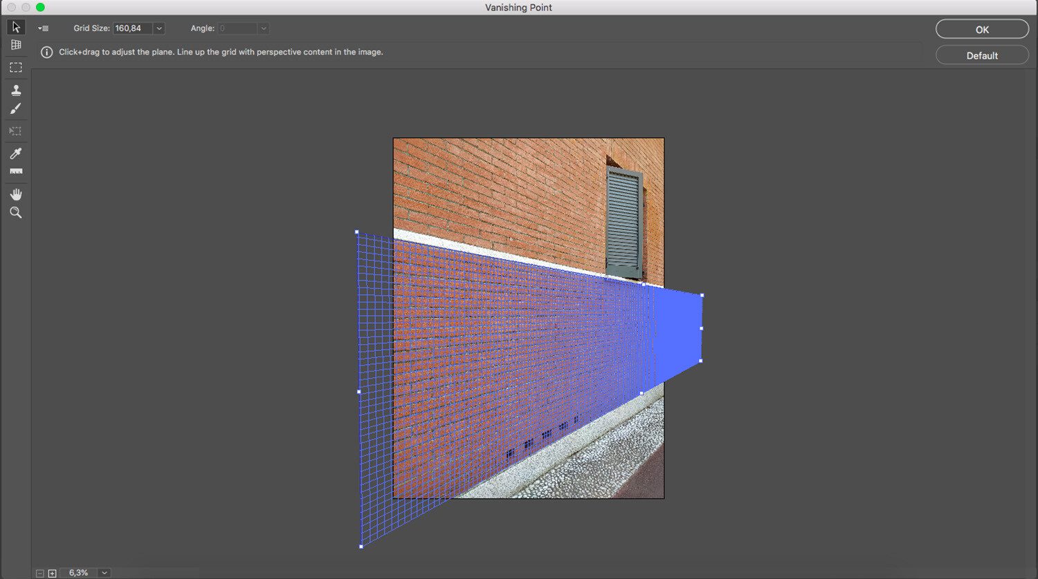
vanishing points work in CAD and photography
Photographers achieve the same thing optically with a tilt-shift lens. Keep the camera perfectly level so verticals don’t converge, then shift the lens element upward to include the top of the building without tilting. Point a normal wide-angle lens up at a tower and its walls lean inwards — which looks like a snapshot, not architecture.
The reason this matters: our eyes and brains treat converging verticals as a signal that we’re craning our necks. Straight verticals read as composed, deliberate, stable — the visual language buildings are supposed to speak in. It’s the same instinct Renaissance painters had when they put the vanishing point at a standing viewer’s eye level.
Most modelling and rendering packages have this toggle somewhere. If you’re setting up a Mac-based workflow, our roundup of architectural design software for Mac covers which applications handle it well.
Which architects deliberately broke the rules?
Once you understand how perspective convinces the eye, you can weaponise it — and some of the best architects in history did exactly that.
The masterpiece is Francesco Borromini’s colonnade at Palazzo Spada in Rome, built in 1652–53 for Cardinal Bernardino Spada. Stand at one end and you see a long, stately arcade running away from you, with a life-size classical statue at the far end.
You’re looking at a corridor slightly under nine metres long. The statue is around 60 centimetres tall.
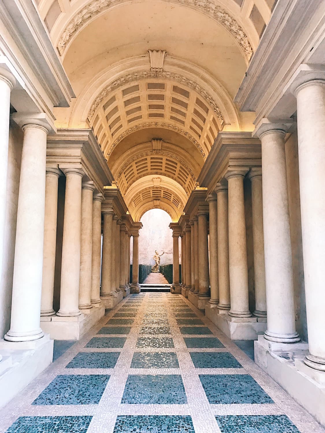
Francesco Borromini, perspectival gallery, 1652-1653, Rome, Palazzo Spada.
Borromini pulled it off by building the perspective into the architecture itself: the columns get progressively shorter, the floor rises, the ceiling drops, and the whole gallery tapers. He worked with a mathematician to get the rates right. The ceiling at the far end is so low that only a child could stand under it. Even the hedges flanking the courtyard were carved from stone rather than planted, because he didn’t trust a gardener to keep the dimensions exact.
This is called forced perspective, and it turns up throughout architectural history — Palladio and Scamozzi’s Teatro Olimpico in Vicenza, Bernini’s Scala Regia at the Vatican, the tapering plan of countless Baroque staircases designed to look grander than their budget allowed.
The lesson for anyone drawing today: perspective isn’t a neutral recording device. It’s a set of assumptions about where the viewer stands, and assumptions can be exploited. Every architectural render you’ve ever seen is making choices about eye height, lens width and vanishing point placement that shape how the building feels before anyone reads a single dimension.
Do you still need to learn perspective if software does it for you?
Yes, and the reason isn’t nostalgia.
Software constructs perspective flawlessly. What it cannot do is decide where to stand, how high the eye should sit, how wide the lens should be, or which vanishing point arrangement tells the truth about a building. Those are design judgements, and they’re the difference between a render that sells a scheme and one that just documents it.
There’s also the speed argument. In a meeting, on site, in front of a client, the fastest way to explain a spatial idea is still a sketch on whatever paper is to hand. Nobody waits while you open a laptop. Architects who can throw down a credible one-point interior in ninety seconds have an advantage that no amount of software fluency replaces.
And the diagnostic argument, which is the underrated one: if you understand perspective by hand, you can look at a render and immediately tell that the camera is too low, or the lens too wide, or the horizon in the wrong place. If you don’t, you’ll know something’s off without being able to say what.
Every serious course still teaches this by hand in first year, and there’s a reason for that — you can see which programmes take drawing seriously in our guide to the top architecture schools. The same applies on the interiors side, where one-point perspective is the daily working language of the profession; our list of the best interior design schools is a good place to start if that’s your direction.
Five quick fixes for better perspective drawings
- Decide the eye height before anything else. 1.6m for a street view, higher for an overview, lower for drama. Never place it by accident.
- Push vanishing points further apart than feels right. Almost every distorted drawing has them too close.
- Put a person in early. Cheapest scale check available, and it catches errors while they’re still cheap to fix.
- Keep verticals vertical unless you specifically want drama. Toggle two-point perspective in your software.
- Fade the background. Atmospheric perspective costs you two minutes and adds depth that geometry alone won’t.
Related reading on Arch2O
- Famous Architects: The Most Influential Names in History
- This Simple Trick Can Solve All Your 2-Point Perspective Problems
- Top Architecture Schools
- 10 Best Interior Design Schools
- Architectural Design Software for Mac
- Why Do Architectural Sketches Still Matter in the 21st Century?

Emily Reyes is a Brooklyn-based architecture writer and Article Curator at Arch2O, known for her sharp eye for experimental design and critical theory. A graduate of the Southern California Institute of Architecture (SCI-Arc), Emily’s early work explored speculative urbanism and the boundaries between digital form and physical space. After a few years in Los Angeles working with boutique studios on concept-driven installations, she pivoted toward editorial work, drawn by the need to contextualize and critique the fast-evolving architectural discourse. At Arch2O, she curates articles that dissect emerging technologies, post-anthropocentric design, and contemporary spatial politics. Emily also lectures occasionally and contributes essays to independent design journals across North America.