Run Run Shaw Creative Media Center
Such an inspiring building to be working in. Rich in light and form, the space truly inspire collaboration and creativity. I really like the fact that the building is really considering the public by having a special section for visitors to learn and experience. It almost acts as a community building while at the same time being private.
The architect’s style is really intriguing. Subtraction is used on various volumetric forms, and through this subtraction spaces, forms and shapes are created which are all adding up until the top sharp point of the building is reached. It is really a work of art and something to inspire.
Courtesy of Daniel Libeskind
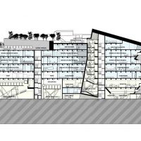
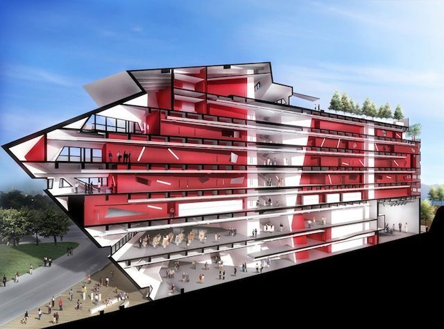
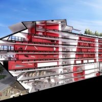
The section submitted by the Daniel Libeskind opens a whole new visual world, not normally open to the physical world. Through this section, all the volumetric forms are joined into one, and strangely it appears to be a ship. Well, this might be a coincidence or a play by the architect. We don’t know but it really is extraordinary.
Daniel Libeskind, the Liberace of architecture. The worn out entertainer, the man who does not understand the requisite of ‘Bigness’ to make these ‘progressive’ and ‘oh so new and exciting’ shapes happen. Were this building completed in the late 90’s or early 2000’s, and one could have deemed it innovative, even radical or revolutionary. But now it seems like just another one out of the box, another cliché. I’m going to be honest, as you can see I’m not Libeskind’s biggest fan. Not even his smallest, I’m no fan at all. So, having said this, I’ll stop being prejudiced against him and look at the project in itself and go from there. Let’s argue the project, not the man.
Courtesy of Daniel Libeskind
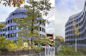
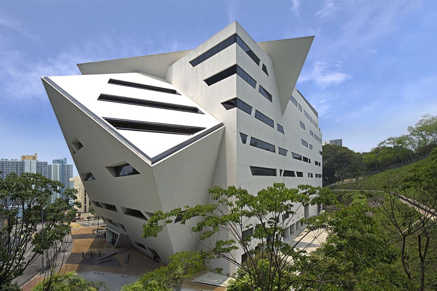
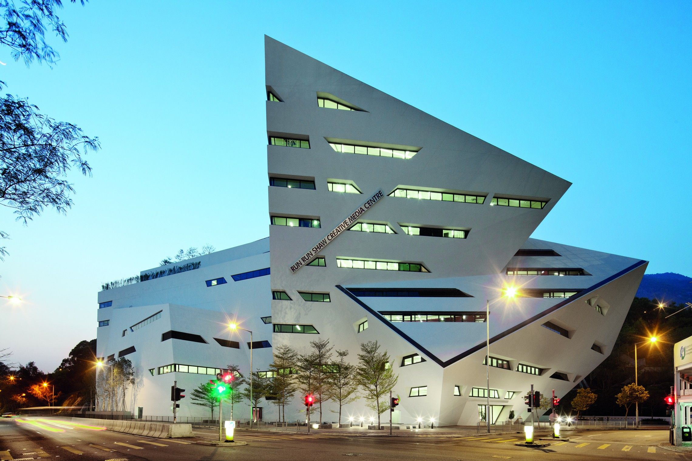
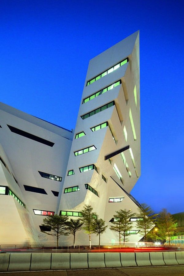
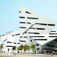
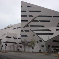
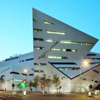
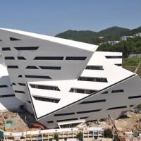
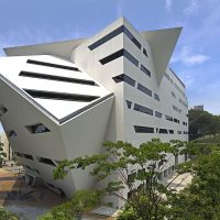
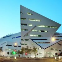
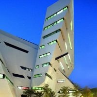
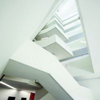
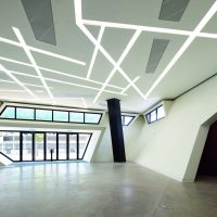
The Run Run Shaw Creative Media Center was built in 2011 by the Polish-American architect Daniel Libeskind, and as a first impact, the building offers us a jagged, crooked geometry, with accentuated angles defining both the overall shape of the building as well as the windows. Yet this geometry does not transpose itself to the inner logic. On the section, we see that only the front façade is bound to this said ‘plasticity’-the inside of the building is as plain as it can get, with floors on top of floors organized in a neat, common way. As a gesture, it’s somewhat contradictory. It is as if one was lying, dressing up the outside in a way that hid the plainness of the insides. The only remarkable aspect of the inner organization, in this sense, is the space of the stairwell. It’s a space that, as the stairs go up, gets more tight. Also, the trajectory of the staircase provides a certain interaction between heights, which is to say, some flights of stairs are interrupted not only on the floors themselves but at half of the floor’s height.
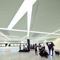
Other than that, I could only add that the inner spaces are banal, punctuated here and there with a crooked angle from some furniture or some lighting features on the ceiling, as if to remind us that this building is actually ‘plastic’ and ‘creative in its shapes’. Ultimately, this building tries to hide it’s ultimate banality with a façade that screams for attention-in a way that is, in fact, useless and cliché. Its tremendously incoherent. Knocking on the door of ‘club starchitect’ in the wrong way, Mr. Daniel-no one will let you in like that.
Courtesy of Daniel Libeskind
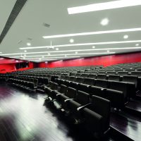
The structure, typical of Daniel Libeskind, is a jagged and dynamic crystalline solid concrete and steel. The shell, purist in its white splendour, sits in front of the landscape of the University of Hong Kong, accommodates facilities such as a theater, multiple sound stages, laboratories, classroom, exhibition spaces, a café and a restaurant.
The form that the building takes is typical of Libeskind, but his insistent style comes across as intrusive and overbearing as the context of the structure becomes insignificant, due to the spectacle of the mass. The edges defining the building lead me to imagine the context (in this case the landscape) with a void in place of the building itself, which can be argued as visually bringing attention to the context. The building, at the end of the day, is functional and an addition to the users.
Courtesy of Daniel Libeskind
Project Information:
Architect : Daniel Libeskind
Location : City University of Hong Kong, Cornwall Street, Kowloon Tong
Project Year : 2011
Project Area : 263,000 square feet
Structural Engineer : ARUP (London and Hong Kong)
Mechanical/Electrical/Plumbing Engineer : ARUP
-
- Courtesy of Daniel Libeskind
-
- Courtesy of Daniel Libeskind
-
- Courtesy of Daniel Libeskind
-
- Courtesy of Daniel Libeskind
-
- Courtesy of Daniel Libeskind
-
- Courtesy of Daniel Libeskind
-
- Courtesy of Daniel Libeskind
-
- Courtesy of Daniel Libeskind
-
- Courtesy of Daniel Libeskind
-
- Courtesy of Daniel Libeskind
-
- Courtesy of Daniel Libeskind
-
- Courtesy of Daniel Libeskind