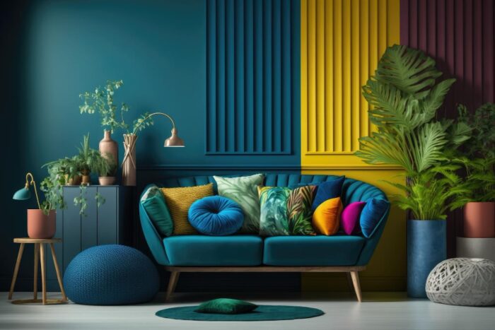
The Color Psychology in Architecture: How Buildings Affect Your Mood
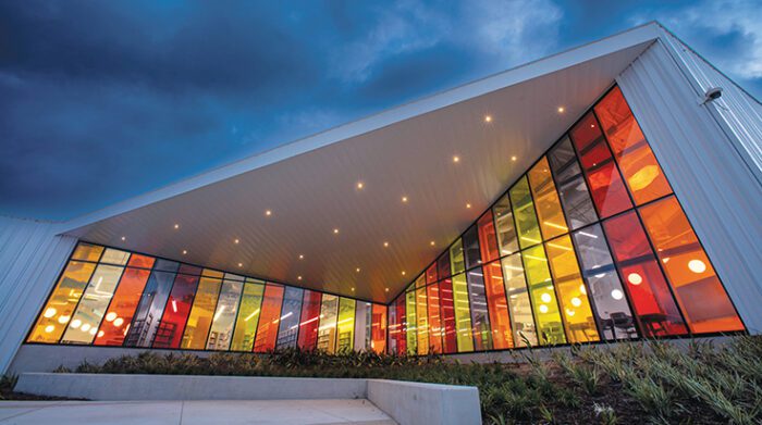
Walk into any hospital emergency room and you’ll never see bright red walls or sunshine yellow paint. But step into Google’s offices, and suddenly there’s orange everywhere, splashes of blue, colors that practically vibrate with energy. This isn’t some random design choice. It’s science at work.
Despite decades of research proving that our bodies have physical reactions to color—measurable changes in heart rate and stress hormones—most architects still treat color like decoration. That’s a missed opportunity when you consider we spend over 90% of our time indoors.
The colors around us aren’t just making things look pretty. They’re changing how we feel, how we heal, and how we perform. The disconnect between what we know about color psychology in architecture and what gets built is pretty eye-opening.
Do Colors Actually Affect Your Mood in Buildings?
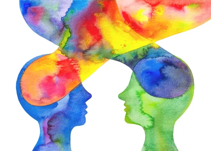
Your brain doesn’t just “see” color—it processes it through multiple pathways that trigger real physiological changes. Within minutes of walking into a red room, your heart rate goes up. Your blood pressure changes. Your cortisol levels shift.
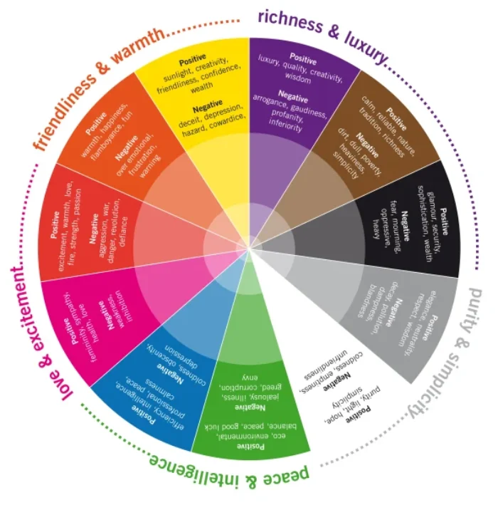
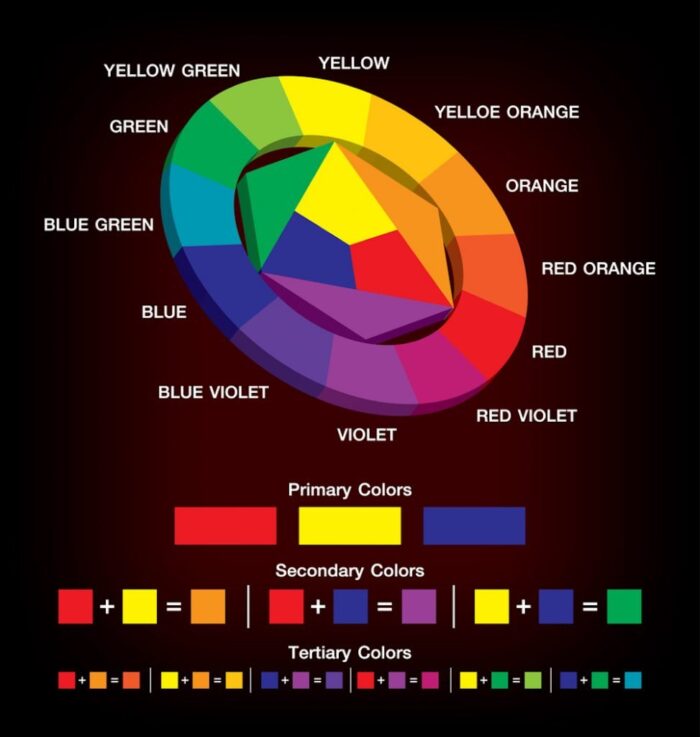
Think of it this way: warm colors like red, orange, and yellow are like caffeine for your nervous system. They wake you up, get you energized, make you feel more passionate. Cool colors—blues, greens, purples—are more like a warm bath. They calm you down, help you focus, make you feel more introspective.
The Science Behind Psychological Effects of Color
The mechanism is straightforward once you understand it. Red wavelengths activate your sympathetic nervous system—great when you need to be alert in an emergency room, terrible when you’re trying to recover from surgery. Blue wavelengths do the opposite, triggering your parasympathetic system and helping you relax.
Green sits right in the middle of the spectrum, which is why it’s the most restful color for human vision. Your eyes don’t have to work as hard to process green wavelengths, making it naturally calming.
Real-World Evidence of Building Color Effects
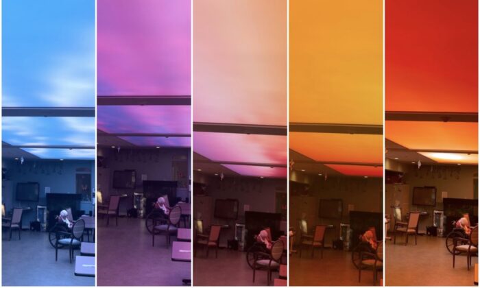
Cincinnati Children’s Hospital completely transformed their patient experience by replacing harsh fluorescent lights and beige walls with a dynamic color system that shifts throughout the day, mimicking natural sunlight. The results? Patient anxiety dropped by 70%. Recovery times got shorter by 1.5 days on average.
That’s not just better patient care—that’s millions in cost savings. Context matters when applying color psychology architecture principles.
What Colors Work Best for Different Types of Buildings?
Different buildings need completely different color strategies, and most architects are getting it wrong. The key is understanding what each space needs to accomplish and matching the color psychology to those goals.
Healthcare: Moving Beyond Boring Beige
Healthcare has led the charge in architectural color theory, mainly because patient outcomes are measurable and hospitals care about liability. The University of Texas Health Science Center found that patients in rooms with warm, earth-toned colors needed 25% less pain medication than those in standard white rooms.
But you can’t just slap warm colors everywhere in a hospital. Emergency departments benefit from energizing colors that keep staff sharp during critical moments. Recovery areas need the opposite—calming palettes that help healing.
Designing for Different Medical Environments
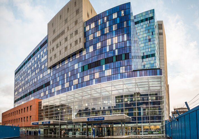
The Royal London Hospital used computational modeling to optimize the wavelength distribution throughout different departments based on what each area needed to accomplish. Emergency rooms got red and orange accents to maintain alertness. Surgery prep areas used calming blues and greens. Patient rooms balanced warm earth tones with cool accents.
This targeted approach to color in interior design for healthcare settings shows how evidence-based color design can improve both patient outcomes and staff performance.
Schools: Color as a Learning Tool
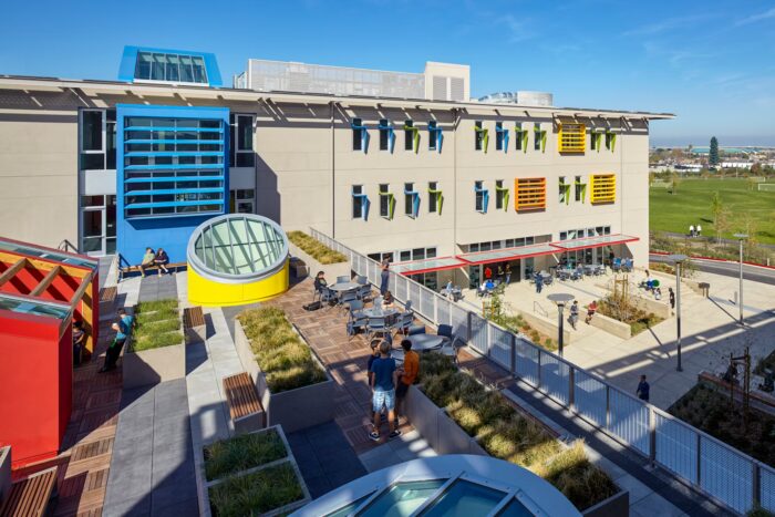
This drives me crazy because the research is so clear, yet most schools still look like prisons. The University of British Columbia proved that red environments help with detail-oriented tasks and accuracy, while blue environments boost creative thinking and problem-solving.
The Nueva School in California implemented this research. Their math and science classrooms use red-dominant palettes during focused work, while art and humanities spaces employ blue-green schemes to encourage creative thinking. Test scores improved 15% in the first year, with the biggest gains in creative problem-solving.
Creating Learning-Specific Color Environments
Different subjects need different color approaches. Math and science benefit from cooler blues and greens that enhance focus and analytical thinking. Art and creative writing spaces work better with warmer colors that stimulate imagination.
Libraries need a balance—quiet study areas use calming blues and greens, while collaborative spaces can handle more energizing yellows and oranges. The key is matching the color psychology to the specific learning activity.
Workplaces: The Productivity Goldmine
Corporate environments are probably the biggest missed opportunity in all of architecture. Companies spend millions on productivity consultants and wellness programs, then stick their employees in beige boxes that research shows reduce performance.
A study tracking 1,500 office workers across 12 buildings found that carefully calibrated color schemes led to 23% higher job satisfaction and 18% better cognitive performance. The key insight? Different work functions need different colors.
Color Strategies for Different Work Functions
Analytical tasks benefit from cooler, more focused palettes. Think accounting departments, legal offices, and research labs. These spaces work best with blues and greens that enhance concentration.
Collaborative activities work better with warmer, more energizing environments. Marketing teams, creative departments, and meeting rooms can handle oranges, yellows, and warm reds that encourage interaction and brainstorming.
Open Office Color Challenges
Open offices present unique challenges for color psychology in commercial architecture. You need to balance the needs of different work types in one space. The solution often involves zoning—using different colors to define areas for focused work versus collaboration.
Some companies use color-changing LED systems that adjust throughout the day. Morning hours might favor energizing colors to help people wake up, while afternoon light shifts to calmer tones that reduce stress.
Why Should Architects Care About Color Psychology?
The numbers don’t lie. Buildings designed without color psychology consideration average 12% lower employee satisfaction and 8% higher turnover. Healthcare facilities that ignore this research see longer patient stays and higher medication costs. Schools with poor color design show measurably worse student outcomes.
We’re talking billions in lost productivity across the built environment. But here’s the problem: most architecture schools don’t require coursework in environmental psychology or neuroscience. The profession prioritizes form over human factors, and it’s costing us.
The Business Case for Color Psychology
When hospitals reduce patient stays by 1.5 days on average through better color design, that’s massive cost savings. When schools see 15% improvement in test scores, that’s better educational outcomes. When offices report 23% higher job satisfaction, that’s reduced turnover costs.
The return on investment for thoughtful color design is clear. The upfront cost of color consultation and specialized lighting systems pays for itself through improved building performance.
Training the Next Generation of Architects
Architecture education needs to change. Students should learn about environmental color psychology alongside structural engineering and building codes. The human factors of design are just as important as the technical aspects.
Progressive architecture firms are already hiring color psychologists as consultants. The competitive advantage goes to architects who understand how their buildings affect the people inside them.
How Does Color Actually Affect Your Brain?
Recent fMRI studies show exactly what’s happening in your brain when you’re exposed to different colors. Red wavelengths light up your amygdala—the part that handles alertness and anxiety. Blue wavelengths activate your prefrontal cortex, improving focus and analytical thinking while reducing stress hormones.
The Neurological Pathways of Color Processing
Your brain processes color through multiple pathways simultaneously. The visual cortex handles basic color recognition, but the limbic system—your emotional center—also responds directly to wavelengths. This is why color affects mood so quickly and powerfully.
The timing matters too. Brief exposure to energizing colors can boost performance, but extended exposure often backfires. This is why we need dynamic color systems that adjust based on how spaces are used.
Individual Differences in Color Response
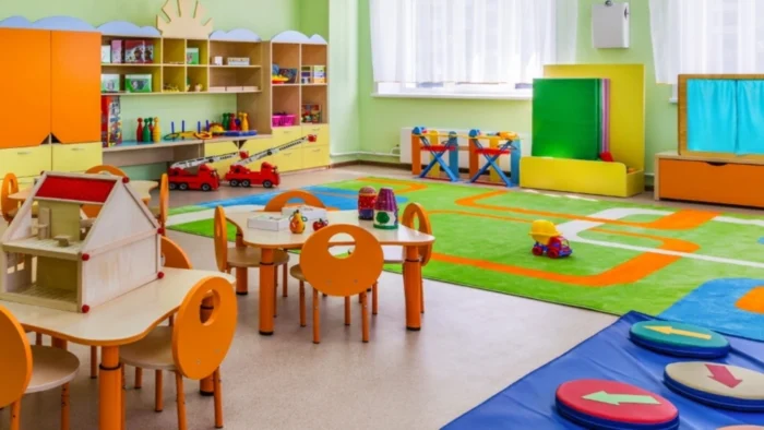
Not everyone responds to color the same way. Age, gender, and personal history all influence how you react to different colors. Children tend to prefer brighter, more saturated colors, while adults often favor muted tones.
Some people are naturally more sensitive to color than others. Architects need to design for the average response while accommodating individual differences through flexible lighting and color-changing systems.
Does Culture Change How We See Colors?
While certain physiological responses seem universal—red consistently increases arousal across cultures—the psychological associations vary dramatically. This creates challenges for architectural color trends in multicultural environments.
White means purity and cleanliness in Western cultures, which is why hospitals use it everywhere. But in many Asian cultures, white signifies death and mourning. Blue is calming in North America but can represent sadness in other contexts.
Designing for Multicultural Environments
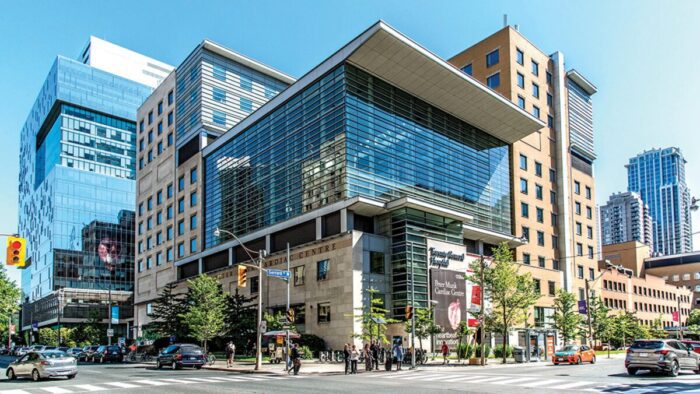
Toronto General Hospital handled this beautifully during their renovation. They consulted extensively with their multicultural patient population and ended up emphasizing universal principles—natural light and biophilic color palettes—while avoiding culturally specific associations that might create discomfort.
The solution often involves focusing on colors that have positive associations across cultures. Earth tones, natural greens, and sky blues tend to be universally calming and pleasant.
Global Color Psychology Research
Research from different countries shows both similarities and differences in color response. The physiological effects tend to be consistent—red increases heart rate regardless of culture—but the emotional associations vary widely.
Architects working internationally need to understand these cultural differences. What works in a New York office might not work in a Tokyo hospital or a Mumbai school.
How Do Colors Affect Your Sleep and Health?
The color temperature of your lighting and even the spectral characteristics of painted surfaces directly influence melatonin production, sleep quality, and metabolic function. This is where circadian color lighting architecture becomes crucial.
Traditional fluorescent lighting, with its blue-heavy spectrum, disrupts circadian rhythms when used inappropriately. This contributes to what researchers call “sick building syndrome”—widespread sleep disorders among office workers.
Circadian Lighting Systems
Progressive practices now integrate circadian lighting systems that adjust color temperature throughout the day, supporting natural biological rhythms. Morning light has more blue wavelengths to promote alertness, while evening light shifts to warmer tones that encourage melatonin production.
But it goes beyond artificial lighting. South-facing spaces with warm-colored walls can become uncomfortably stimulating during peak daylight hours, while north-facing rooms with cool palettes may feel depressingly dim.
The Health Impact of Poor Color Design
Spaces with inappropriate color schemes can contribute to fatigue, headaches, and mood disorders. The wrong colors at the wrong times can disrupt sleep patterns even hours after exposure.
Healthcare facilities are particularly sensitive to these effects. Patients recovering from surgery need environments that support healing, not colors that increase stress hormones.
What Colors Should You Use in Your Home?
Residential application is trickier because homes need to accommodate diverse activities and multiple people with different preferences. But the research offers some clear guidelines for building design color impact in residential settings.
Bedroom Color Strategies
The University of Rochester found that bedroom color affects sleep quality. Blue environments promote deeper, more restorative sleep compared to other colors. Avoid red and bright orange in bedrooms—they’re too stimulating for rest.
Warm earth tones work well for bedrooms too. Browns, soft greens, and muted yellows create a cocoon-like feeling that promotes relaxation. The key is avoiding colors that are too bright or too dark.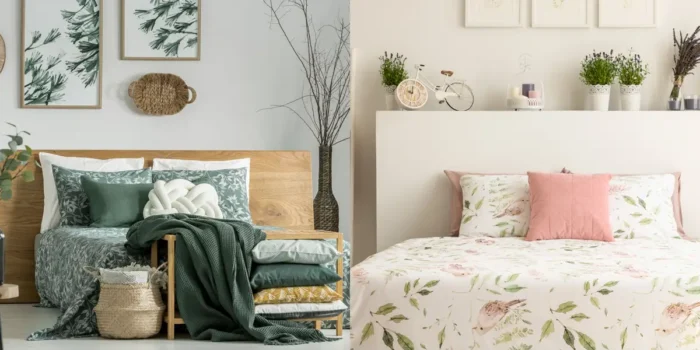
Kitchen and Dining Color Psychology
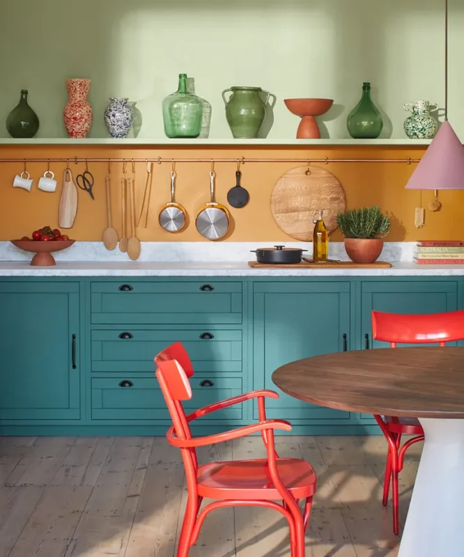
Kitchen color affects appetite and social interaction. Warm yellows and oranges encourage gathering and conversation, while cool blues can suppress appetite. This is why most restaurants use warm color schemes.
Red can work in kitchens but use it sparingly. Too much red can make people feel rushed and stressed while eating. A better approach is using red as an accent color with neutral backgrounds.
Living Space Color Balance
Living rooms need to balance energy and relaxation. You want people to feel comfortable and social, but not overstimulated. Warm neutrals with colorful accents often work best.
The challenge is balancing psychological optimization with personal preference and cultural considerations. Smart residential designers now use color consultation as a standard service, employing validated assessment tools to determine optimal strategies for individual families.
How Do Stores Use Color Psychology?
Retail and hospitality have embraced this research with enthusiasm, mainly because the results show up directly on the bottom line. But it’s more sophisticated than the old “red creates urgency” approach.
Modern Retail Color Strategies
Contemporary retail color strategy considers the entire customer journey. Nordstrom’s flagship store used computational color modeling to optimize lighting and surface colors for garment display, resulting in a 22% increase in sales per square foot.
Different retail environments need different approaches. Luxury stores often use calming colors to encourage browsing and consideration. Discount retailers might use more energizing colors to create urgency.
Hospitality Color Design
Luxury hotels now employ color psychologists as standard consultants, recognizing that optimal color design can justify premium pricing while reducing operational costs through improved energy efficiency.
Hotel lobbies need to feel welcoming but not overstimulating. Guest rooms should promote rest and relaxation. Restaurants within hotels might use different color schemes to encourage dining and social interaction.
The Future of Color Psychology in Architecture
Virtual and augmented reality systems now let architects test color strategies with real human responses before construction begins. Machine learning algorithms analyzing biometric data from building occupants will soon enable real-time color optimization—spaces that adjust based on collective physiological and emotional states.
The integration of color psychology into building information modeling systems will make evidence-based color design routine rather than exceptional. As green building certification programs begin incorporating human factors metrics, architects who master these principles will have competitive advantages.
Smart Building Color Systems
The next generation of buildings will feature adaptive color systems that respond to occupant needs in real-time. Sensors will monitor stress levels, attention, and mood, automatically adjusting colors to optimize human performance and wellbeing.
This technology exists today but needs to become more affordable and user-friendly. The buildings of the future will be responsive environments that actively support human health and productivity.
The evidence is overwhelming: architectural color profoundly influences human behavior, health, and performance through well-documented mechanisms. The challenge is translating this knowledge into systematic design practice that prioritizes human wellbeing alongside aesthetic considerations.
We’re designing buildings that will shape human experience for decades. We owe it to their occupants to make sure those experiences are optimized through thoughtful application of color psychology research. The tools and knowledge exist—we just need to start using them.
Luca Moretti is a content strategist with a foundation in urban design and architecture. Based in Milan, he focuses on writing that bridges aesthetics, material culture, and everyday spatial experiences.


