

Good office design matches space to the way people actually work. Most office work mixes focused individual tasks, conversations, meetings and short social contact, so a good office gives people a choice of settings for each, rather than one uniform layout. This guide is for architecture students and designers. It sets out the principles that matter most in office design, explains each one, analyses four built precedents from the history of the office, lists key standards with their jurisdictions, and ends with a design checklist.
Quick answer: the principles that matter most
- Start from work patterns, not furniture. Find out how much time people spend on focused work, collaboration, meetings, calls and travel before choosing a layout.
- Provide a range of settings. Combine open workspace with quiet rooms, meeting rooms of different sizes, phone rooms and informal areas.
- Zone by noise and activity. Separate loud, social activities from quiet, focused ones, and use buffers such as storage and circulation between them.
- Bring daylight and views to as many people as possible. Plan depth and desk positions around the windows.
- Design for change. Teams grow, shrink and reorganise. Use regular grids, raised floors or accessible services, and furniture that can be moved.
- Meet the local rules. Space, lighting, ventilation, accessibility and fire escape are set by law and standards that vary by country.
Office design principles explained
Work patterns and settings
Office design begins with a brief. Observing how space is used, interviewing teams and studying booking data shows how many people are in the office at once and what they do there. A team that spends most of the day on calls needs different space from one that works in long, quiet stretches or one that collaborates around physical models. The result is a schedule of settings, not just a desk count.
Many organisations now use activity-based working: people do not have assigned desks but choose a setting for each task. It can save space, but only if there are enough quiet and meeting settings, good storage for personal items, and clear rules. Where people need specialist equipment or long periods of concentration, assigned desks may still work better.
| Work pattern | Typical settings | Design notes |
|---|---|---|
| Focused individual work | Desks in quiet zones; small focus rooms; library-style areas | Away from circulation and social areas; good acoustic absorption |
| Calls and video meetings | Phone rooms; small enclosed booths | Enough of them; ventilated; near desks |
| Small-group collaboration | Team tables; open project areas; writable walls | Next to the team's desks; some sound containment |
| Formal meetings | Meeting rooms in a range of sizes | Often in deeper parts of the plan; booking data guides numbers |
| Social and informal contact | Kitchen, café or lounge areas | Central and visible; separated from quiet zones |
| Specialist work | Workshops, model rooms, labs | Services, storage and noise planned case by case |
Source: Arch2O synthesis of workplace planning practice (as of 29 October 2026).
Zoning and acoustics
Noise is the most common complaint in open-plan offices. Designers manage it in three ways: by planning, placing noisy and quiet zones apart; by absorption, using ceilings, wall panels, carpets and screens; and by masking or separation, adding background sound or enclosed rooms for calls. The ISO 3382-3 standard describes how room acoustics in open-plan offices can be measured, which is useful for checking a design once built.
Daylight, light and comfort
Plan depth decides how many people sit near a window. Deep floor plates are efficient but leave the centre far from daylight; that zone is often better used for meeting rooms, stairs and support space. For electric lighting, the European standard EN 12464-1 (2021 edition) gives a maintained illuminance of 500 lux for writing, typing, reading and data processing (EN 12464-1 values summary). Glare control at screens, good ventilation and thermal comfort matter as much as light levels.
Flexibility
The office of today will not fit the organisation of ten years from now. A regular structural and planning grid, services that can be reached and moved, and partitions and furniture that can be rearranged make change cheaper. Over-specifying fixed rooms in the middle of the floor makes later change difficult.
Precedent analysis
Four buildings show how ideas about office design have changed, and why the same principles keep coming back.
Larkin Administration Building, Buffalo (1904-1906)
Frank Lloyd Wright’s office for the Larkin mail-order company placed clerks at rows of desks around a tall central light court, with offices and services in corner towers. It was an early sealed, mechanically ventilated office, and it put daylight and a shared central space at the heart of the plan. The building was demolished in 1950; only a fragment of a brick pier survives on the site (Larkin Administration Building).
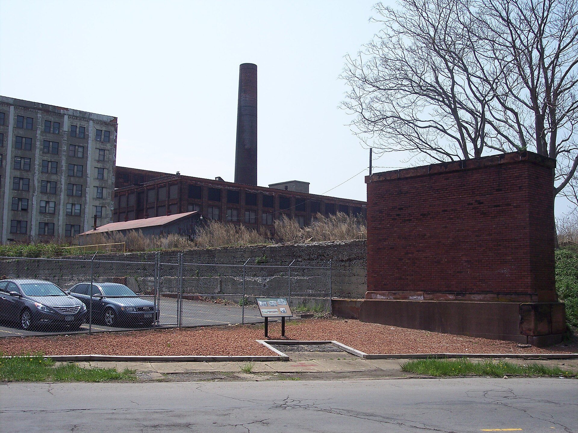
The only surviving fragment of the Larkin Administration Building in Buffalo, demolished in 1950. Photo: Fortunate4now, CC0, via Wikimedia Commons. Image: Fortunate4now (Creative Commons Zero)
Lesson: a strong shared space can organise a large workforce, but the layout reflects a supervised, factory-like model of clerical work.
Johnson Wax Administration Building, Racine (1936-1939)
Wright returned to the open office in the Great Workroom of S. C. Johnson’s headquarters in Racine, Wisconsin. It is a single open room about 130 by 210 feet (about 40 by 64 metres) with room for around 200 desks, roofed by sixty slender “dendriform” columns on a 20-foot grid, and lit by glass tubing in the walls and skylights. It is a National Historic Landmark (Johnson Wax Headquarters).

The Johnson Wax Administration Building turns solid brick walls to the street and lights its Great Workroom from above and through glass tubing. Photo: Michael Barera, CC BY-SA 4.0, via Wikimedia Commons. Michael Barera, source, CC BY-SA 4.0
Lesson: an open office can feel generous and calm when daylight, structure and ceiling height are designed together, though it offered little acoustic privacy.
The office landscape (Bürolandschaft), from 1958
In Germany, the Quickborner consulting team, founded in 1958 by Wolfgang and Eberhard Schnelle, proposed the office landscape: open floors where desk groups were arranged by communication and work flow, not by rank, with plants and screens instead of walls, and with informal break areas. The publisher Bertelsmann was one of the first clients (Office landscape). Later, panel-based systems furniture in the United States offered more privacy and density, and by the 1970s the open landscape had largely given way to rows of cubicles.
Lesson: layouts based on how people communicate can work well, but if density rises and quiet spaces are removed, the benefits disappear.
Centraal Beheer, Apeldoorn (1968-1972)
Herman Hertzberger’s office for the Centraal Beheer insurance company was built from many small, repeated square units linked by bridges and voids. Each unit was a workplace that teams could arrange and personalise, and the whole building read as a small town of workspaces rather than one large floor. It is a key building of Dutch structuralism.
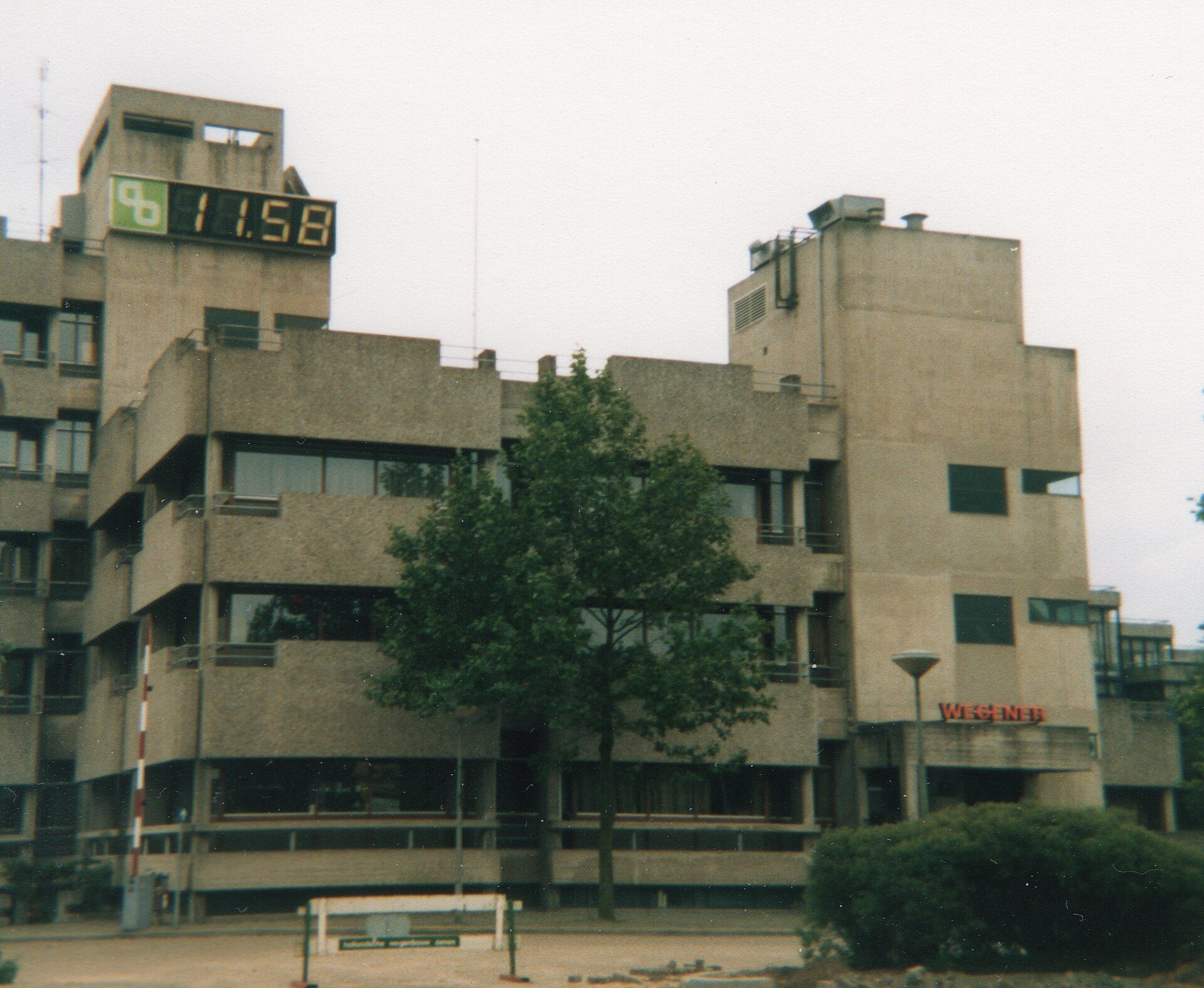
Centraal Beheer, Apeldoorn (Herman Hertzberger, 1968-1972), photographed in 1985. Photo: JopkeB, CC BY-SA 4.0, via Wikimedia Commons. JopkeB, source, CC BY-SA 4.0
Lesson: breaking a large office into human-scale units gives teams a place of their own while keeping the whole organisation visible and connected.
Standards and guidance
Office design is shaped by regulations and standards that differ between countries. Always check the current edition for the project’s location. Examples:
- United Kingdom, space per person: the Approved Code of Practice to the Workplace (Health, Safety and Welfare) Regulations 1992, HSE L24 (second edition, 2013), gives a minimum room volume per person for workrooms (HSE L24).
- United Kingdom, screen work: the Health and Safety (Display Screen Equipment) Regulations 1992 cover workstation assessment and equipment.
- Europe, lighting: EN 12464-1:2021, lighting of indoor workplaces.
- International, acoustics: ISO 3382-3, measurement of room acoustics in open-plan offices.
- Accessibility and fire: national building codes and accessibility laws, such as the Approved Documents in England or the ADA Standards in the United States, set requirements for routes, doors, toilets and escape.
Industry bodies such as the British Council for Offices also publish specification guidance on matters such as occupational density and floor-to-ceiling heights; these are recommendations, not legal requirements.
Checklist for students and designers
- Have you studied how the client’s teams actually work, and turned that into a schedule of settings?
- Is there a balance of open space, quiet rooms, meeting rooms and informal areas?
- Are noisy and quiet zones separated, with absorption on ceilings and walls?
- Can most people see daylight and a view from where they work?
- Does the plan meet local rules on space, lighting, ventilation, accessibility and escape?
- Can the layout change without major building work?
- Have you shown the design in plan and section, with furniture, so others can test it?
In short, office design works when it starts from people’s work patterns and gives them a choice of well-lit, acoustically sensible settings that can change over time. The precedents show that every era has rediscovered this, from Wright’s light courts to Hertzberger’s workplace units.

Sophie Tremblay is a Montreal-based architectural editor and designer with a focus on sustainable urban development. A McGill University architecture graduate, she began her career in adaptive reuse, blending modern design with historical structures. As a Project Editor at Arch2O, she curates stories that connect traditional practice with forward-thinking design. Her writing highlights architecture's role in community engagement and social impact. Sophie has contributed to Canadian Architect and continues to collaborate with local studios on community-driven projects throughout Quebec, maintaining a hands-on approach that informs both her design sensibility and editorial perspective.