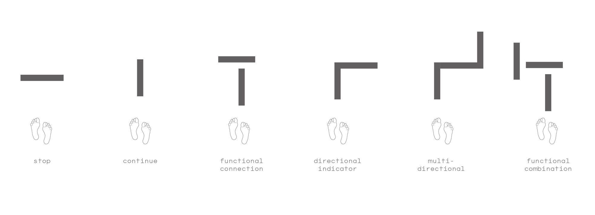
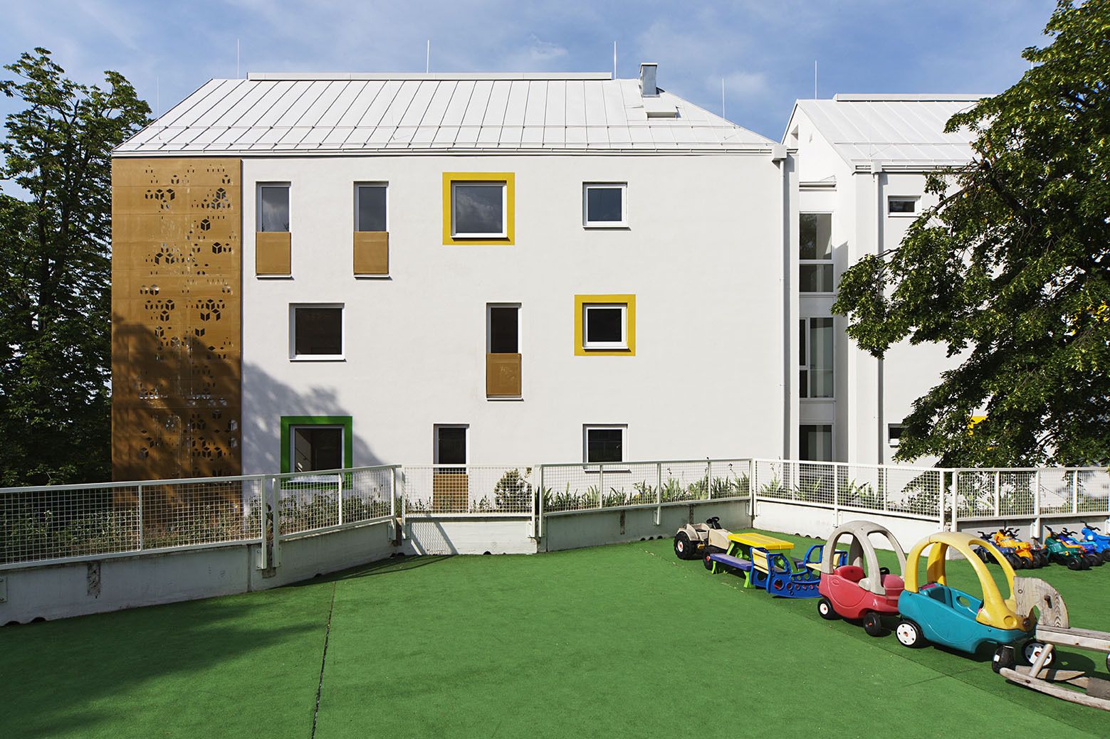
Through the Eyes of The Blind- Architecture is often linked with visual aesthetics but should include all senses, creating experiences for people from diverse backgrounds. While architecture is theoretically a multisensory field involving various sensory elements, including texture, color, sound, and aroma, practical emphasis is frequently on visual perception. This limits architecture exploration mainly to sight for identifying features and navigating built environments.
© Jannes Linders
When you encounter the phrase “Architecture for The Blind,” it likely conjures images of spaces enriched with elements that heighten one’s sense of touch and sound. And you’re right. In architecture tailored for the Blind, the focus is on acoustics and materials. Creating accessible environments and maximizing natural lighting is fundamental, considering that even individuals with vision impairment can perceive colors and light to some extent. In this article, we talk about How Architecture Supports the Blind‘s Daily Lives.
1) Integrate Tactile Surfaces into Architecture for The Blind

© Flickr user Daveynin
In architecture, emphasizing accessibility is crucial to cater to individuals of all abilities. However, the prevailing view often narrows it to physical disabilities, such as those impacting wheelchair users, which architects tend to associate with features like ramps and elevators. It’s vital to acknowledge that disability comes in diverse forms, and genuine architectural accessibility goes beyond accommodating wheelchair users. For the Blind, incorporating tactile elements in design greatly aids navigation in new environments.
Read More: Architecture & Design for the disabled people
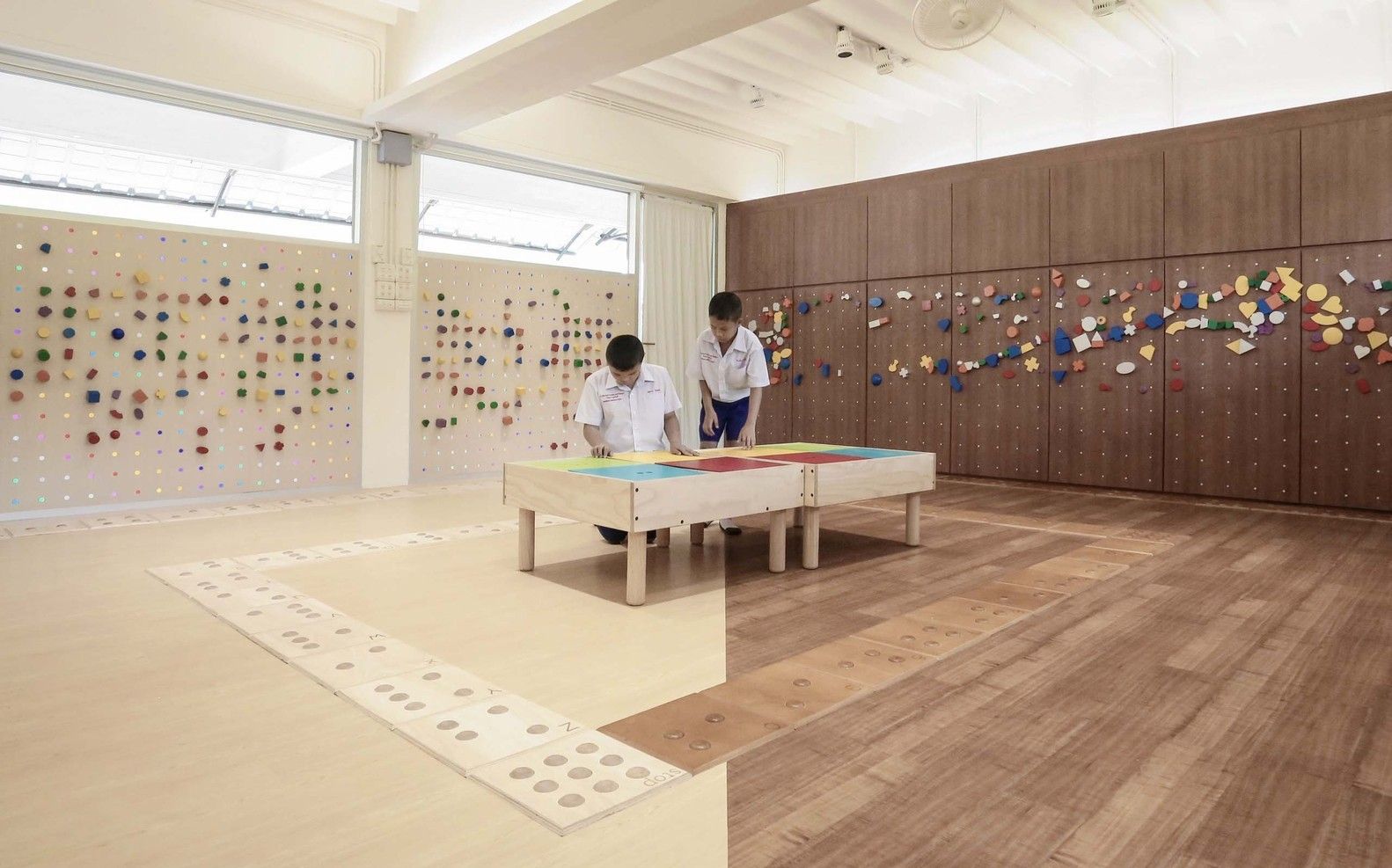
1- Pattern Types, Sizes, and Colors
In 1965, Japanese engineer Seiichi Miyake created tactile bricks to assist a visually impaired friend. Just two years later, Okayama City in Japan pioneered tactile paving. By 1985, it was a nationwide requirement for the Blind, adopted by Japan National Railway. The concept eventually extended worldwide to countries like Australia, the UK, the US, and beyond.

© Motortion Films / Shutterstock
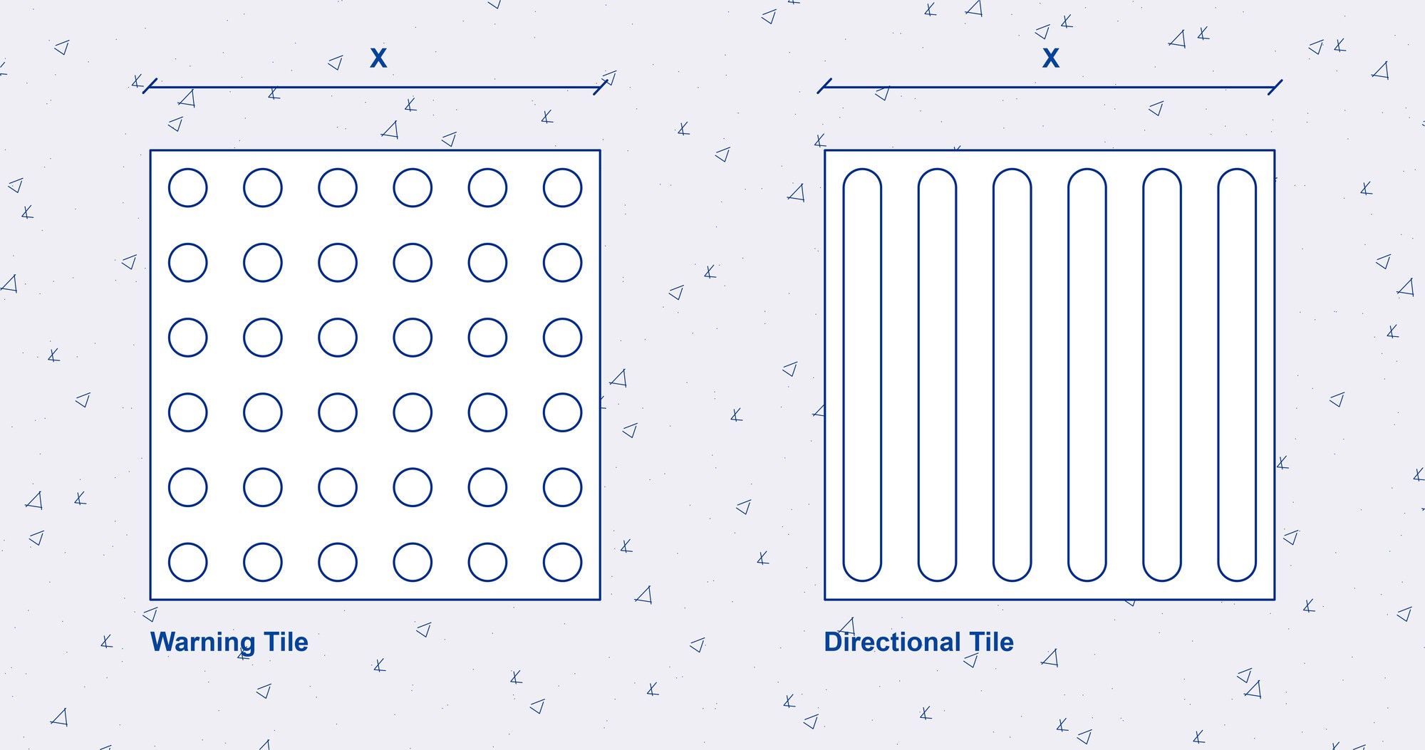
Tactile paving comes in various types, with colors and markings denoting different meanings. To enhance visibility for partially-sighted pedestrians, they are often brightly colored, meeting requirements like the Americans with Disabilities Act’s 70% color contrast rule. Many countries opt for a vibrant yellow hue.
© Enrique Tovar
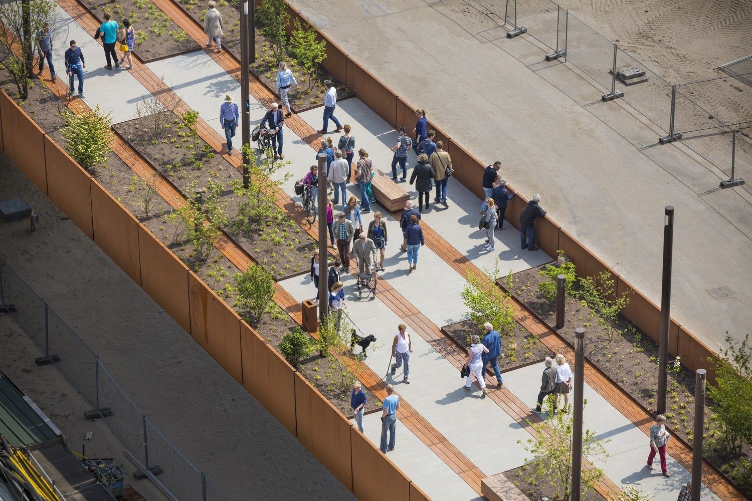
The tactile flooring system of the Blind consists of two types: warning and guidance. Warning flooring consists of a pattern of detectable dots or domes designed for The Blind or those experiencing vision impairment who use a white cane. These should be placed where critical safety information, imminent hazards, and decision-making points are communicated, and The warning and guidance pavement can be perceived through touch, either with the feet or the cane, enabling individuals to maintain a straight path and navigate safely.
© MINVU
Tiles are typically crafted from ceramic, concrete, rubber, or plastic Materials. Dome and bar elements are occasionally separately produced in stainless steel sections, presenting an alternative to the conventional format. It’s important to consider that the level of visual contrast may vary depending on the finish of the surrounding floor. Tactile paving follows precise guidelines. In the UK, ‘blister lines,’ parallel lines of truncated domes, indicate the transition from a sidewalk to a road. Meanwhile, ‘offset blister lines,’ featuring staggered domes, serve as warnings for railway platform edges.
2-Approaching Elements and Level Changes
© Enrique Tovar
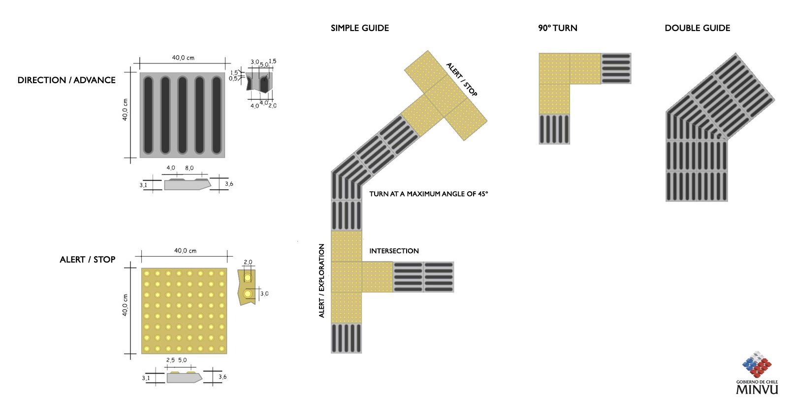
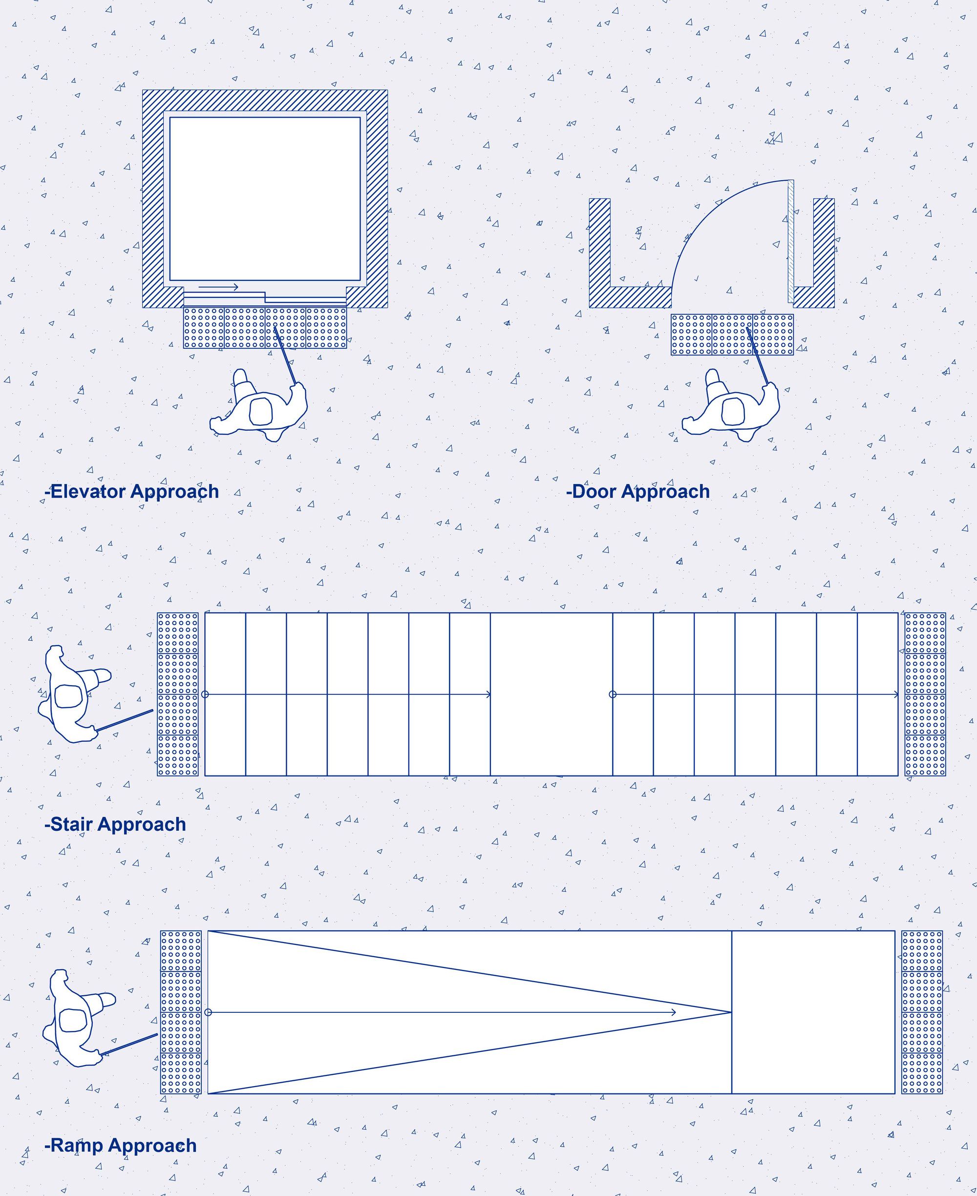
To optimize accessibility for individuals with visual impairments when approaching elements like interactive machines, counters, information modules, or tactile-visual signage, precise placement of warning pavement modules is vital.These modules should be positioned close to the objects to minimize spatial confusion and create a clear, direct path. This arrangement helps individuals determine the location and boundary of the object or area and provides a reliable tactile and visual reference during frontal approaches, aiding in obstacle avoidance.
To ensure a seamless and safe transition between the tactile flooring and the object, it’s crucial to accurately align and secure the warning pavement modules. This alignment ensures that the modules terminate precisely at the front edge of the relevant object or cover, enhancing detection and recognition.
© Ekkachan Eiamananwattana
Tactile surfaces are a fundamental component of architecture and urban design, serving as crucial aids for the visually impaired to navigate potential hazards in the built environment. Disabilities reside not within individuals but rather in the physical barriers of space. To maximize their effectiveness, architects should proactively reference the accessibility guidelines specific to their region or country. By adhering to these fundamental principles, tactile surfaces can serve their functional purpose and add value to architectural design, fostering inclusive projects that enhance the lives of all occupants through meticulous attention to detail.
2) Great Examples of Architecture for The Blind
© Jasper Sanidad
Designing accessible spaces for The Blind is essential. Architects embracing universal design principles acknowledge that the needs of The Blind are the same as anyone else’s. Inclusive design guarantees all users can easily navigate spaces and understand their functions. This article highlights projects designed with visually impaired users in mind, promoting inclusivity in our urban environments.
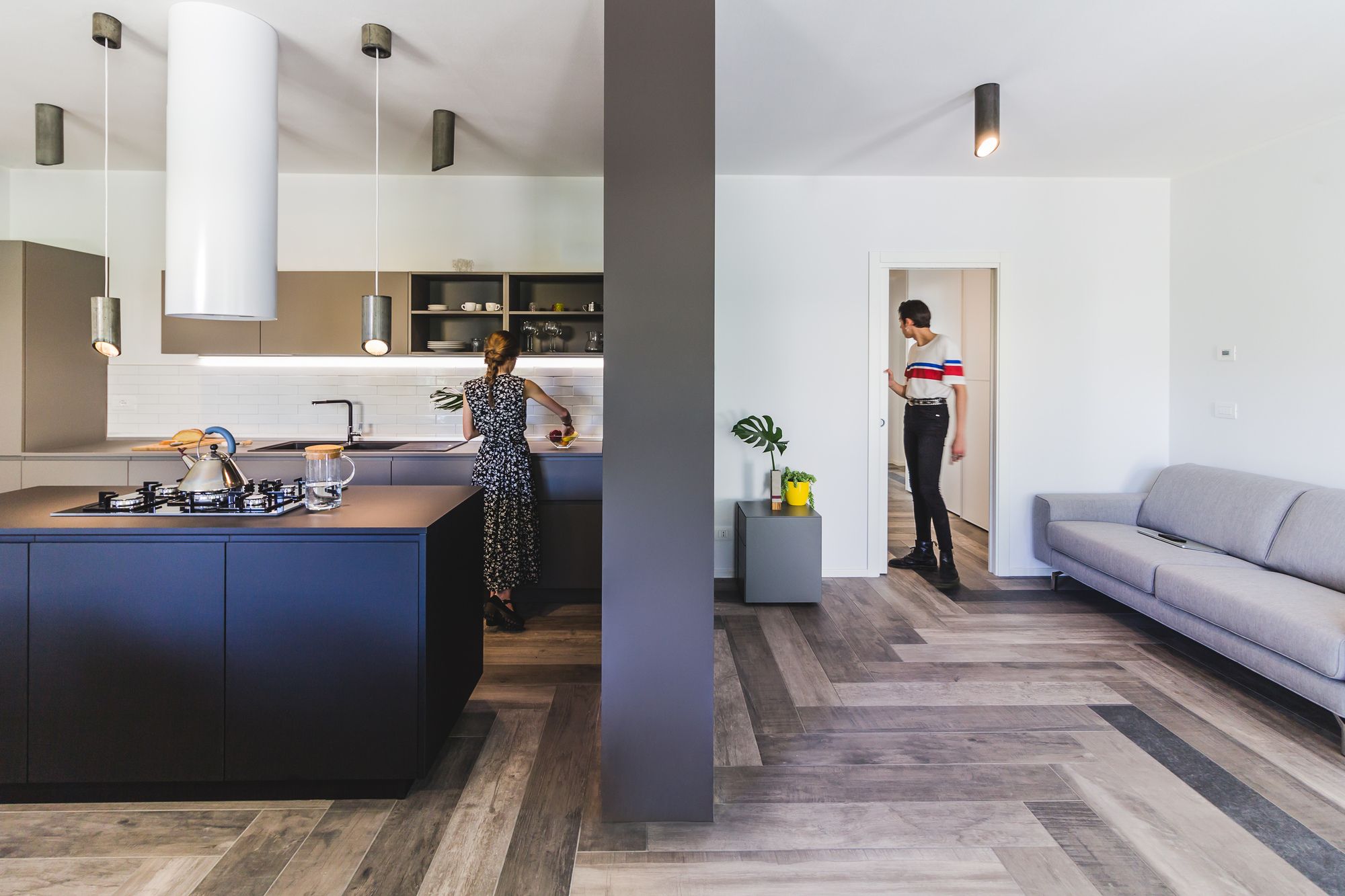
1-The Casa Mac House | So & So Studio
© Stefano Calgaro
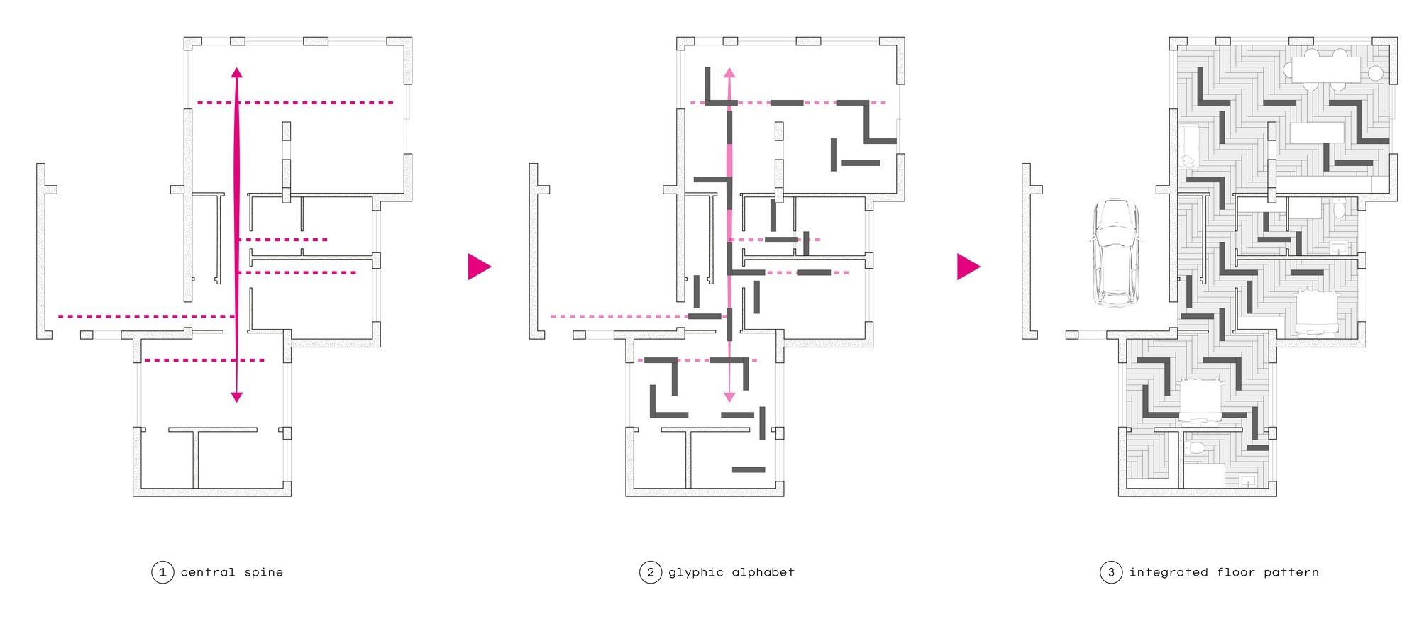
Designing a home for a blind homeowner is a significant undertaking that necessitates careful consideration. So & So Studio’s objective was to develop a user-friendly design language based on simple glyphs, using materials like stone and porcelain to create an embedded map system.
©So & So Studio
The project revolved around a central corridor spine that eliminated potential confusion, connecting entrances from the garage, front door, and back patio to critical areas like the bedroom, kitchen, guest room, bathroom, and living room. The studio mapped her daily activities as nodes within the house layout to ensure a seamless transition between the client’s old and new homes.
©So & So Studio
Eliminating door thresholds and unnecessary material changes created spatial continuity, making it easier for the client to navigate her new environment. The studio used tactile stone tiles in the floor pattern to accentuate program nodes and activate a way-finding system. This resulted in a tactile alphabet within the house’s floor for the homeowner’s convenience.
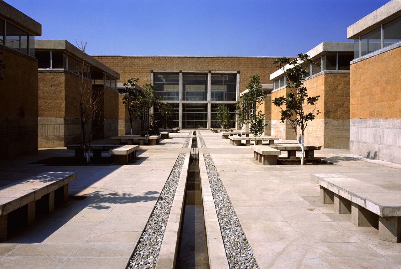
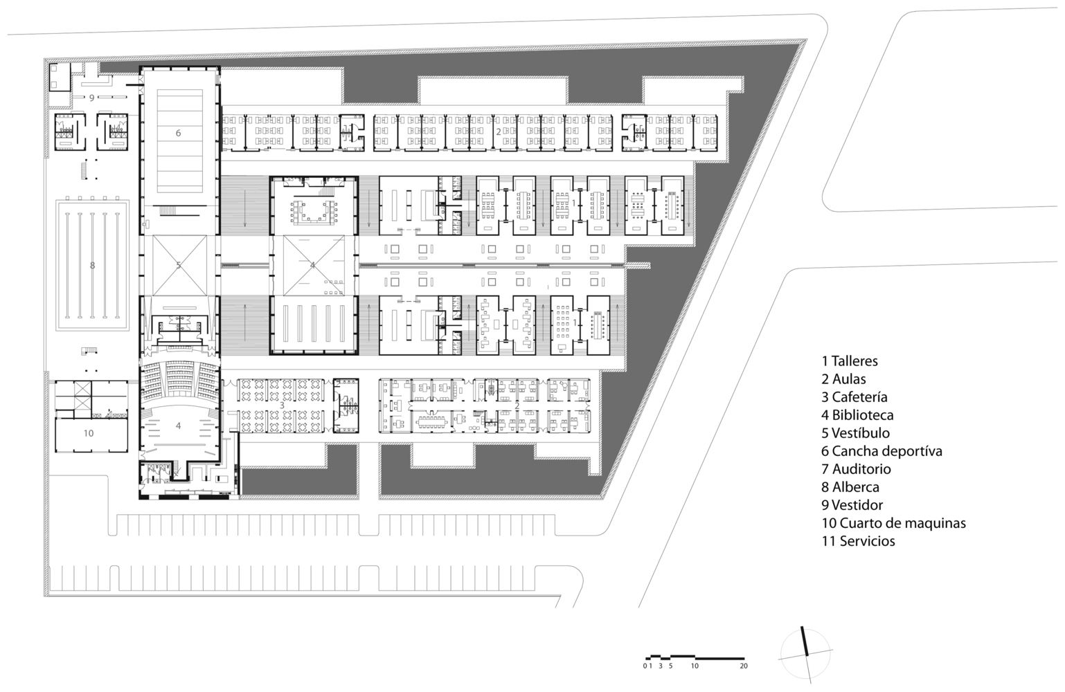
2- Center for The Blind and Visually Impaired | Taller de Arquitectura-Mauricio Rocha
© Luis Gordoa
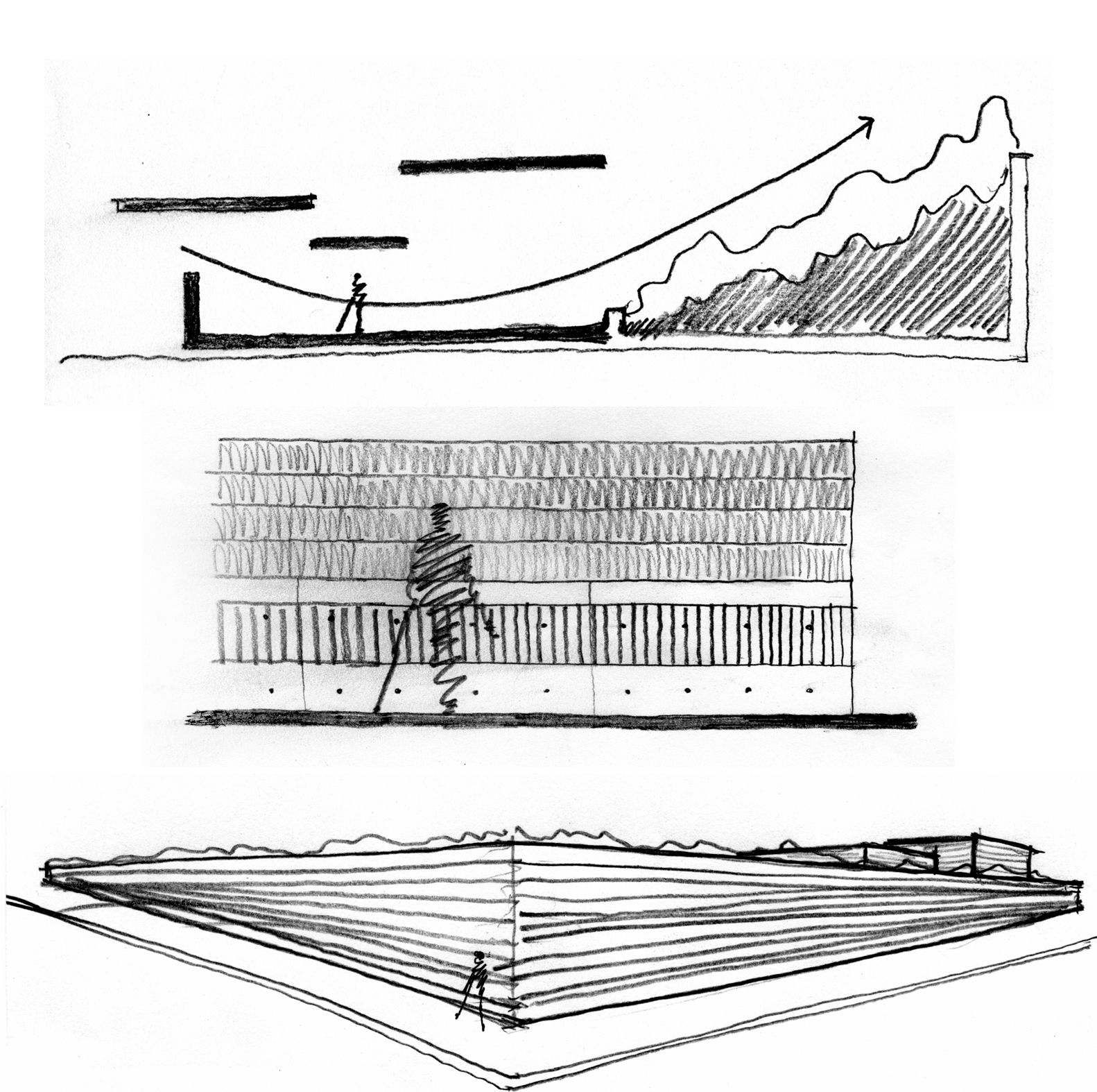
The Center for the Blind and Visually Impaired, designed by Taller de Arquitectura and Mauricio Rocha, is conceived to enhance users’ spatial perception by engaging all five senses as sources of experience and information. The project’s layout resembles a sequence of tactile filters extending in parallel strips from the entrance to the rear of the building.
©Taller de Arquitectura-Mauricio Rocha
The layout comprises three distinct filters. The first encompasses the building housing administrative offices, a cafeteria, and utility areas. The second filter includes two parallel lines of symmetrically organized buildings surrounding a central plaza, accommodating a store, the “tifloteca-sonoteca” (a sound and touch gallery), and five arts and crafts workshops. The third filter features classrooms with views of gardens and private courtyards. Perpendicular to the entrance, a series of double-height volumes houses the library, gymnasium-auditorium, and swimming pool.
©Taller de Arquitectura-Mauricio Rocha
Tactile cues are provided through horizontal and vertical lines in the concrete walls, facilitating the identification of each building at hand height. Additionally, six varieties of fragrant plants and flowers in the perimeter gardens serve as sensory markers to assist users in navigating the complex.
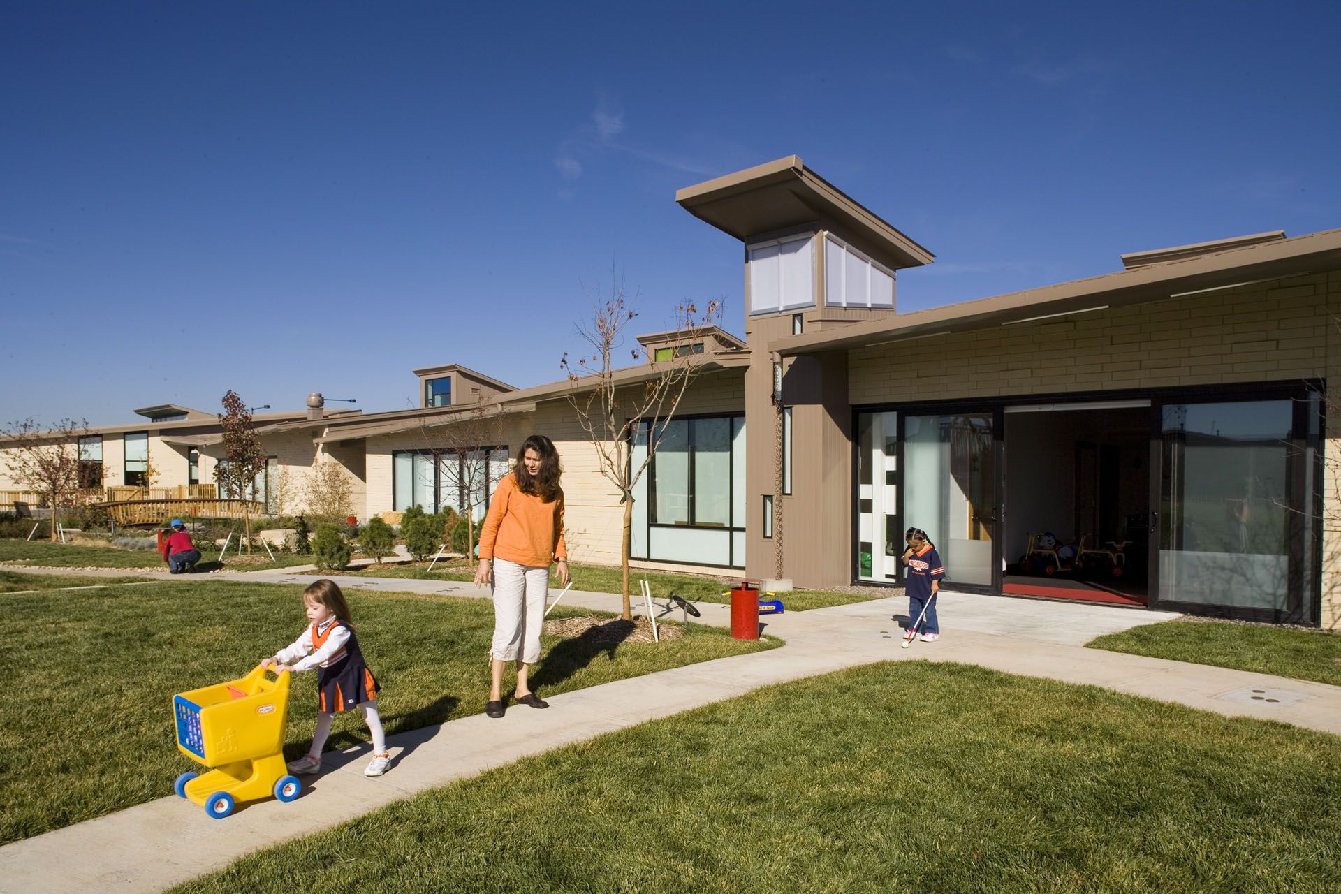
3- Anchor Center for Blind Children | Davis Partnership Architects
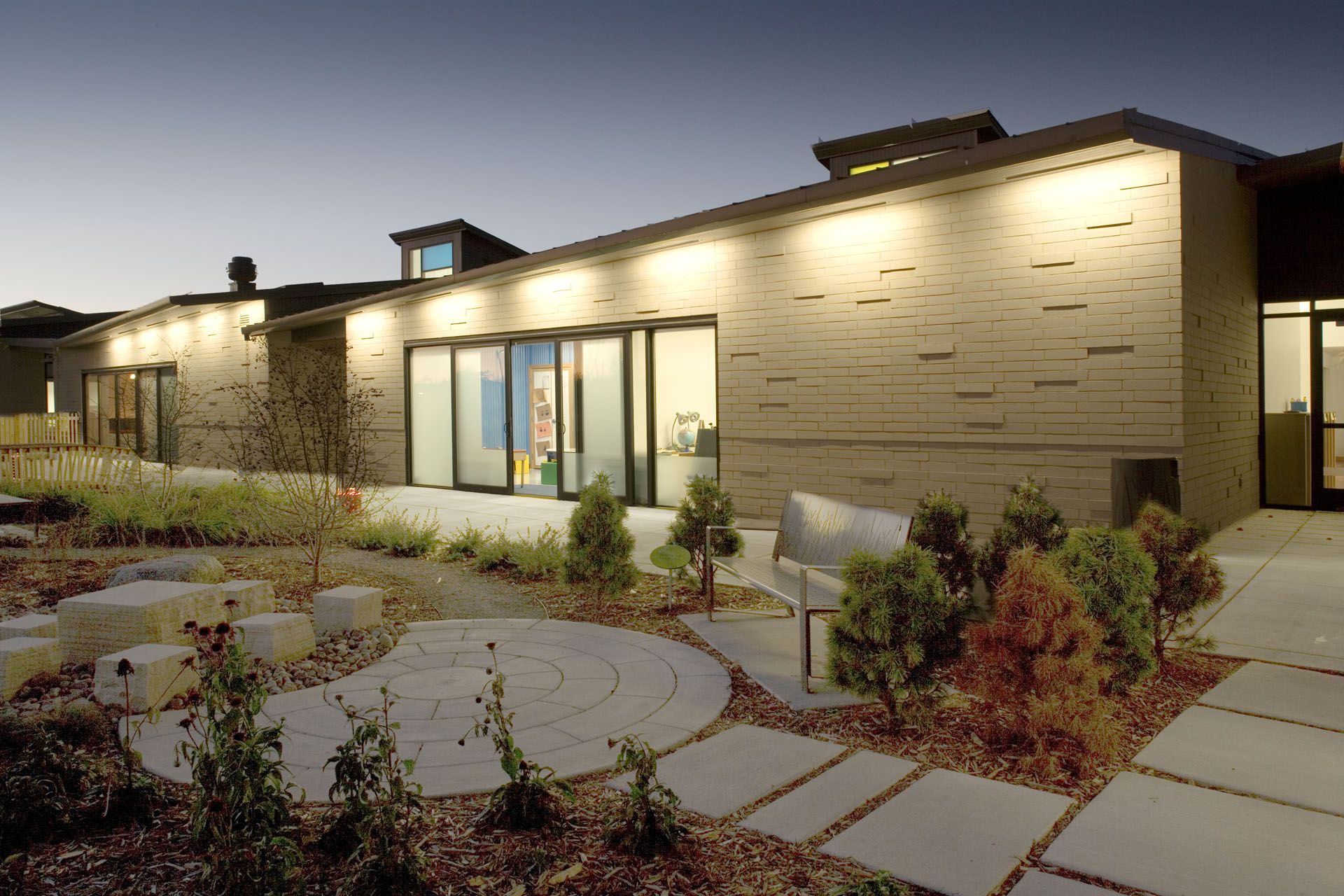
©Ron Pollard
The Anchor Center for the blind children, designed by Davis Partnership, is a 15,000-square-foot teaching facility in Denver, focusing on creating a “touch-friendly” environment for visually impaired toddlers and preschoolers. The one-story center features classroom pods with masonry inspired by Braille, creating a unique interplay of light and shadow. The classrooms are arranged along a central spine, allowing northern light to penetrate through celestial windows beneath angled roofs.
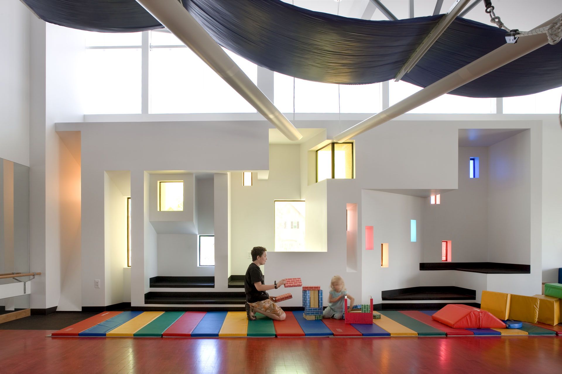
©Nick Lehoux
The interior design follows a color theory, with rose, blue, and yellow finishes incorporated through door lights, skylights, and wall sconces. The layout is designed to be relatively clean and free of obstacles, providing a safe and exploratory space for children, including features that help guide them within the architectural layout.
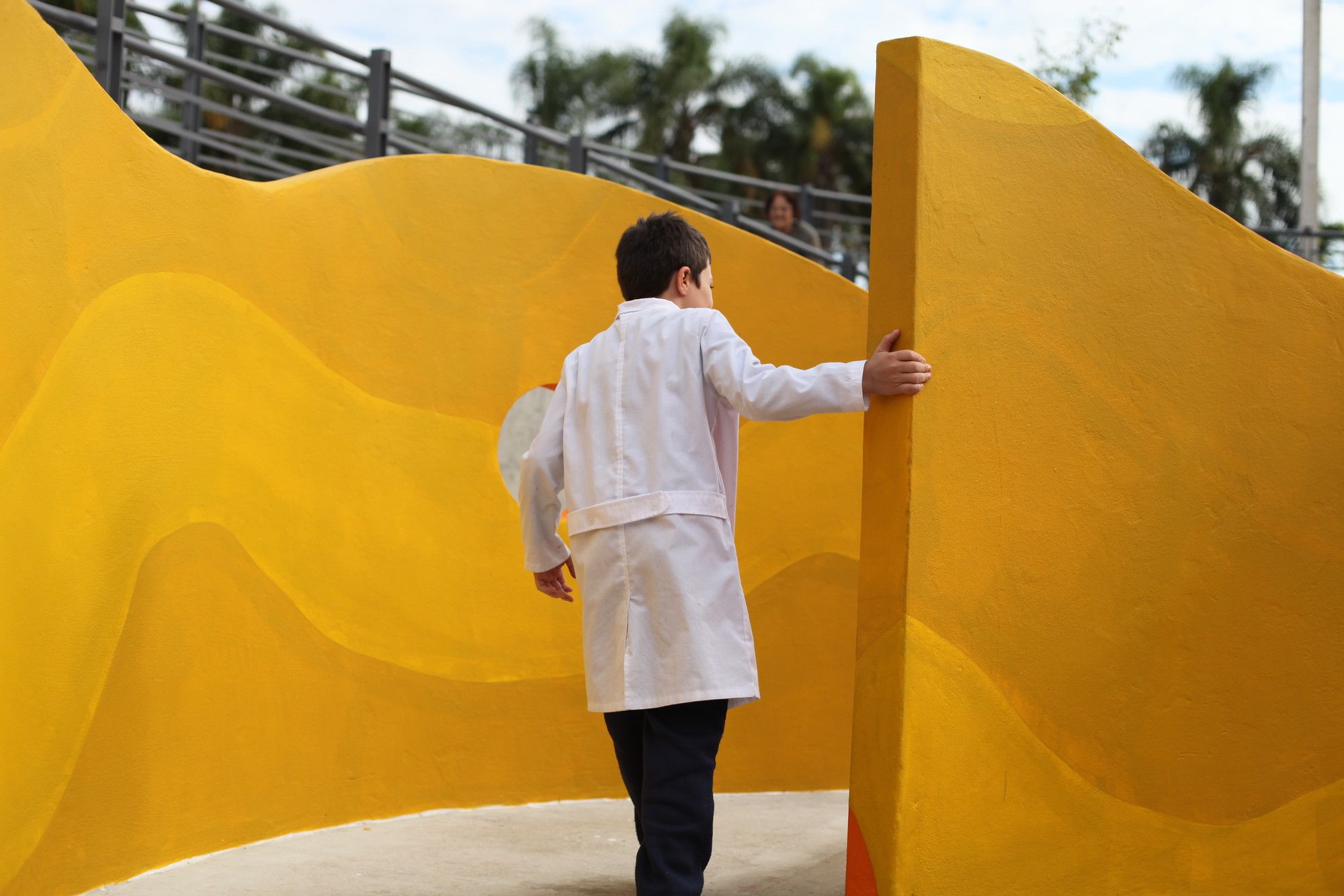
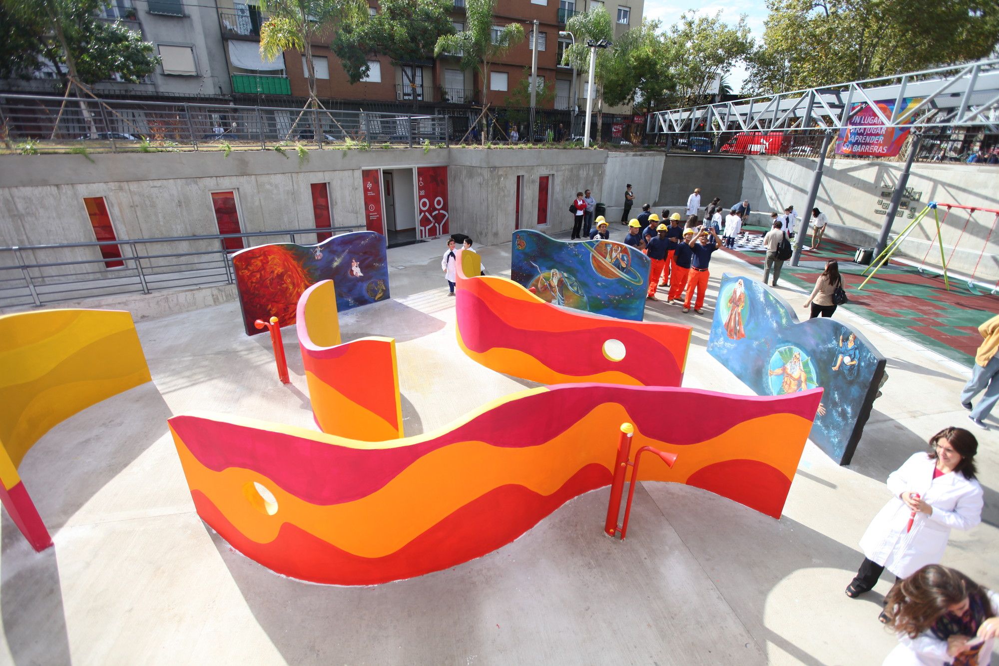
4-Friendship Park | Marcelo Roux + Gastón Cuña
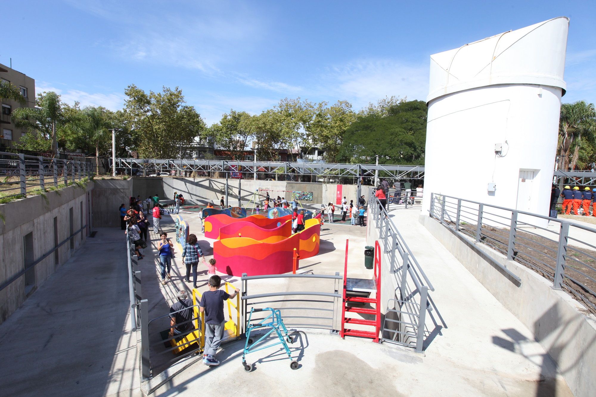
©Courtesy of Marcelo Roux
An inclusive park, designed to cater to individuals regardless of their cognitive abilities, offers features that heighten tactile, auditory, and olfactory experiences. This 3,500 square-meter park is divided into six sectors: children’s games, a theater, and recreational areas. Notably, the park is entirely barrier-free and incorporates unique design concepts. The park features horizontal and vertical textured surfaces to enhance tactile experiences for individuals with visual impairments.
©Courtesy of Marcelo Roux
Auditory experiences are enriched by a waterfall producing distinctive sounds, creating an auditory map contributing to a playful microclimate. Musical games, such as drums and a xylophone, are also included. The park’s sensory appeal is further enhanced by aromatic flowers and plants, allowing visitors to engage with the space through multiple sensory dimensions.
Careful material selection is evident throughout the park, with reinforced concrete, metal, and rubber in specific areas contributing to the park’s overall design and functionality.
5-Batthyány László Institute for the Blind | A4 Studio
© A4 Studio
Designed for the Blind children and mental disorders, A4 Studio created an inclusive structure that connects to an existing building via a bridge. The primary objective was to craft a user-friendly building that maximizes exposure to natural light through innovative methods. Careful consideration was given to the orientation of blinds, and perforated metal sheets were strategically employed to mitigate the impact of excessive glare. These sheets are positioned in front of expansive glass surfaces and feature Braille inscriptions with words like “trust,” “home,” “shelter,” and “love.” The rehabilitation center received funding from Azerbaijan and Hungary and incorporated various perforation designs created by artistic companies to enhance the facility’s aesthetic and functional aspects.
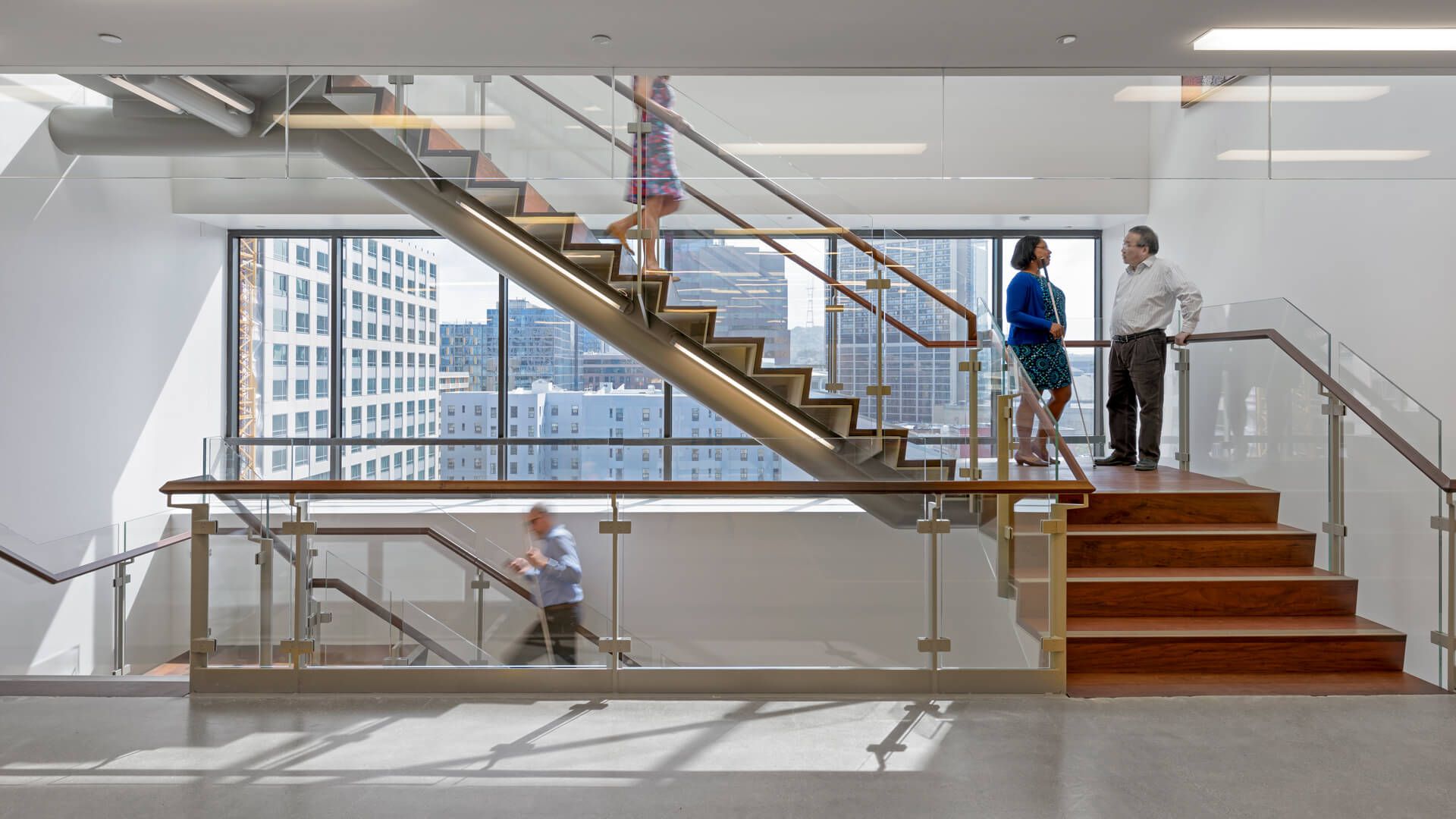
6- The LightHouse for The Blind and Visually Impaired
©Jasper Sanidad
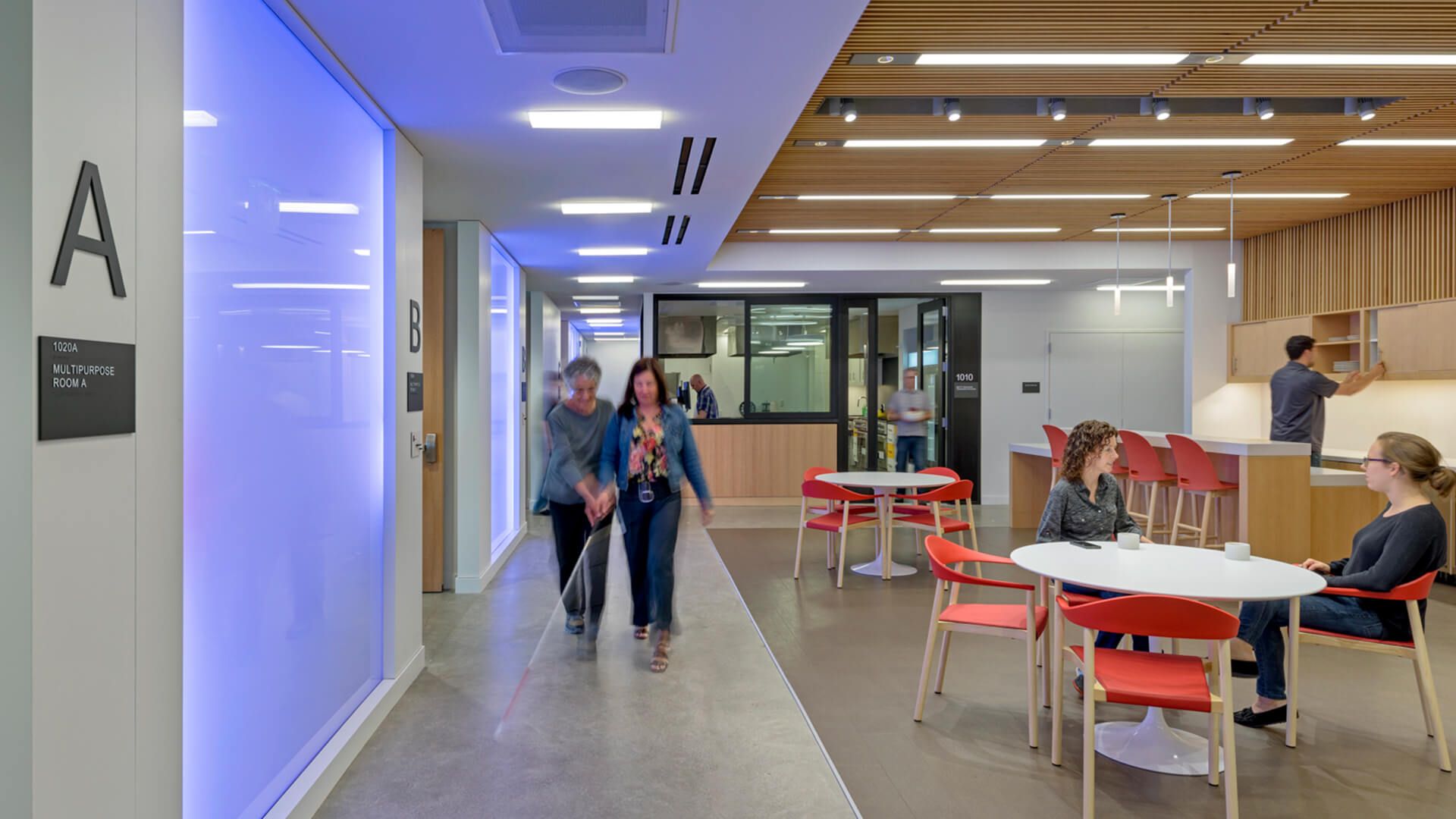
A well-established social services organization with 114 years of experience, The LightHouse for the Blind and Visually Impaired collaborated with Mark Cavagnero Associates for their new project in San Francisco. The facility encompasses various spaces, including a Braille training room, retail store, multipurpose room, and offices. Given the center’s focus on serving blind individuals, the design revolved around three key elements: materials, acoustics, and lighting.
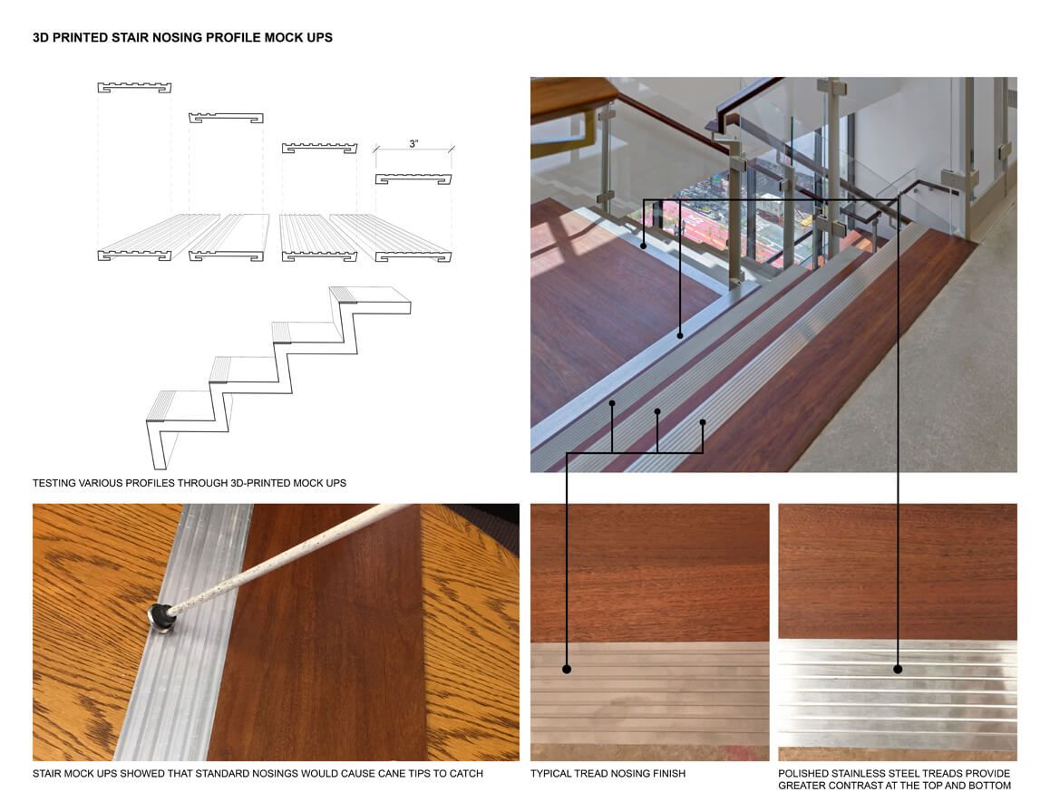
©Jasper Sanidad
Interestingly, approximately 90% of visually impaired individuals have some residual vision that can be sensitive to excessive glare and illumination. With this in mind, the design prioritizes soft, low-intensity lighting and neutral colors rather than bright, harsh alternatives. Public areas feature polished concrete flooring, and metal transition strips on the floor help define and differentiate the various spaces effectively. Given the paramount importance of sound for the visually impaired, acoustical treatments were implemented to minimize disruptive mechanical sounds and enhance positive auditory cues, such as footsteps.
Read More: Architecture for the Blind: LightHouse Renovations Take a Leap Down the Path
Emily Reyes is a Brooklyn-based architecture writer and Article Curator at Arch2O, known for her sharp eye for experimental design and critical theory. A graduate of the Southern California Institute of Architecture (SCI-Arc), Emily’s early work explored speculative urbanism and the boundaries between digital form and physical space. After a few years in Los Angeles working with boutique studios on concept-driven installations, she pivoted toward editorial work, drawn by the need to contextualize and critique the fast-evolving architectural discourse. At Arch2O, she curates articles that dissect emerging technologies, post-anthropocentric design, and contemporary spatial politics. Emily also lectures occasionally and contributes essays to independent design journals across North America.