

The most useful designer tips for a cramped home are about space before style: leave clear routes through every room, choose furniture sized to the room rather than the showroom, layer the lighting, and plan storage from the start. This guide is for homeowners and interior-design students working with small rooms. It lists twelve common interior design mistakes that make a home feel smaller, gives a practical fix for each, and adds two dimensioned layout examples and a lighting and materials checklist you can use before you buy anything.
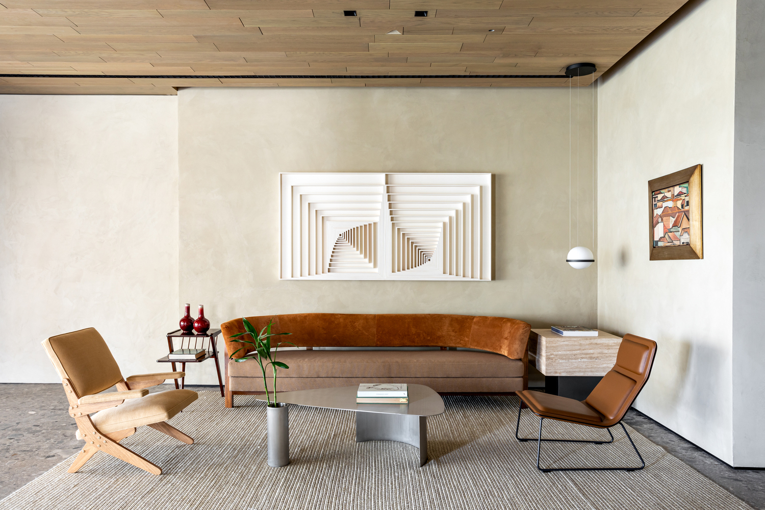
Ceppo Apartment / Meireles+Pavan Arquitetura. ©Fran Parente
The most common interior design mistakes in small homes
Most of these mistakes are easy to make, from choosing the wrong furniture to misjudging scale. Several also apply to larger homes, but in a small room every centimetre shows. If you are still choosing a look, our guide to interior design styles is a good starting point; the fixes below work with any of them.
1) Poor lighting
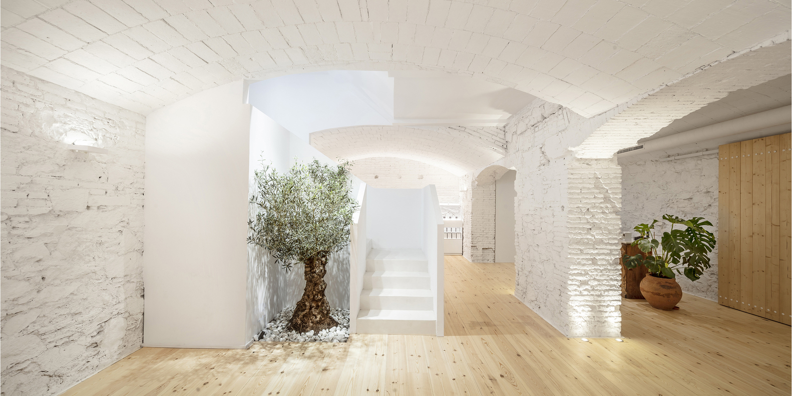
Carner Barcelona Perfumery / Jofre Roca arquitectes. ©Adrià Goula
Lighting is often left until last, yet it changes how big a room feels more than almost anything else. A single ceiling fitting in the middle of a small room lights the floor and leaves the corners and walls dark, which makes the room feel smaller.
How to fix it: layer the lighting. Use general (ambient) light, task light where you read, cook or work, and accent light on walls, shelves or art. Lighting the walls and corners pushes the visual boundary of the room outwards. Put the layers on separate switches or dimmers so the room can change with the time of day.
Also read: The 10 Common Mistakes Architecture Students Make
2) Too much furniture
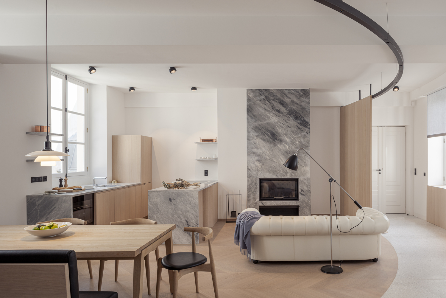
Nicolai Paris Apartment / noa* network of architecture. ©Antoine Huot
Filling a small room with furniture is the quickest way to make it feel cramped. The aim of space planning is to make the room work for how you actually use it, not to follow the latest trends or fit in every piece you own.
How to fix it: start with the routes. Mark the paths people take through the room (door to sofa, door to window, sofa to kitchen) and keep them clear; then add furniture around them. In a small living room, a large rug that the front legs of the seating stand on can tie the arrangement together and make the room read as one space rather than a collection of pieces.
Also read: 7 Sofa Ideas for Small Living Rooms
3) Hanging art at the wrong height
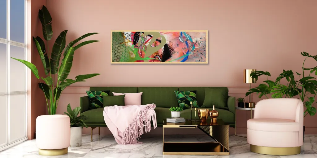
La Playa Rosa III (The Pink Beach III) by Alejandro Martinez. ©Artlita
Art hung too high floats away from the furniture and makes ceilings look lower; art hung in a scattered way adds visual clutter.
How to fix it: a widely used gallery convention puts the centre of a picture at about 145-150 cm (57-60 in) above the floor, roughly average eye level (Eden Gallery guide). Above a sofa or sideboard, keep the bottom of the frame about 15-25 cm above the furniture so the two read as a group. In a small room, one larger piece is usually calmer than many small ones.
4) Not testing paint colours in the room’s light
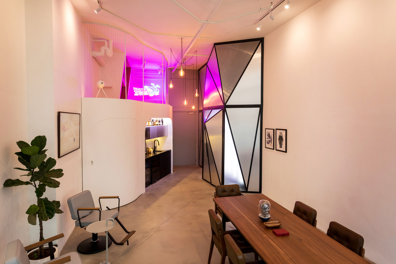
Two of a Kind Apartment / WY-TO architects. ©Frank Pinckers
The same paint looks different in morning light, evening light and under artificial lamps, and a colour that looks fresh in a shop can look heavy in a dim north-facing room.
How to fix it: paint large swatches (at least A4 size) on card, fix them to different walls, and look at them during the day and at night before you decide. Light, warm neutrals usually make small rooms feel larger, but a deep colour used on every surface, including the ceiling, can also blur the corners and make a small room feel intentional rather than cramped.
5) Buying an oversized dining table
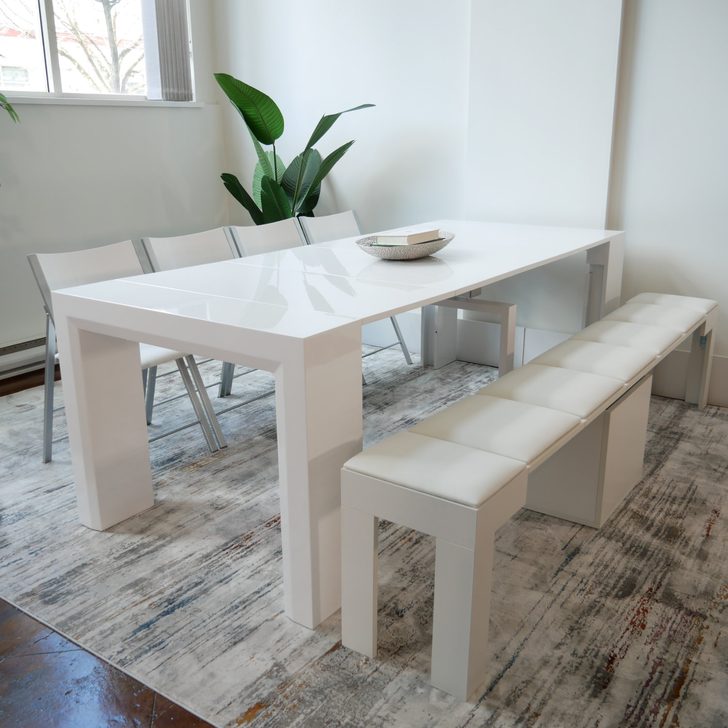
©Expand Furniture
It is tempting to plan for the dinner parties you might host rather than the meals you eat every day. In a small home a large table blocks routes for the 360 days a year it is not full.
How to fix it: choose a round or extending table. A round table of about 90-107 cm (36-42 in) diameter seats two to four comfortably every day; an extending version can seat six when needed. Remember the space around it: the US National Kitchen and Bath Association recommends at least 112 cm (44 in) from the table edge where people need to walk past a seated diner (NKBA Kitchen Planning Guidelines).
Also read: 19 Modern Dining Room Design Ideas
6) Pushing all the furniture against the walls
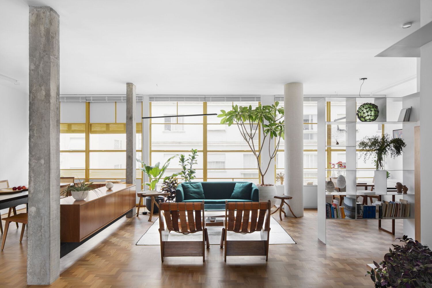
Louveira Apartment / Ana Sawaia Arquitetura. ©Carolina Lacaz
Lining every wall with furniture seems to free the middle of the room, but it often leaves an empty centre, long distances between seats and no clear zones.
How to fix it: group seating for conversation, with seats close enough to talk easily, and pull pieces slightly away from the wall where you can. Even a few centimetres of space behind a sofa lets light and air move around it and makes the room feel less boxed in.
7) Miscalculating wallpaper
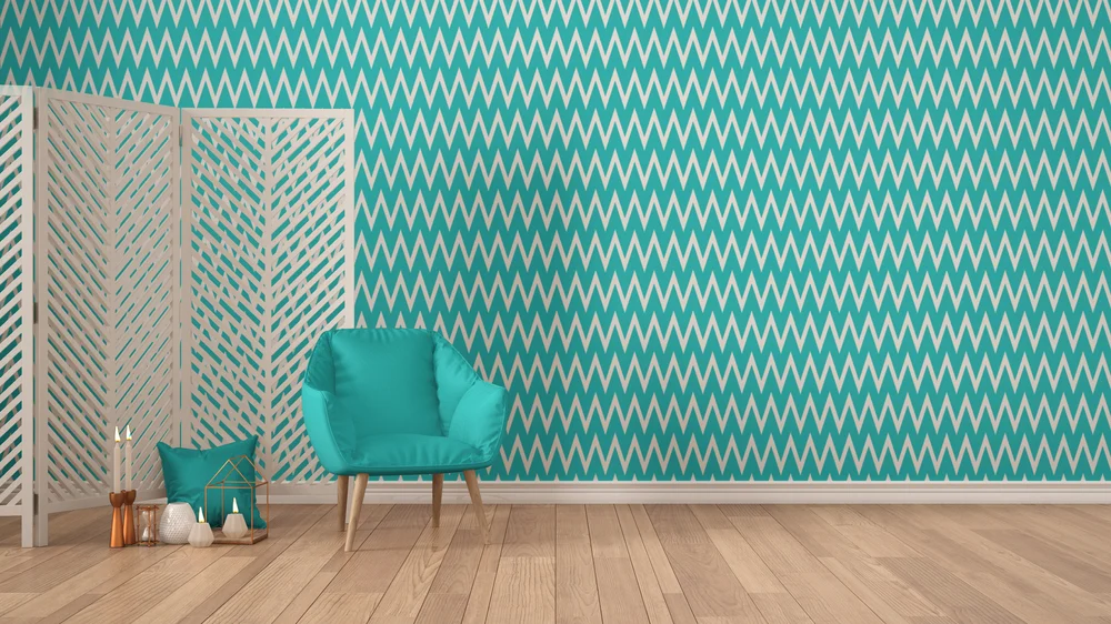
©HomeLane
Ordering wallpaper by guesswork leads either to waste or, worse, to a second batch that does not quite match the first.
How to fix it: measure the width of each wall and the floor-to-ceiling height, then check the roll size and pattern repeat on the label. Standard rolls in the UK and Europe are about 10.05 m long and 0.53 m wide. Work out how many full-height drops (strips) you need, how many drops one roll gives once the pattern repeat is added to each drop, and round up. Order all rolls from the same batch (Practical DIY: estimating wallpaper).
8) Ignoring “less is more”
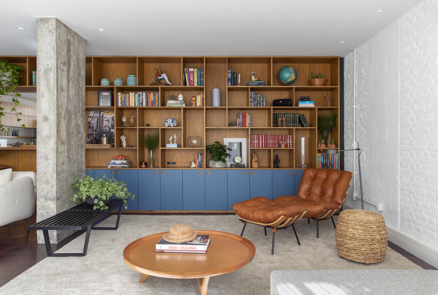
Sabará Apartment / Felipe Rodrigues Arquitetura. ©Maíra Acayaba
Every object in a small room competes for attention. Too many accessories, colours and patterns make the room feel busy and therefore smaller.
How to fix it: list what the room must do, then what you would like it to do, and furnish in that order. Keep a few surfaces deliberately empty.
9) Buying everything as matching sets
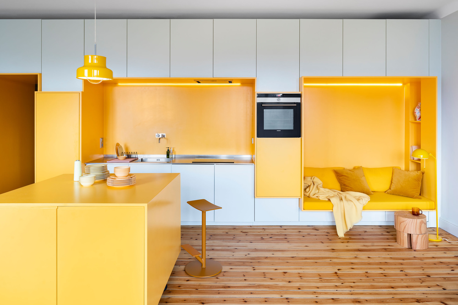
Function Walls / Lookofsky Architecture. ©Mattias Hamrén
Matching suites look tidy in a showroom, but a room furnished entirely in sets can feel flat and impersonal.
How to fix it: keep one element consistent (a wood tone, a fabric, a colour) and vary the rest. Mixing a sofa with contrasting chairs, or a table with different chairs, gives a small room character without adding more things.
10) Curtains that are too short or hung too low
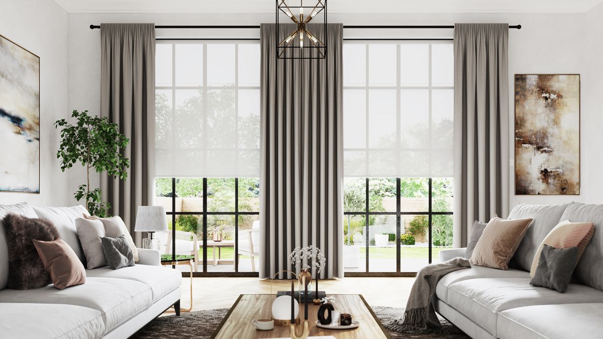
©Swift Direct Blinds
Curtains that stop above the floor or hang just above the window frame cut the wall into pieces and make the ceiling look lower.
How to fix it: mount the pole or track well above the window, closer to the ceiling, and let the curtains reach the floor. Extend the pole beyond the frame so the open curtains sit on the wall rather than over the glass, which also lets in more daylight.
11) Underestimating storage
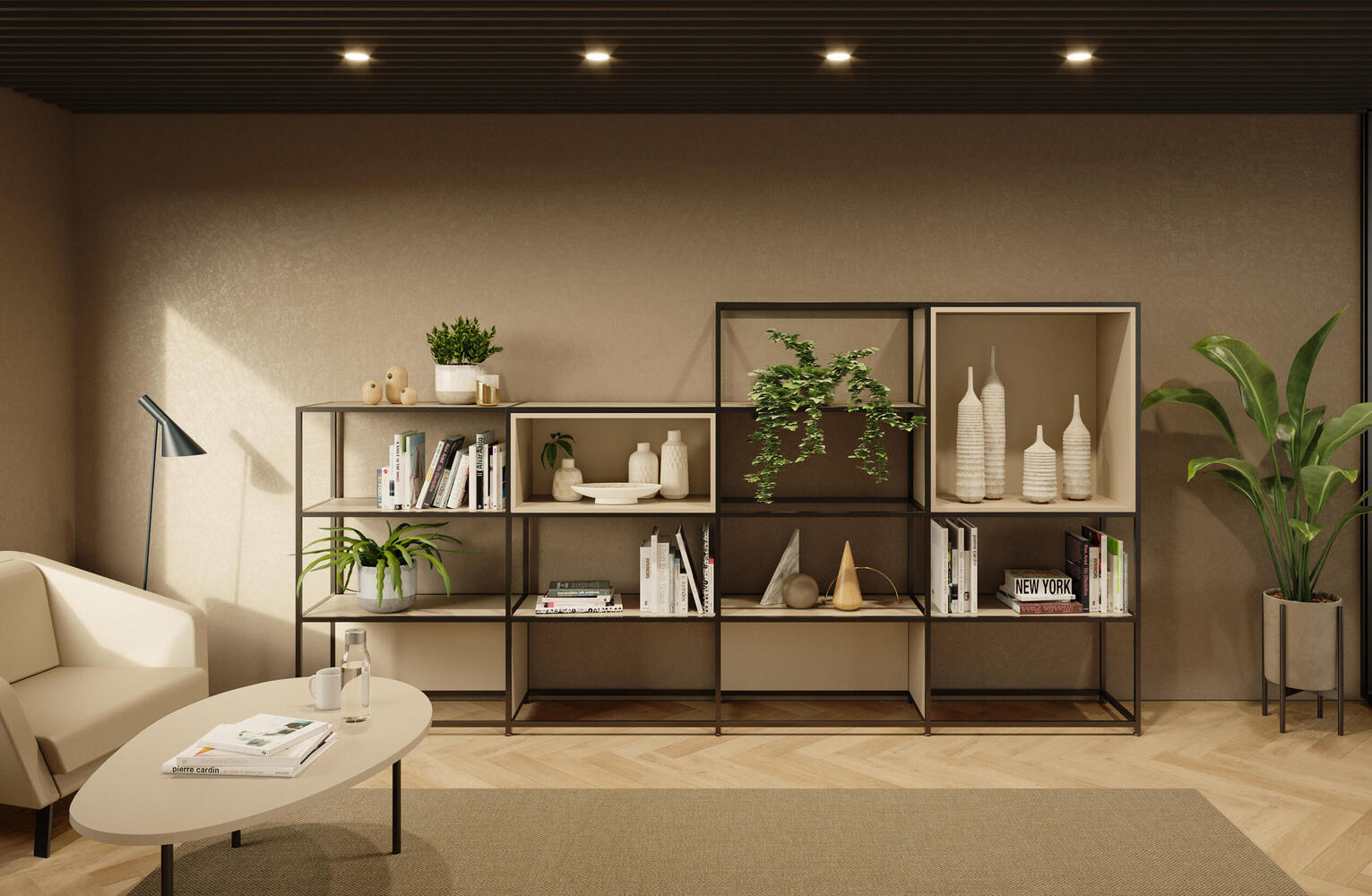
©Dynamobel
A small home without enough storage soon looks cluttered, however well it is furnished.
How to fix it: plan storage at the start. Use full-height cupboards rather than several low ones, put shelves above doors and in alcoves, and use the space under beds and stairs. Our tiny house interiors guide has more ideas for very small spaces.
12) Overlooking multi-purpose furniture
©Resource Furniture
In a small home, many rooms do more than one job: a living room may also be a guest room, an office and a playroom.
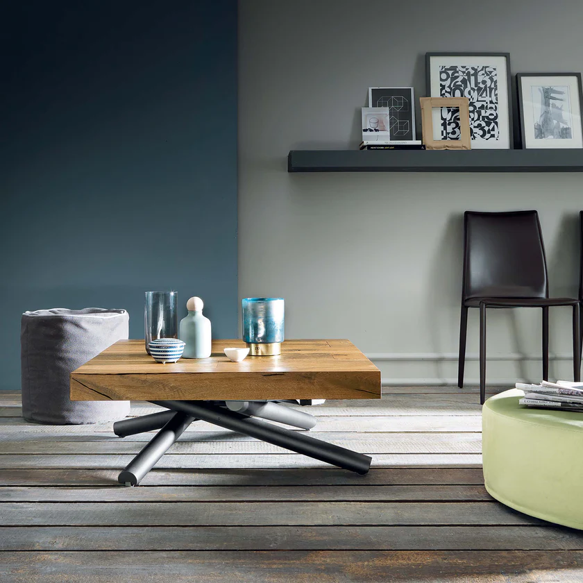
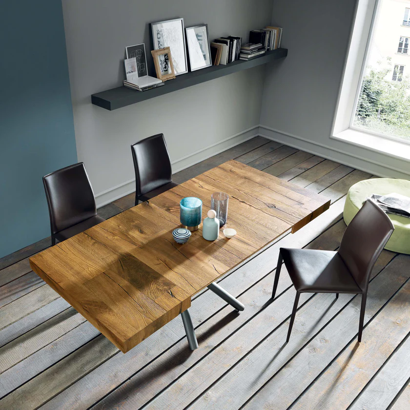
How to fix it: choose pieces that do two jobs, such as storage ottomans, sofa beds, extending or height-adjustable tables, and wall beds. Check the mechanism and the space it needs when open before you buy.
©Resource Furniture
Layout options with dimensions
The two examples below are worked examples, not standards. They show how quickly a small room fills up once you allow for the space around furniture as well as the furniture itself. Dimensions are typical, so measure your own furniture.
| Example | Element | Dimension | Running total |
|---|---|---|---|
| A. Living room, 3.0 m deep (sofa facing TV) | Sofa depth | 0.90 m | 0.90 m |
| Gap sofa to coffee table | 0.40 m | 1.30 m | |
| Slim coffee table | 0.45 m | 1.75 m | |
| Route between table and TV unit | 0.85 m | 2.60 m | |
| TV unit depth | 0.40 m | 3.00 m | |
| B. Dining for four, round table | Table diameter | 1.00 m | 1.00 m |
| Chair zone each side (no route behind) | 2 x 0.80 m | 2.60 m square zone | |
| C. Dining for four, rectangular 1.20 x 0.80 m | Table plus 0.80 m chair zone on each side | 2.80 m x 2.40 m | Larger zone with corners |
Source: Arch2O worked example; chair-zone allowance based on NKBA guidance of about 32 in (81 cm) from table edge where no one passes behind (secondary sources) and 44 in (112 cm) where people walk past (as of 2026-11-01).
The living-room example fits a 3.0 m deep room only with a slim coffee table, and the route between table and TV unit ends up just under the 90 cm often recommended for a main walkway. If that route is the way into the room, move the TV to a side wall or drop the coffee table in favour of side tables. The dining example shows why a round 100 cm table is easier to fit than a rectangular table for four: the zone it needs is compact and has no corners to walk around.
Lighting and materials checklist
Use this checklist alongside the designer tips for a cramped home above, before you buy anything new:
- Three layers of light: ambient, task and accent, on separate switches or dimmers.
- Light the walls and corners, not just the floor.
- Consistent colour temperature across the room (warm white for living areas is common).
- Light, low-contrast floors running through connected rooms to make them read as one space.
- Mirrors placed to reflect a window or a view, not a cluttered corner.
- Furniture on legs so more floor is visible.
- Curtains floor-length and hung high.
- Storage built in and full-height where possible, with plain fronts.
- A budget: many of these fixes cost little; see our tips for revamping a home interior on a budget.
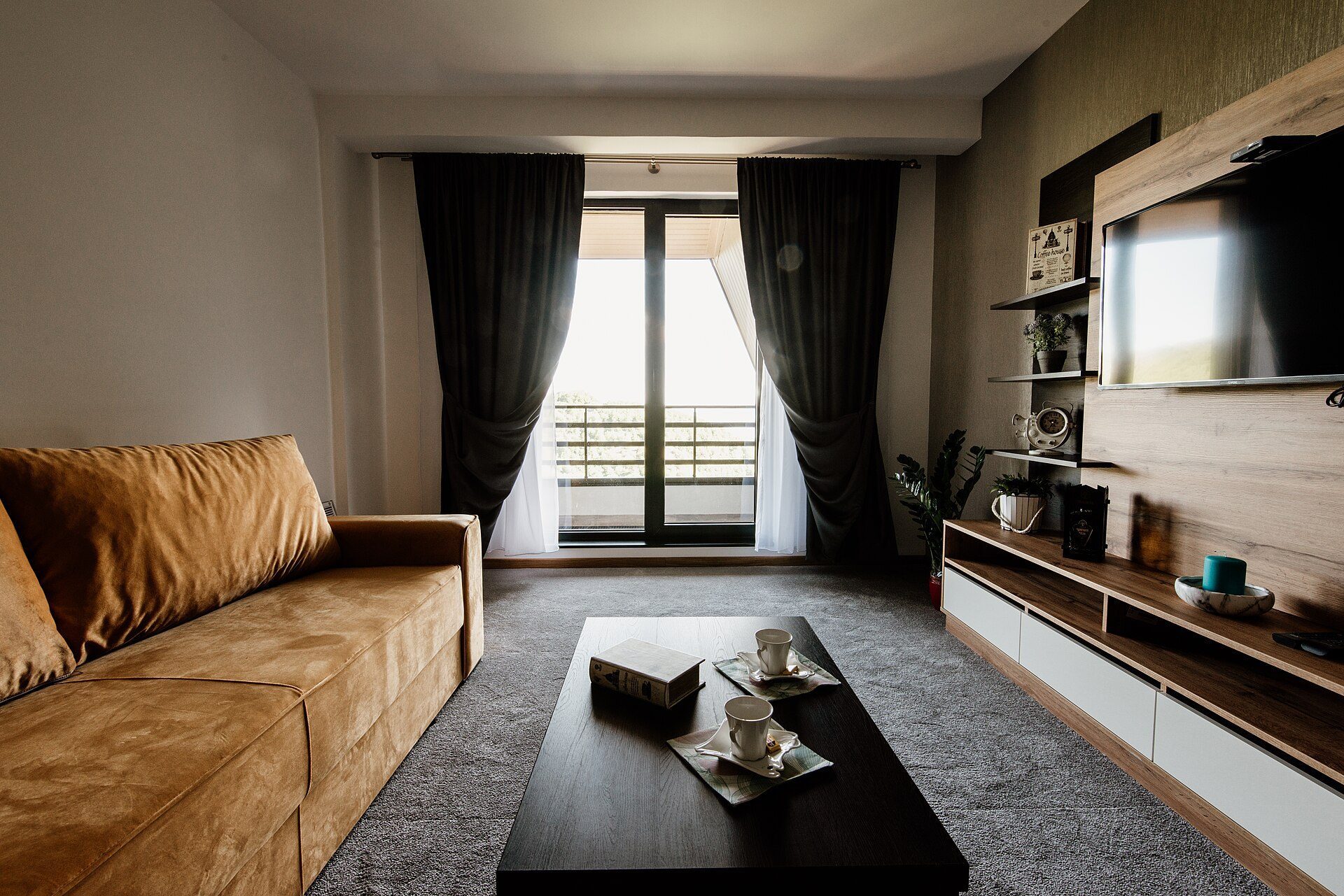
A narrow apartment living room: wall-mounted TV unit and low storage keep the floor clear, and floor-length curtains frame the balcony door. Photo: Shixart1985, CC BY 2.0, via Wikimedia Commons. Shixart1985, source, CC BY 2.0
Interior design mistakes: in a nutshell
Many small homes feel cramped because of a few common choices: too much furniture, poor lighting and storage left as an afterthought. Clear the routes, size furniture to the room, layer the light and plan storage early, and even a very small home can feel open and calm. These designer tips for a cramped home work because they start from how people move through and use a room, which is the basis of good interior design in any space.
Sources and further reading
- NKBA Kitchen Planning Guidelines (dining clearances; US guidance, not a building code).
- Practical DIY: estimating the number of rolls of wallpaper.
- Eden Gallery: how high to hang art.

Aly Bayoumi is an editor with a sharp eye for detail and a deep commitment to clarity and precision. Passionate about architecture and design, he sees every project as an opportunity to shape compelling narratives that bring creative visions to life. With a focus on accuracy and engaging storytelling, Aly combines editorial expertise with a dedication to elevating the voices and ideas that shape the built environment.