Roly-Poly
The story contained in the space can be compared to the relationship between the body and the mind. No matter how high the visual completeness of the space is, if the story is simple or poor, or if it is similar to something, the user easily feels boredom and emptiness. Even though all the restaurants in the alley of Haejang-guk are disguised as original, the scenery in which they line up only in one house in the end makes the rest of them a sub-class. The story of the real ancestor produces emotions and heals various interpretations. The body of space has the possibility that it can be made complete only with the soul of the story.
Many brands have their own stories. The story is communicated to the public as an image and becomes a symbol of a mixture of positive and negative. There are also images that are missing and want to fill. Although Ottogi has a good image of being healthy and kind, it also has an image of being conservative and tacky. Therefore, progressive or sophisticated images are relatively lacking. Ottogi’s new image overcoming this dilemma will be shown and experienced by the 20s and 30s is a natural thing for the future as a company. Our proposal was positively accepted and pushed forward quickly.
Photography by © Park woo-jin
It is a project that involved and intervened in all parts from Roly-Poly cotto naming to space planning and space design, styling and product design and graphic design. Initially, the requested space was planned as a food and beverage space selling curry and ramen sold by Ottogi on an area of about 265m2 and 80 pyeong, but it was expanded to about 500 pyeong by proposing the possibility of expansion through the use of idle spaces. The simple composition of selling ramen and curry was expected to serve as a symbolic space that gave complex functions on the expanded space and made 2030 consumers feel a new image of the brand. However, a metaphorical interpretation was needed that could appeal to the younger generation while avoiding the brand’s explicit expression.
In the era of Simulacre, which prioritizes phenomena over reality, Ottogi may have a stagnant image for the younger generation. It was planned with anticipation of its role as a space that could overcome this dilemma and show the future of the company. Through analysis from various aspects, positive images, negative images, and images that are lacking were identified and a concept to overcome them was established. Even if it’s nonsense, it’s constant but innovative, good but strong, friendly but sensational image. To that end, I thought that design in a complex rather than simple, emotional rather than stimulating, analog way rather than digital would be a solution as a non-temporary and sustainable space. Therefore, as time passed and the space became ripe, I hoped that the language of the space would be transmitted to the user in a slow breath.
Photography by © Park woo-jin
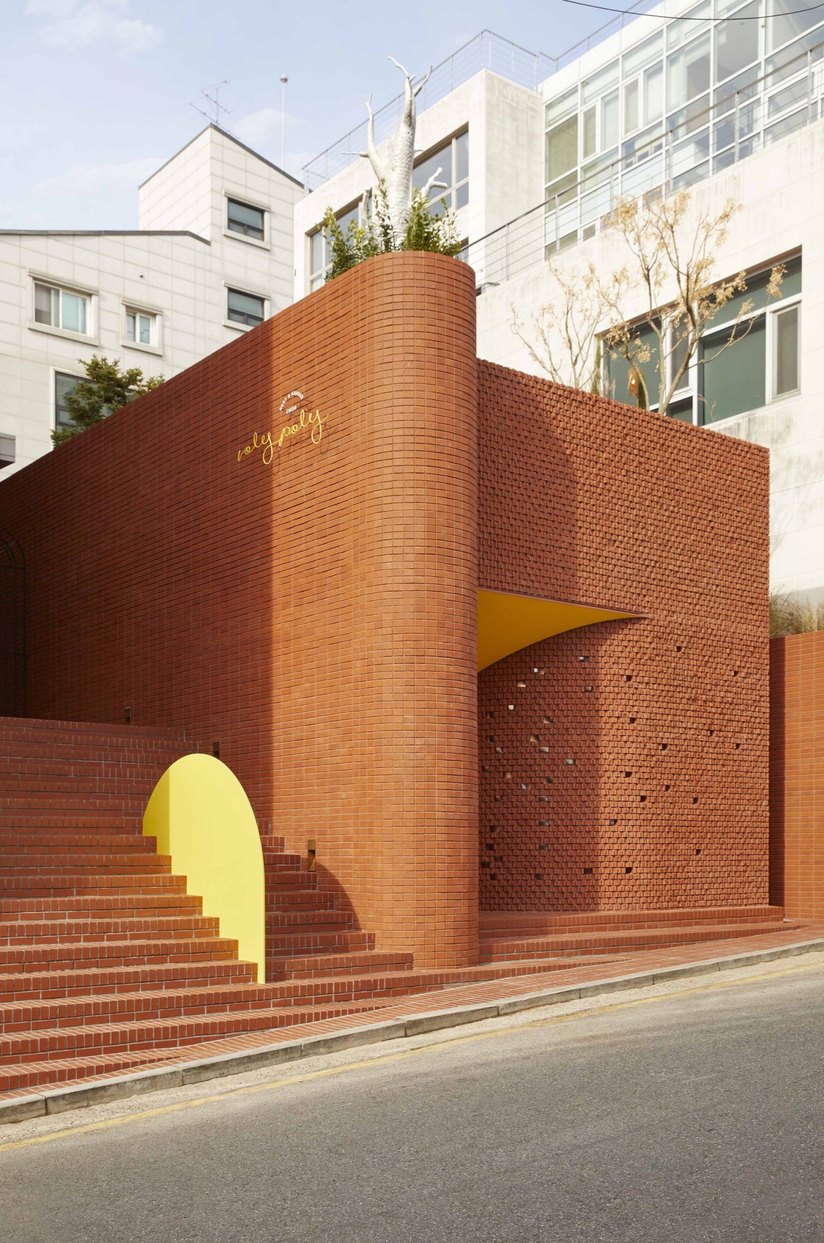
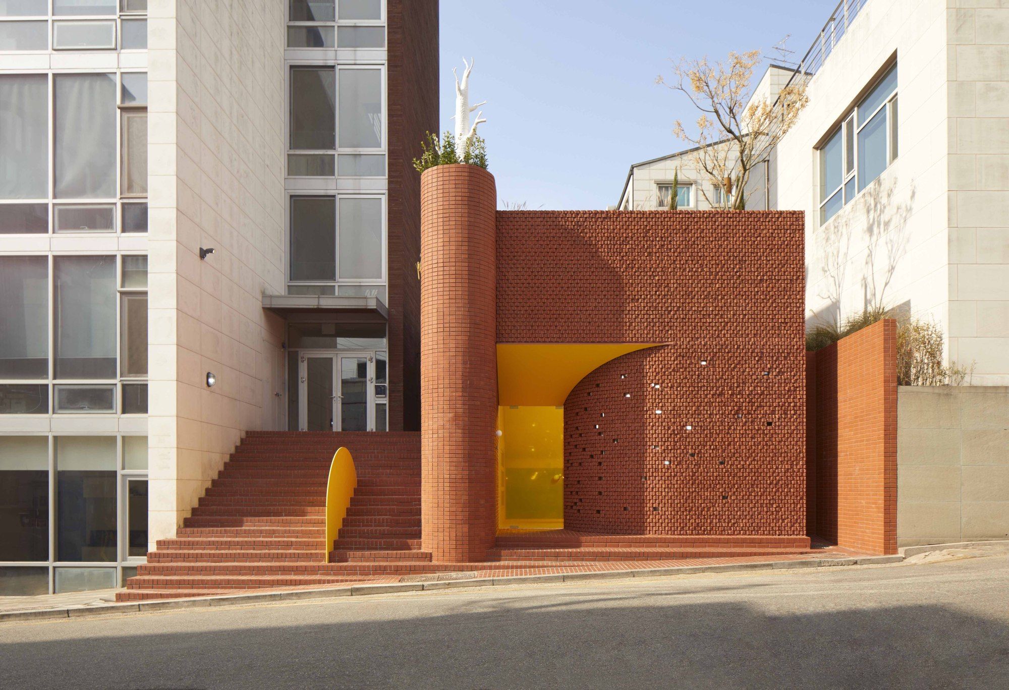
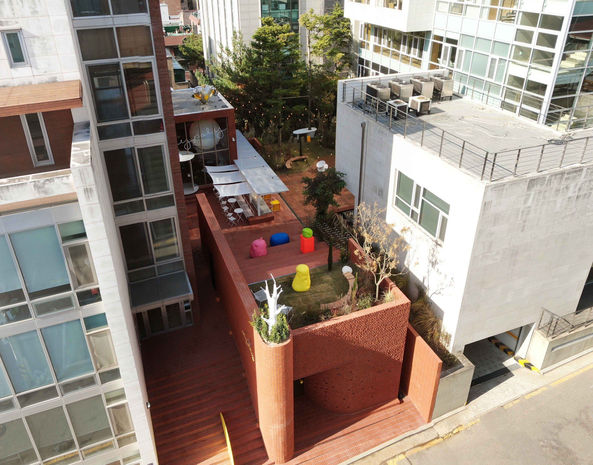
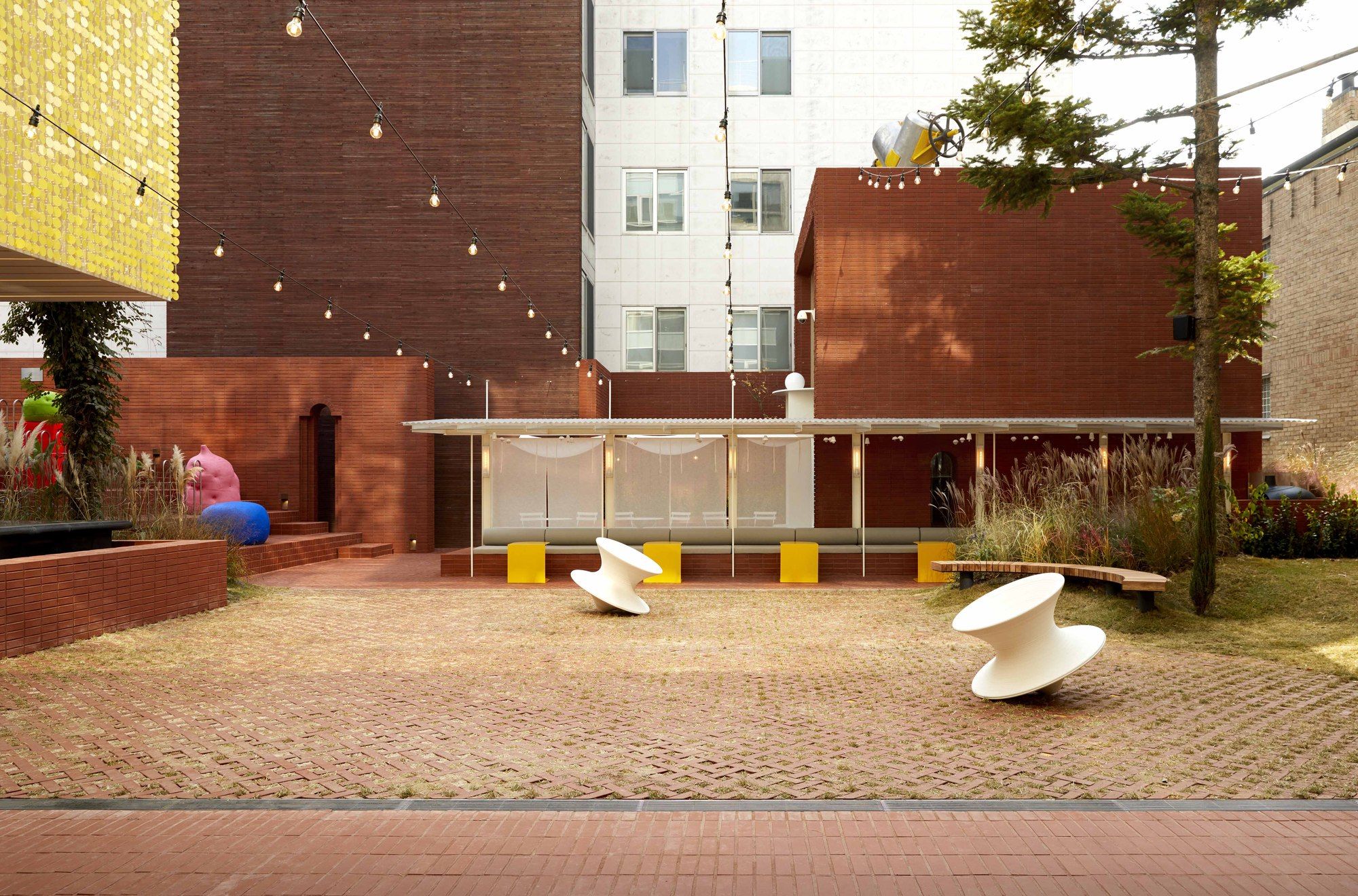
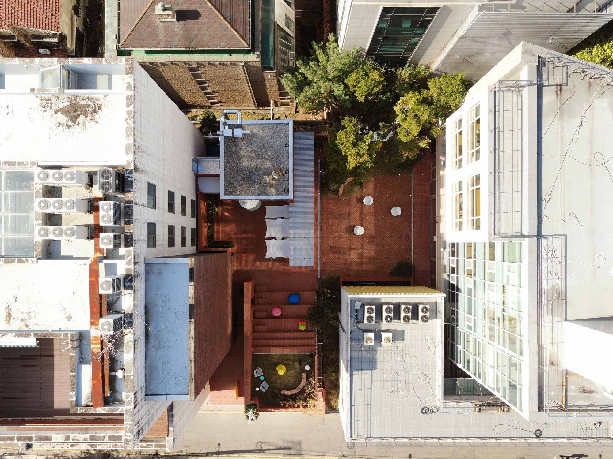
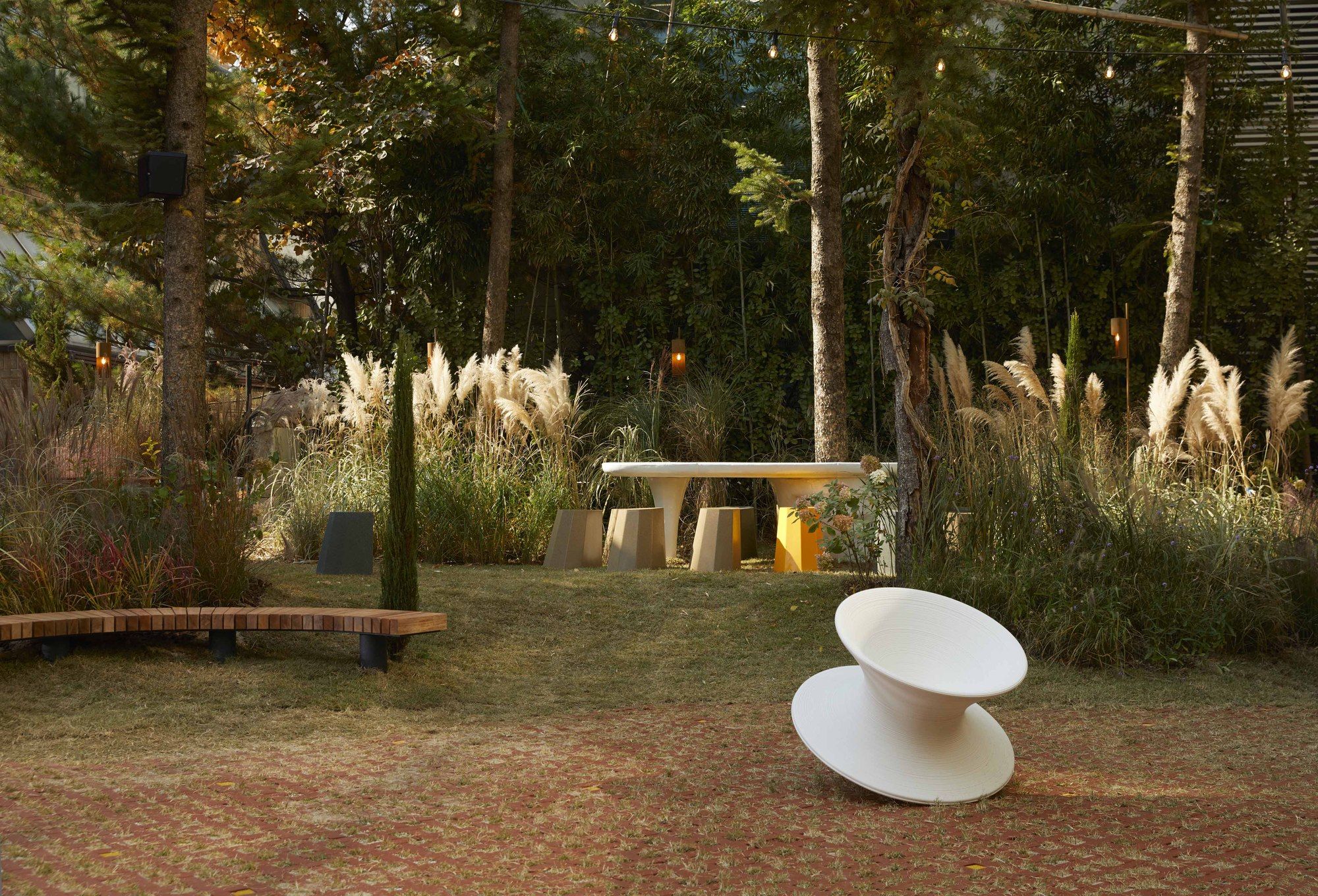
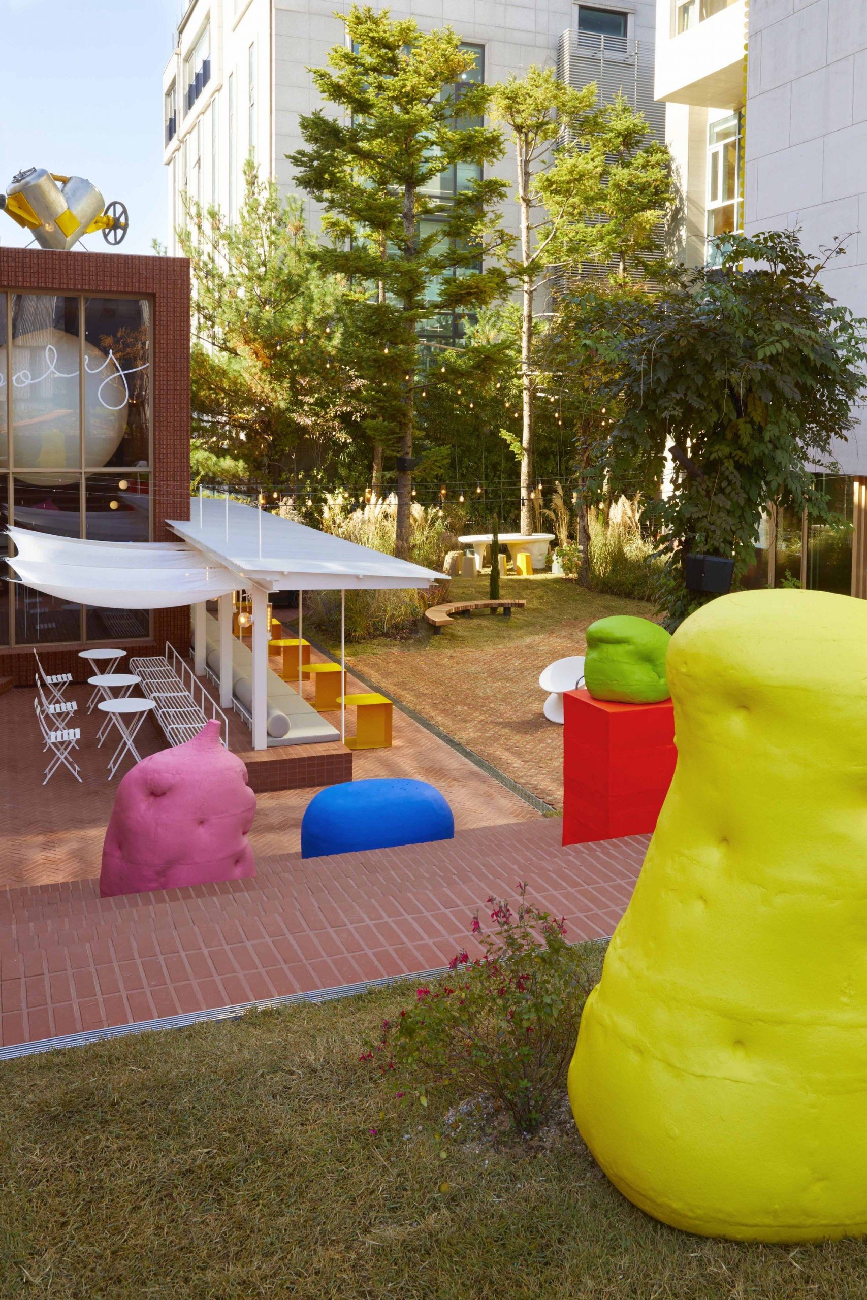
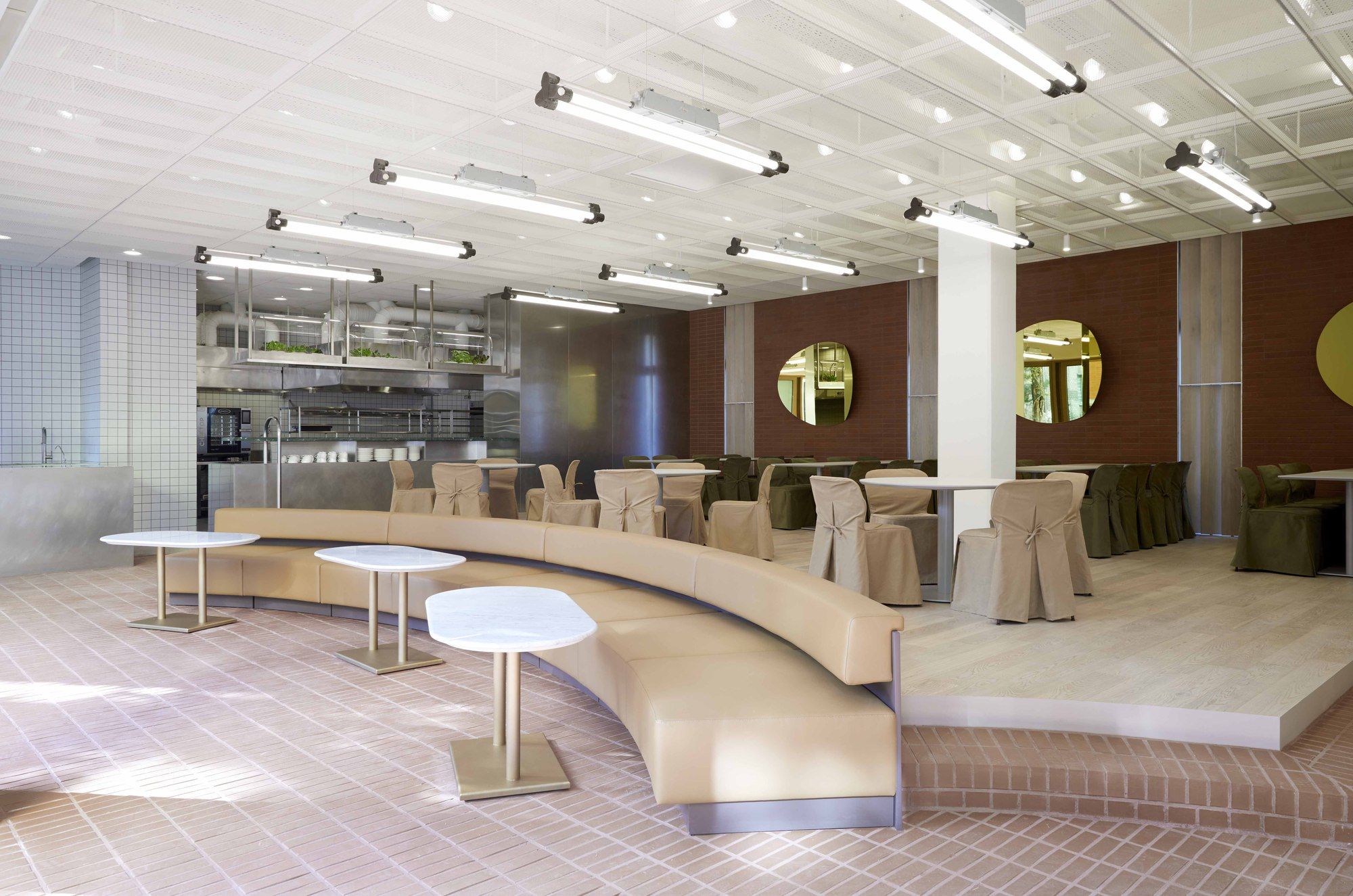
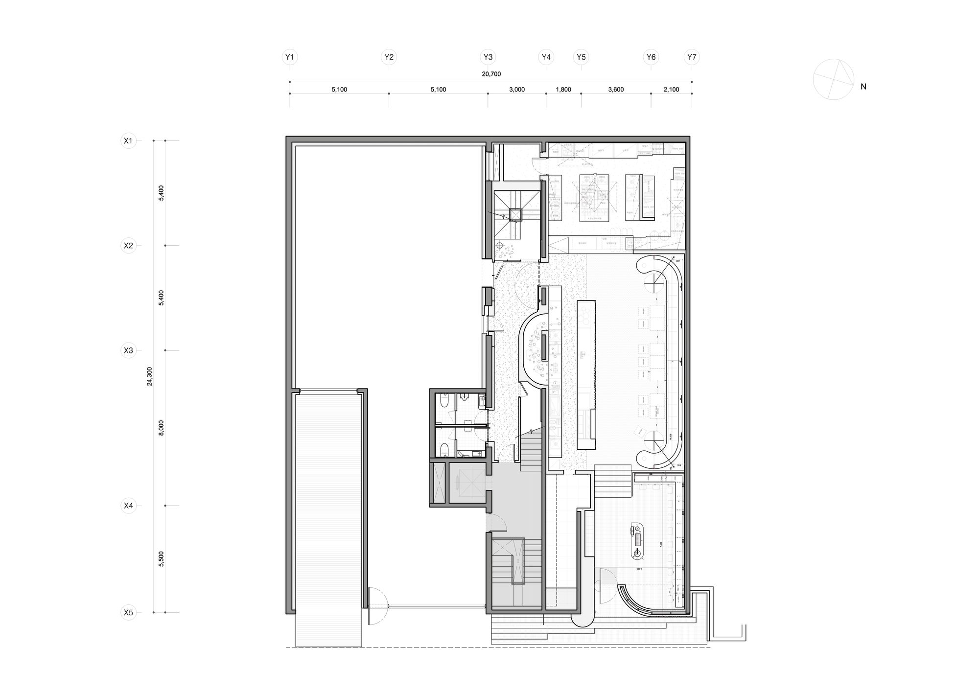
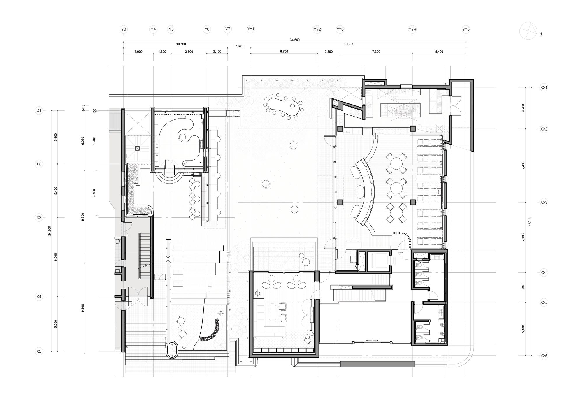
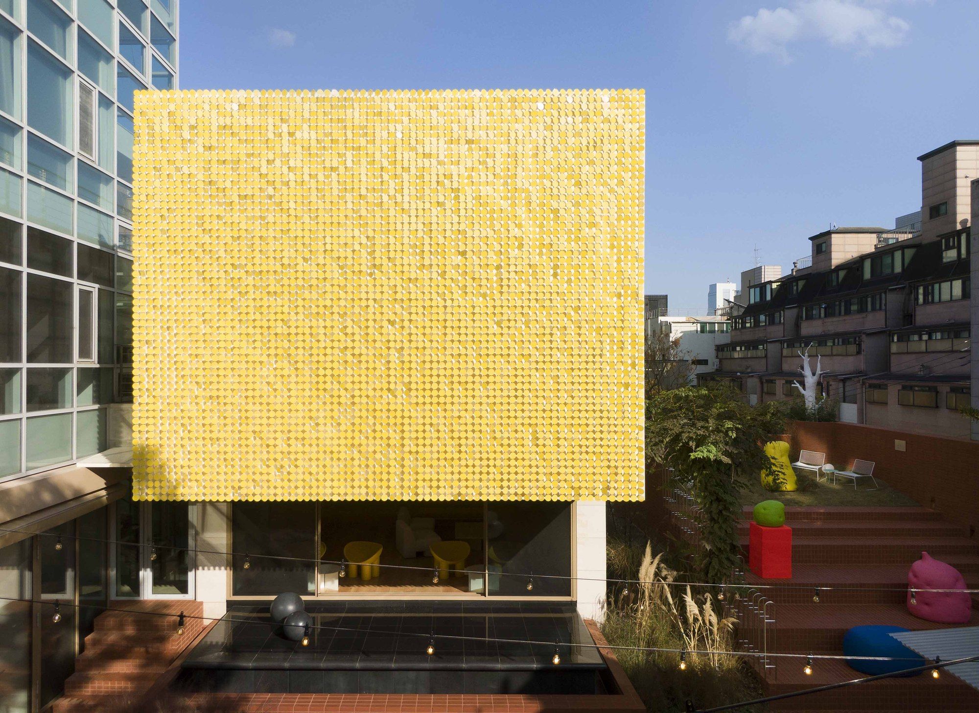
Composition of space – It can be said that the core of the design is to combine the gardens hidden in the two existing buildings into one to secure the largest area in the entire space and to give it an intermediary role. The six scattered spaces form a relationship through this garden and perform their respective functions. The order of cave , cube, slope (hill), shade, garden, hall (banquet hall), sala (living room) The seven spaces separated by each have different roles and heights and provide various sequences.
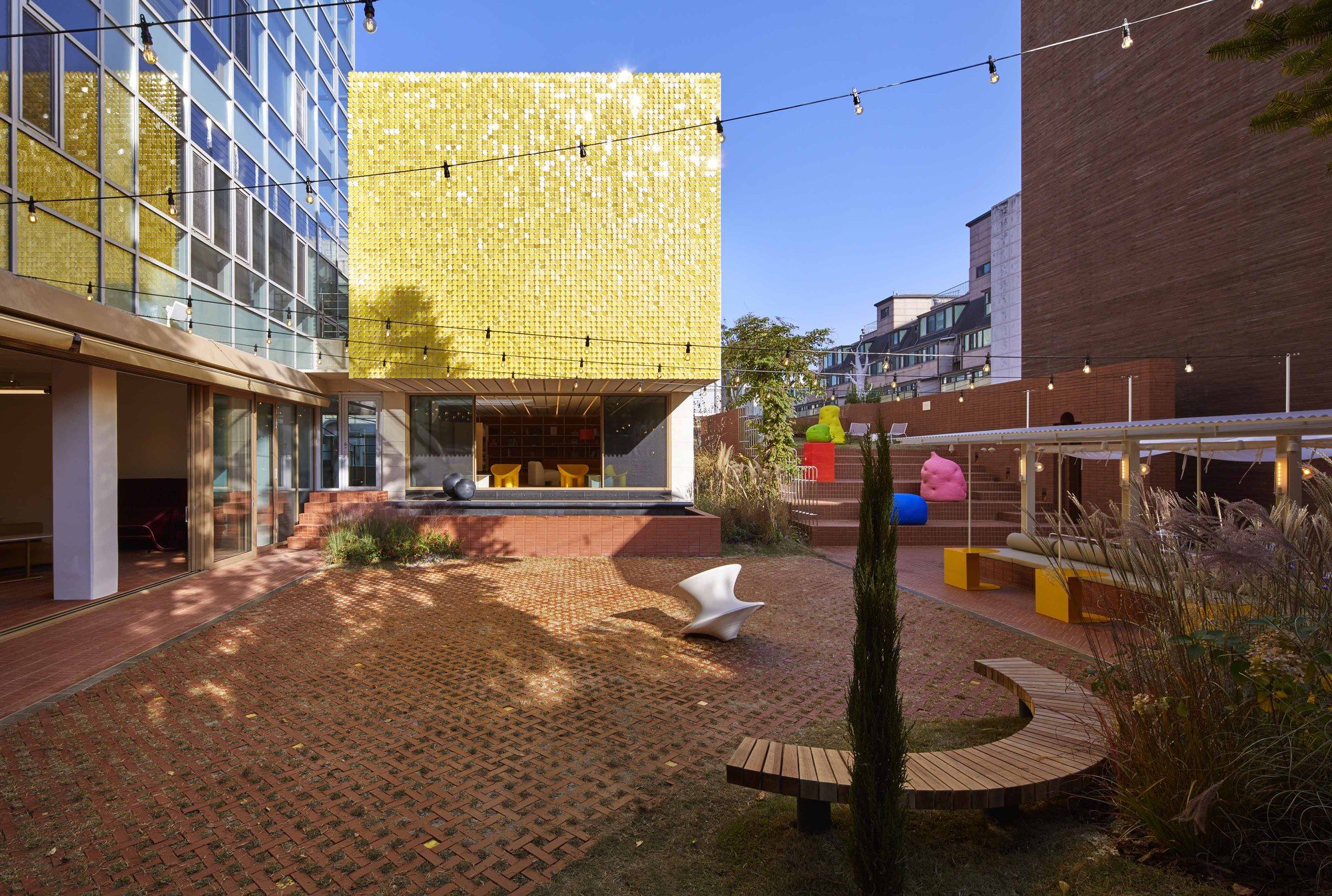
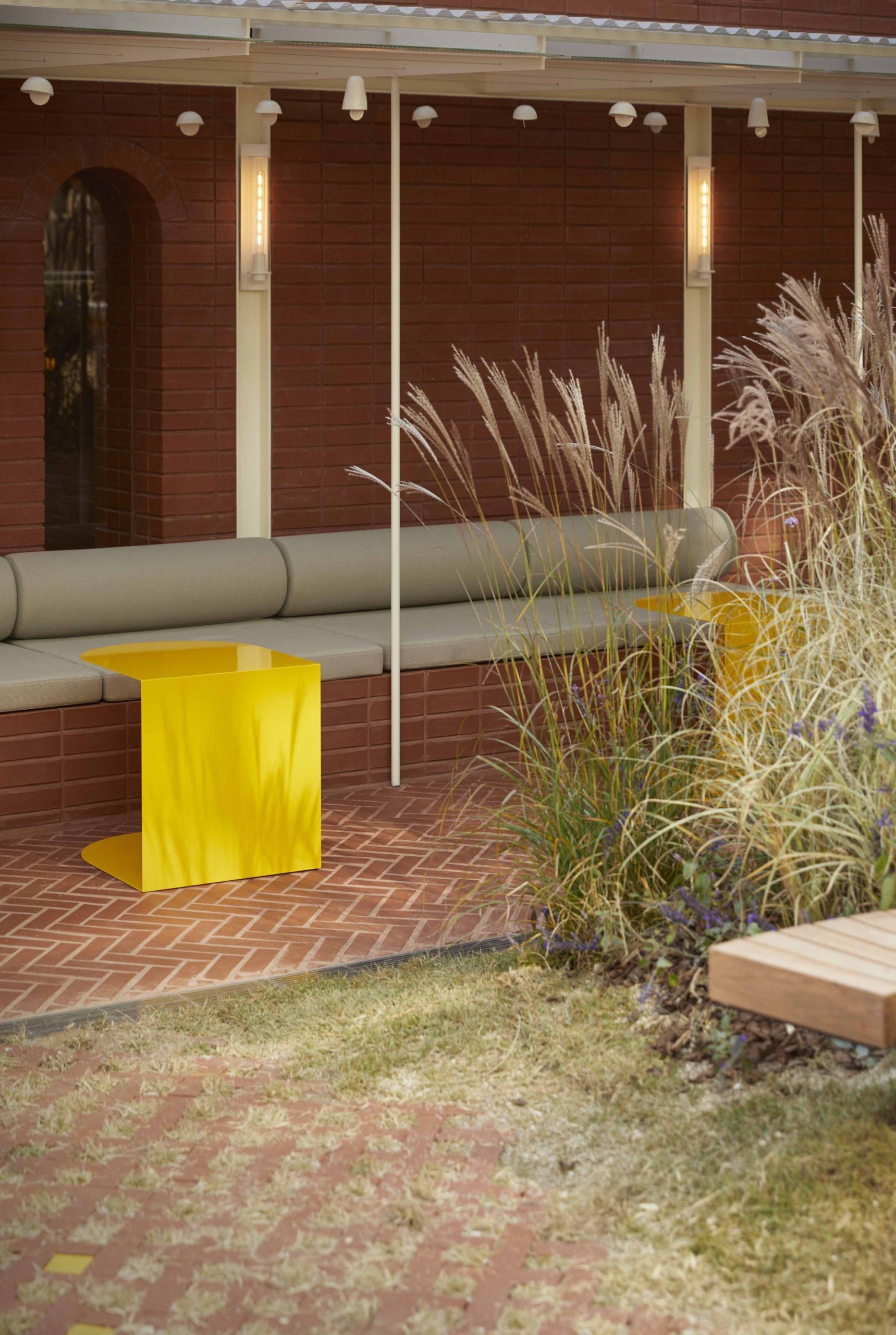
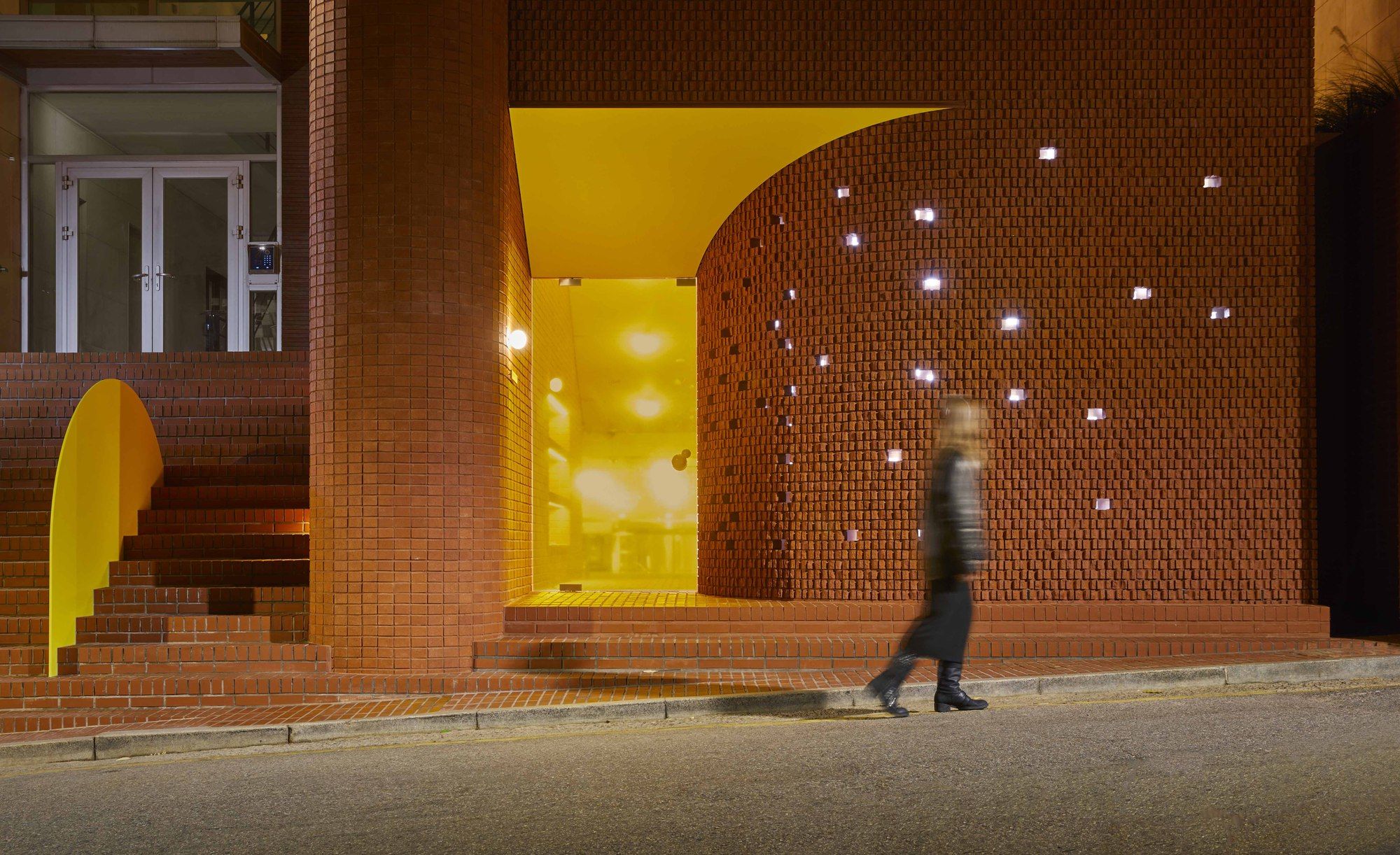
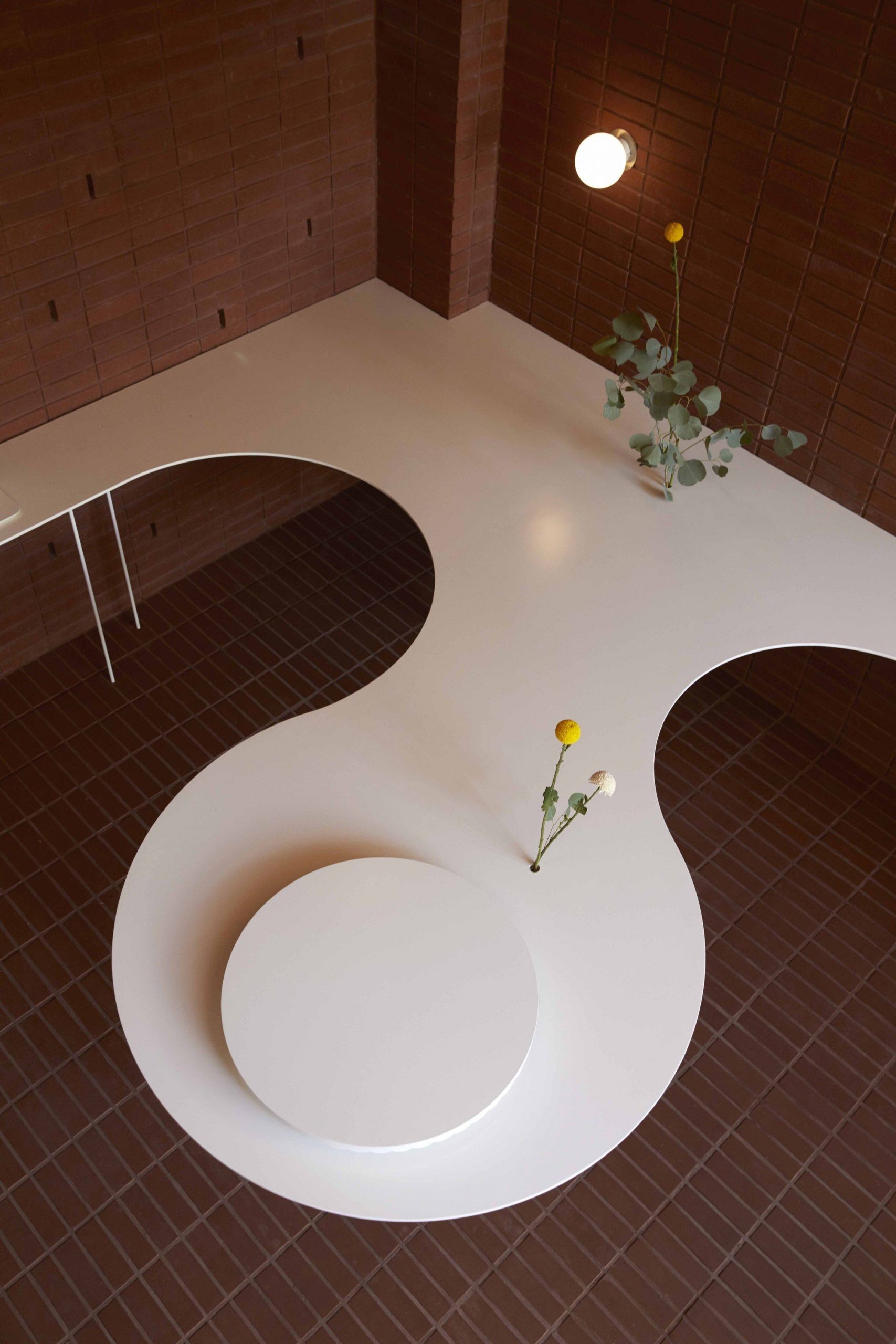
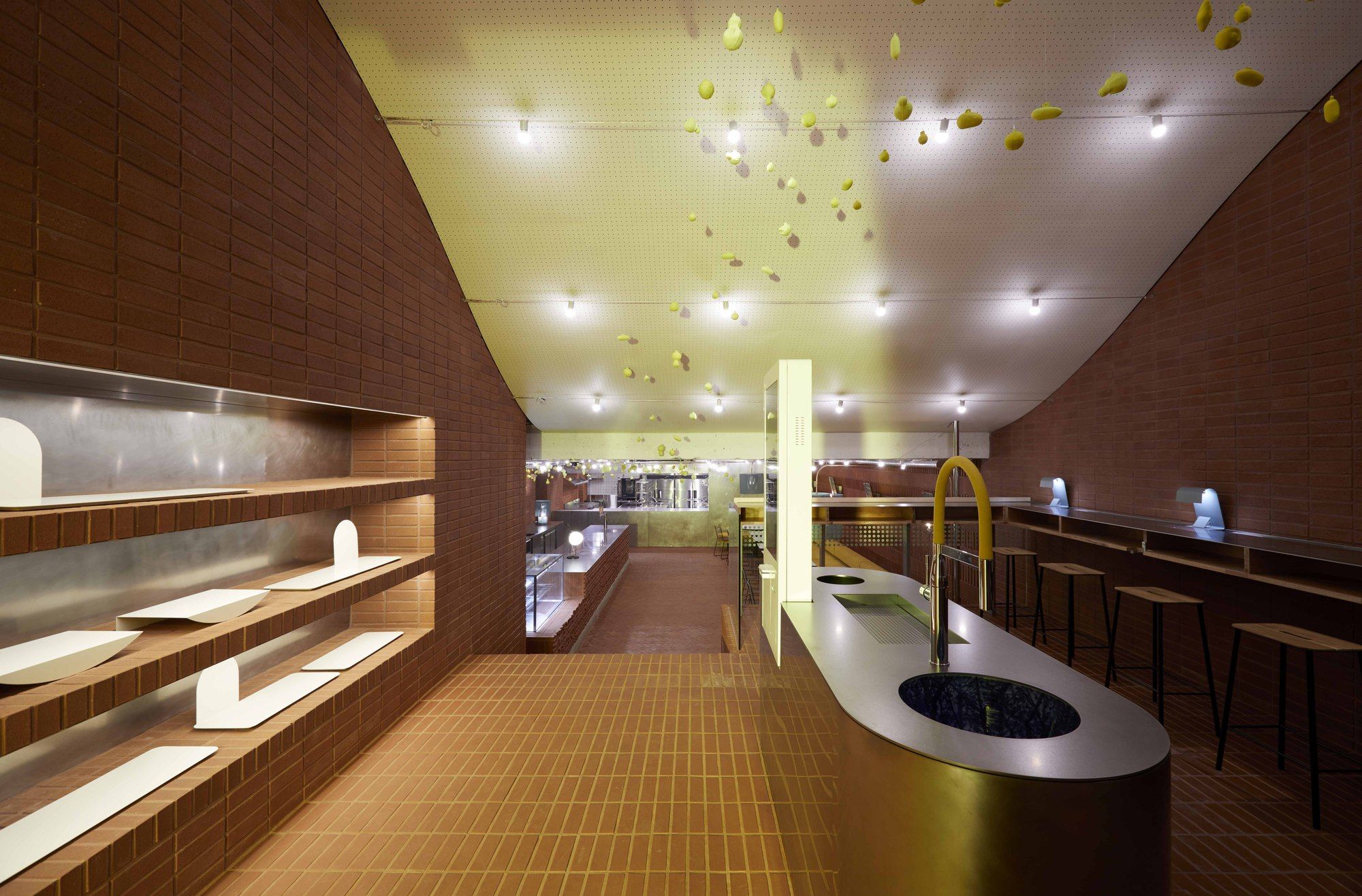
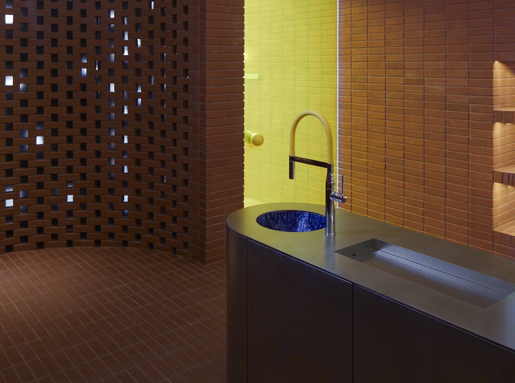
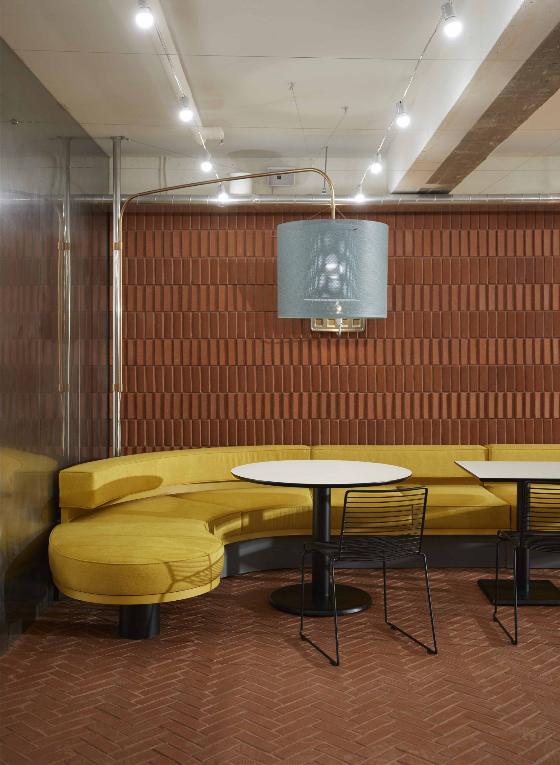
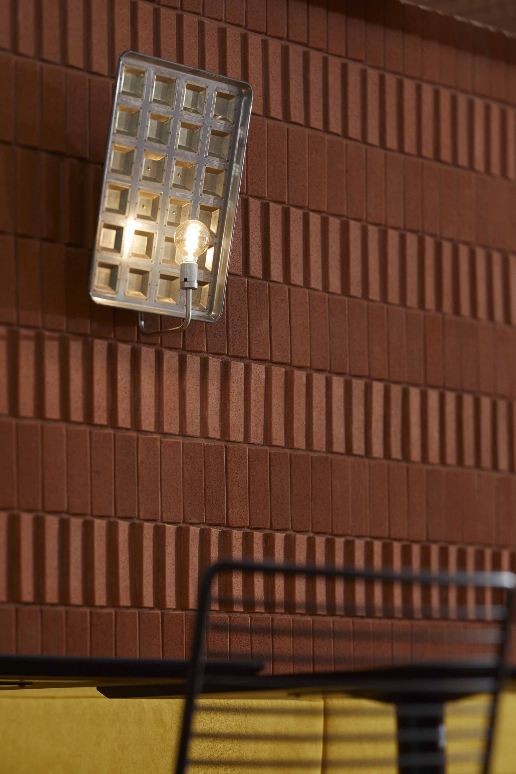
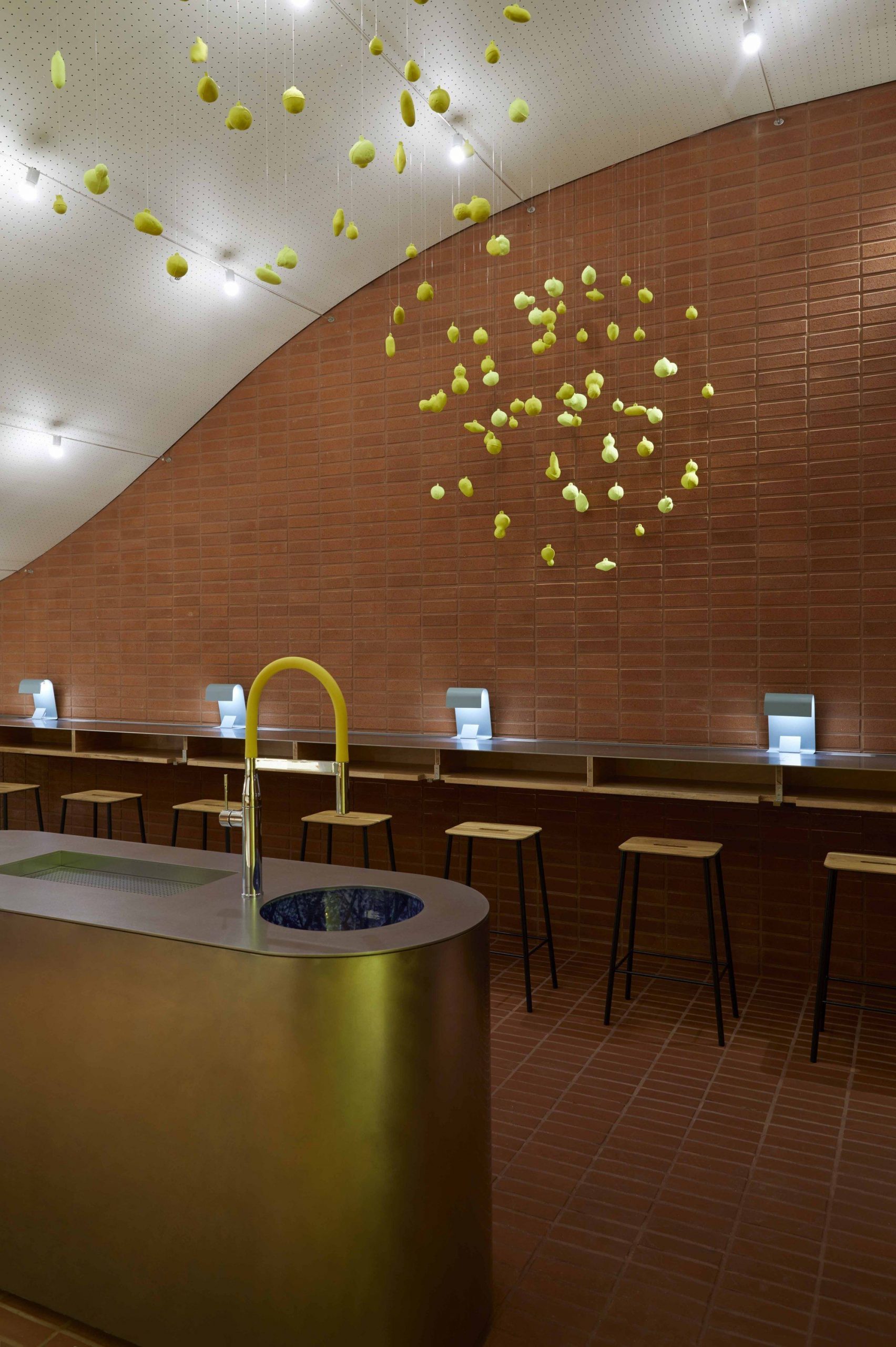
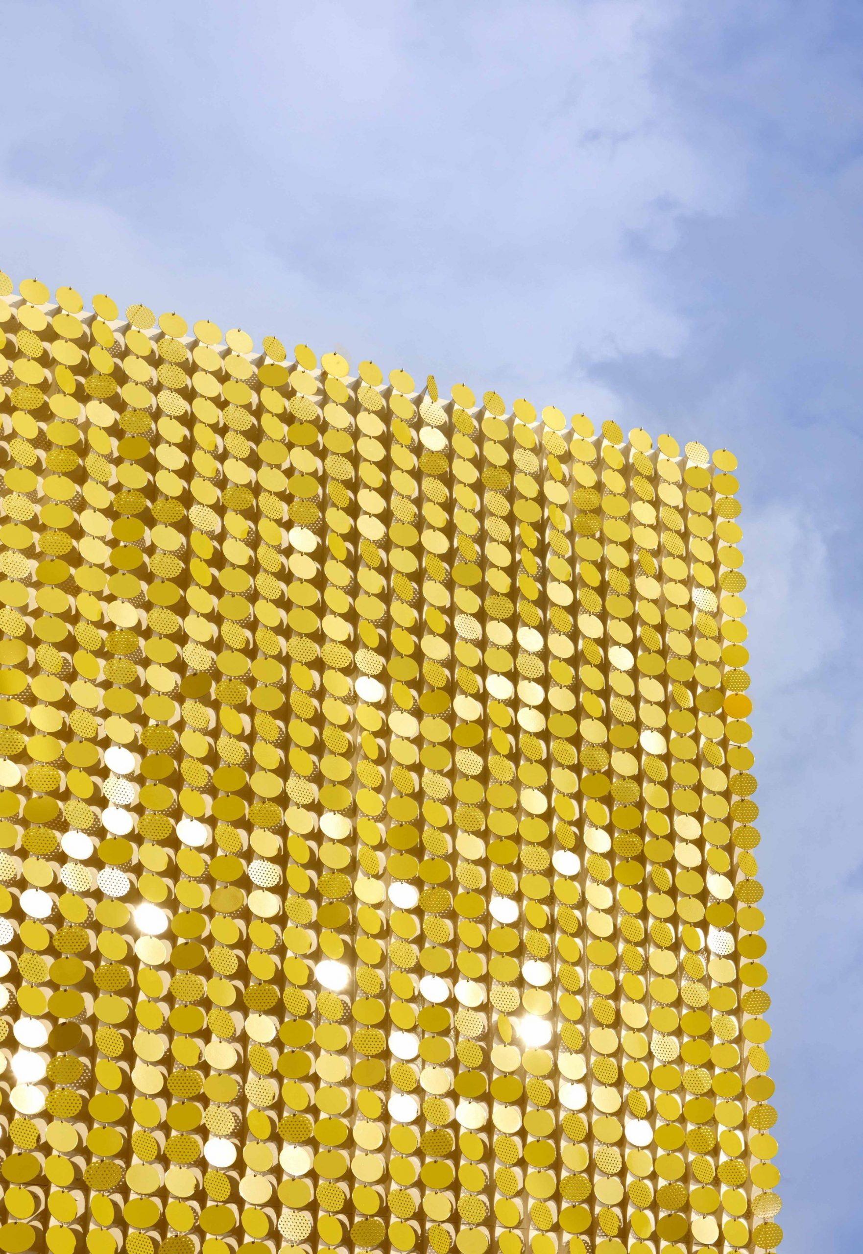
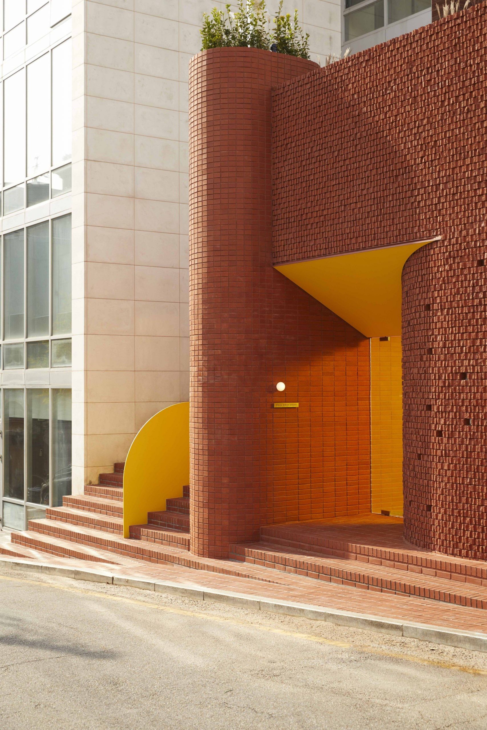
The main material of the space is red brick. Red brick has universality and persistence, and is a material that is solidly constructed by gathering small cells. About 100,000 bricks are in line with the conservative nature of bricks that do not change easily over the years and the corporate spirit that has steadily developed. The various construction methods and patterns of bricks are performances that overcome the conservatism of materials. Also, yellow is the symbolic color of Ottogi. Since yellow gives a completely different feeling depending on the color, brightness, and area of use, we decided to devote ourselves to conveying the image of color without insisting on the symbolic color of the brand. The materials used inside were matched with wood, fabric, and ceramic that match the main material brick. However, stainless steel was used for the rhythmic feeling of the physical properties, but it was manually ground to give a sense of time.
Photography by © Park woo-jin
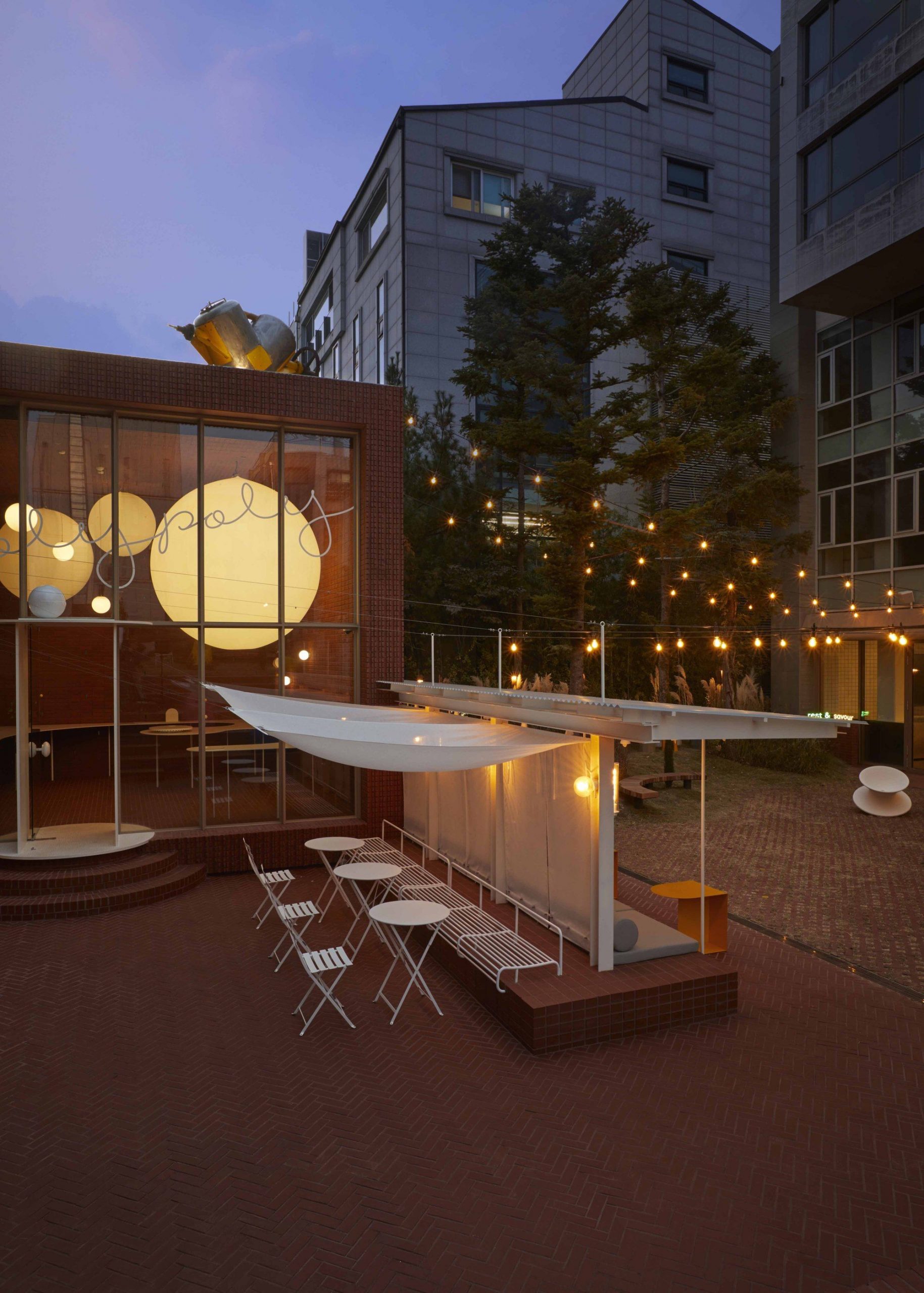
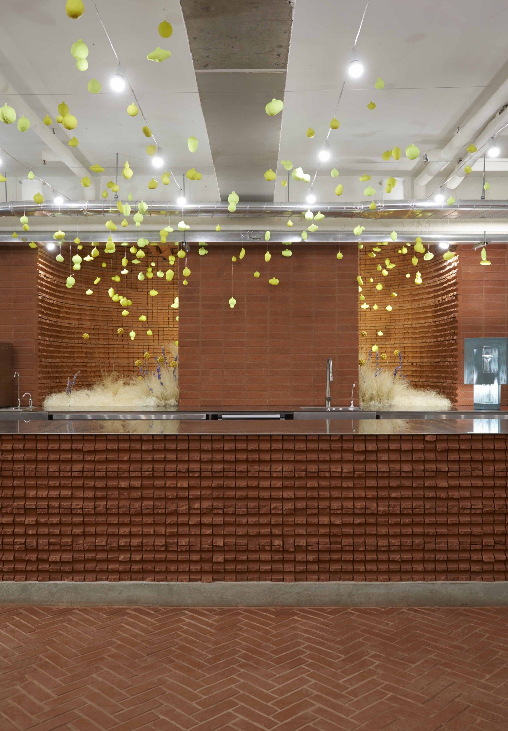
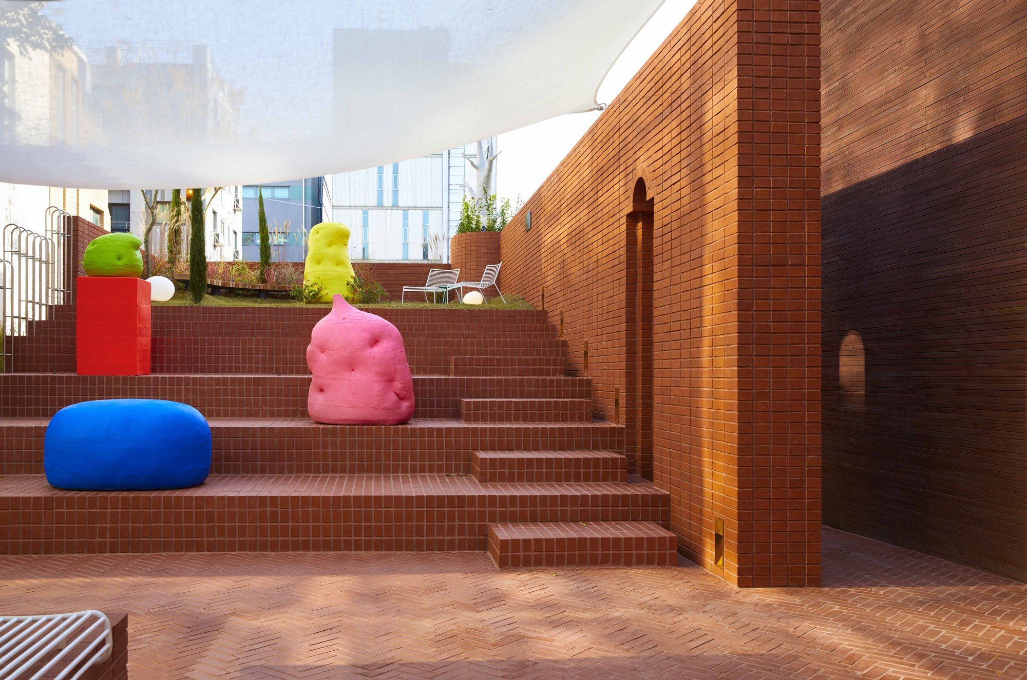
The cave facing the road is a subterranean space without windows and sells food and drinks. More than 400 fluorescent colored objects hanging from the ceiling suggest and guide the landscape of the garden. The interior of the space is finished in various patterns of bricks, and the 8-meter bar and booth sofas become the axis of the narrow and long space. When you leave the cave and go up to the ground through a narrow vertical staircase, you will encounter cubes and slopes facing each other. The cube of the cube is a space that sells goods developed for this project. The front wall inside the cube, which is finished with bricks on all sides, receives light through the thin gaps in the brick. Inside, a large, curved metal shelf floats as if floating. A large balloon with embedded lighting was hung on the ceiling so that it could be easily recognized from the outside. The brick-stacked stair-shaped slope is designed to allow active seating, and a small lawn space at the top provides an opportunity to view the entire garden. On the stairs, various fluorescent colored ceramic objects by artist Lee Heon-jeong are arranged to become a material for users to play.
Photography by © Park woo-jin
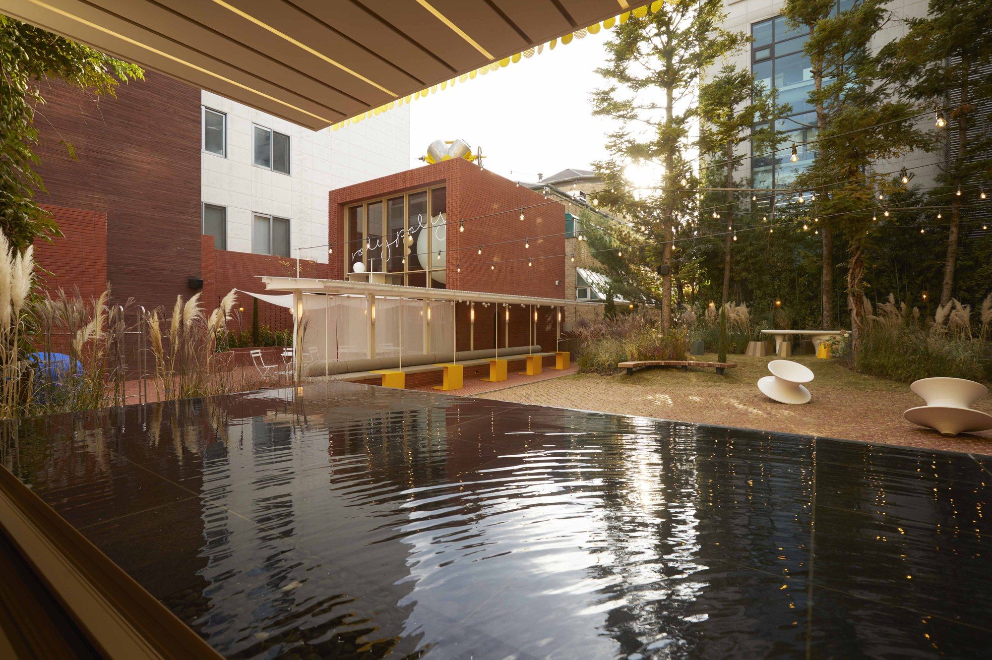
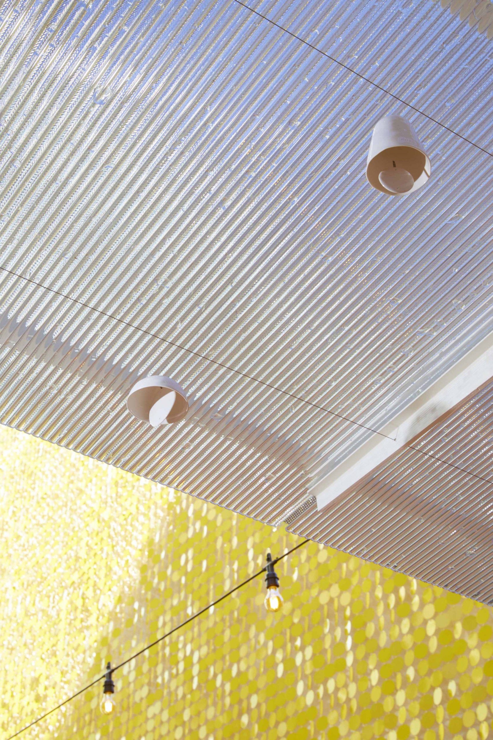
The shade attached to the cube is finished with a punched metal roofing material that transmits sunlight and relieves the texture of the hard cube. The long shape of the shade divides the garden in half on the plane, but at the height of the line of sight, it creates a layer of space to add depth. About 40 landscapes made of ceramics are installed under the roof, awakening the sense of sound throughout the garden even with a small wind.
The garden becomes the core of the whole space, and all the spaces on the ground aim for it. Gardens bloom and fall differently from a solid brick scalpel and respond to the season. The garden, which is composed of a variety of flowering plants, was planned to achieve harmony with several existing fir trees. Superflowers that react sensitively to the wind respond to the sturdiness of bricks and give a sense of balance to the entire garden. At the end of the garden, a small hill is formed using the existing level to communicate with Sala located on the opposite side.
Photography by © Park woo-jin
The garden becomes the core of the whole space, and all the spaces on the ground aim for it. Gardens bloom and fall differently from a solid brick scalpel and respond to the season. The garden, which is composed of a variety of flowering plants, was planned to achieve harmony with several existing fir trees. Superflowers that react sensitively to the wind respond to the sturdiness of bricks and give a sense of balance to the entire garden. At the end of the garden, a small hill is formed using the existing level to communicate with Sala located on the opposite side.
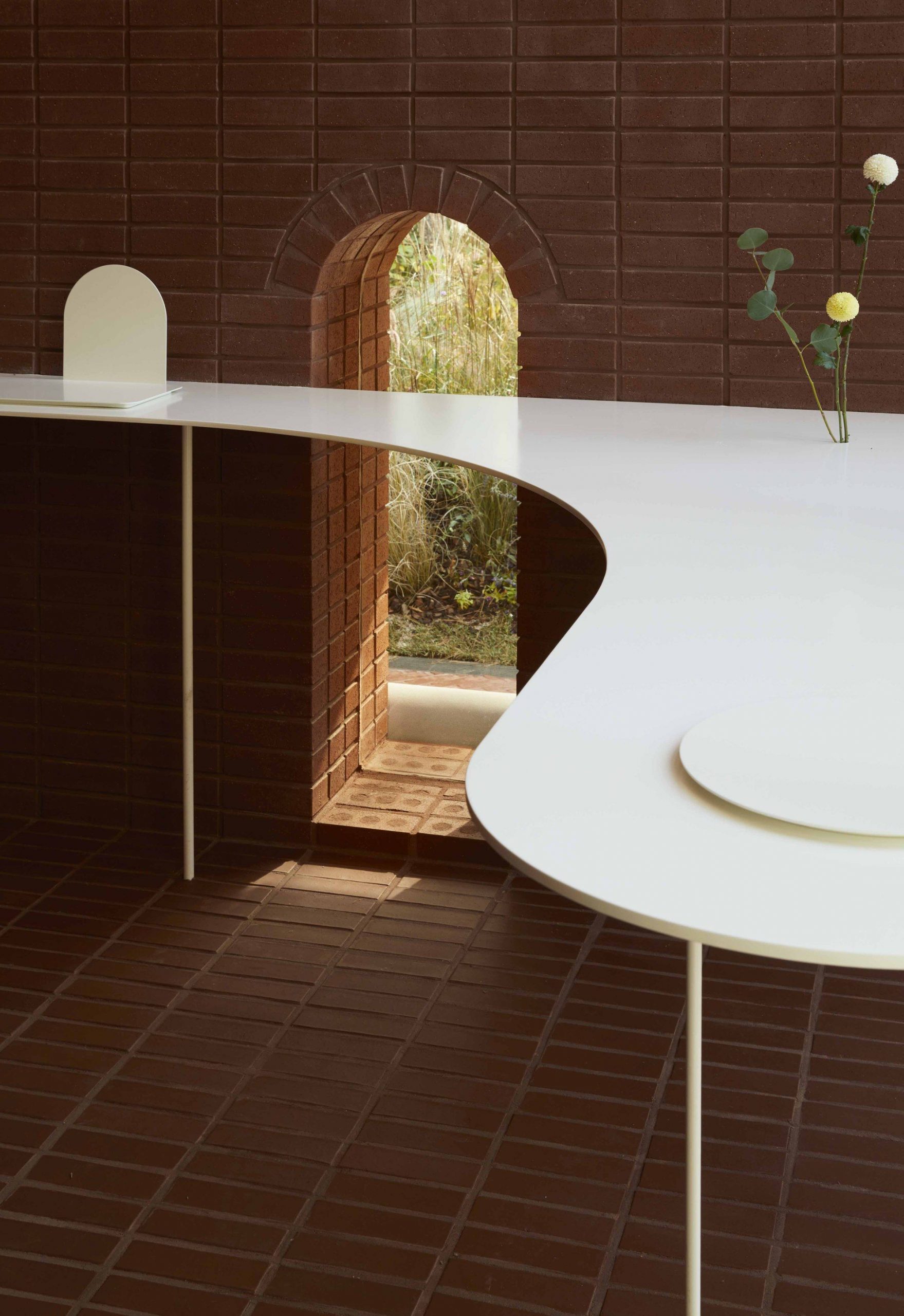
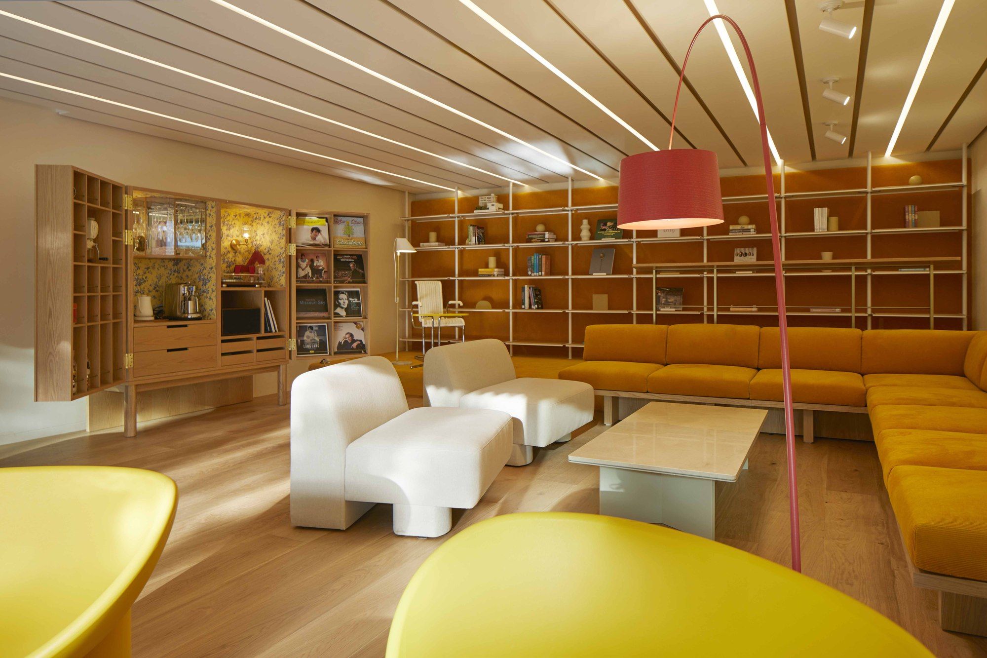
The interior of Sala is designed to feel cozy and comfortable, like a living room at home. I tried to give depth of color by using yellow, which is the symbol of the company, but expressing it with finishing materials of various materials. There are furniture like treasure chests in the space. When you open the door of heavy furniture, tools and small items to enjoy music, coffee, wine, etc. are set inside to surprise users. The whole window of Sala is also open and you can see the whole garden through the water space.
Photography by © Park woo-jin
Project Info:
Architects: studioVASE
Location: Yongsan-Gu, South Korea
Area: 1015 m²
Project Year: 2020
Photographs: Park woo-jin