

The core interior design principles are balance, scale and proportion, rhythm, light, and contrast with a clear hierarchy, all resting on a plan that leaves enough room to move. Balance makes a room feel stable; scale relates furniture and openings to the body and to the room; rhythm leads the eye; light, both daylight and artificial, makes everything else visible; contrast tells you what matters most. This guide is for students and homeowners who want rules they can measure. It combines historic references with a practical method for checking circulation, furniture use and light. Images identify what they actually show; an exterior photograph is not evidence of an interior arrangement.
Quick answer: interior design principles as rules of thumb
- Balance: distribute visual weight so that no side of the room feels heavier, either symmetrically or by matching a large element with several smaller ones.
- Scale and proportion: size furniture to the room and to the people using it, and keep clear routes through it.
- Rhythm: repeat a colour, shape or interval so that the eye moves through the space.
- Light: plan daylight first, then layer ambient, task and accent lighting.
- Contrast and hierarchy: decide on one focal point per room and let everything else support it.
These principles are independent of style. They apply equally to the interior design styles that recur across decades and to new ones.
Five interior design principles in historic interiors
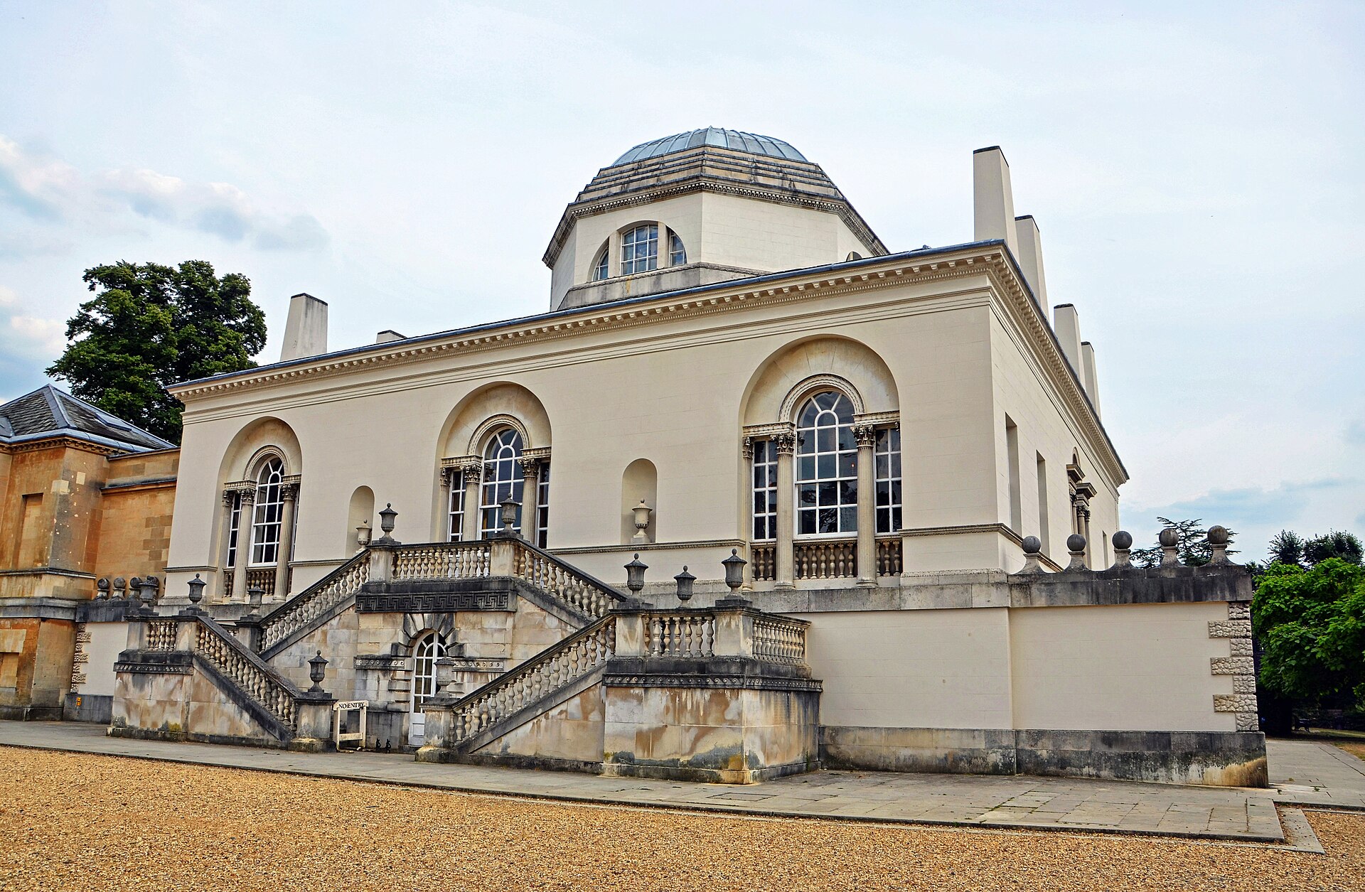
Balance: Chiswick House, London
Lord Burlington designed Chiswick House in the 1720s as a Palladian villa, finished with interiors by William Kent. According to English Heritage, its rooms of different shapes, octagonal, rectangular and circular, are arranged around a central saloon lit by an octagonal dome. Doors, chimneypieces and paintings are placed on axes, so each wall answers the one opposite. Symmetrical balance like this feels formal and calm; asymmetrical balance, where a large sofa is offset by a group of chairs and a lamp, feels more relaxed. Both depend on the same idea of equal visual weight.
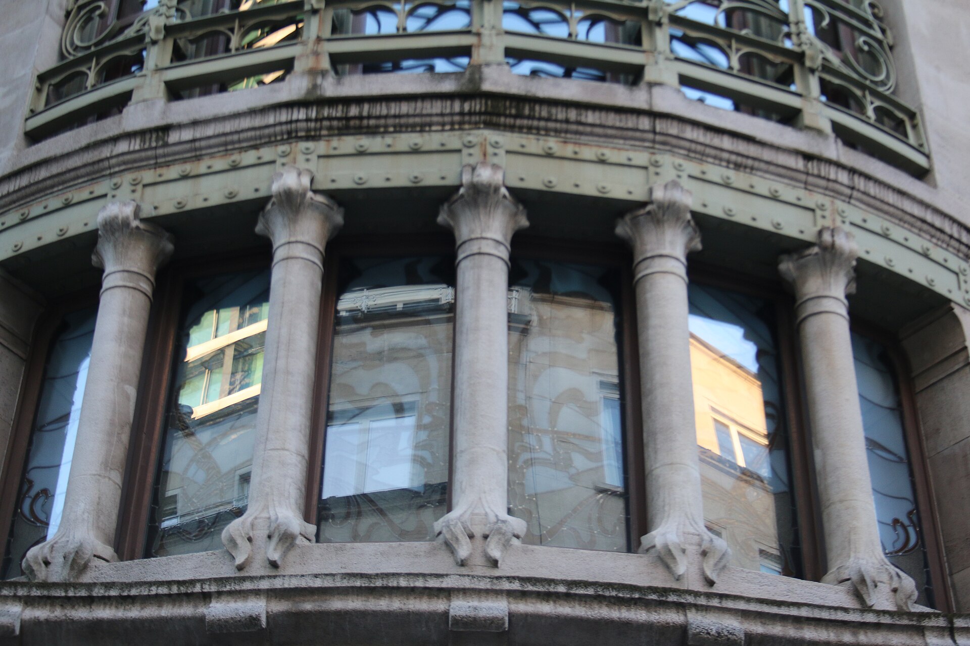
Rhythm: Hôtel Tassel, Brussels
Victor Horta’s Hôtel Tassel, completed in 1893, is often described as one of the first Art Nouveau buildings. Its stair hall repeats curving iron lines in the balustrade, columns, wall painting and floor mosaic, so the eye is carried up the stair through the house. Iron columns, then associated with stations and greenhouses, were left exposed and shaped like plant stems. The house is part of the UNESCO listing of Major Town Houses of the Architect Victor Horta. Rhythm in a room can be as simple: a repeated chair, a regular grid of frames or a colour that returns three times.
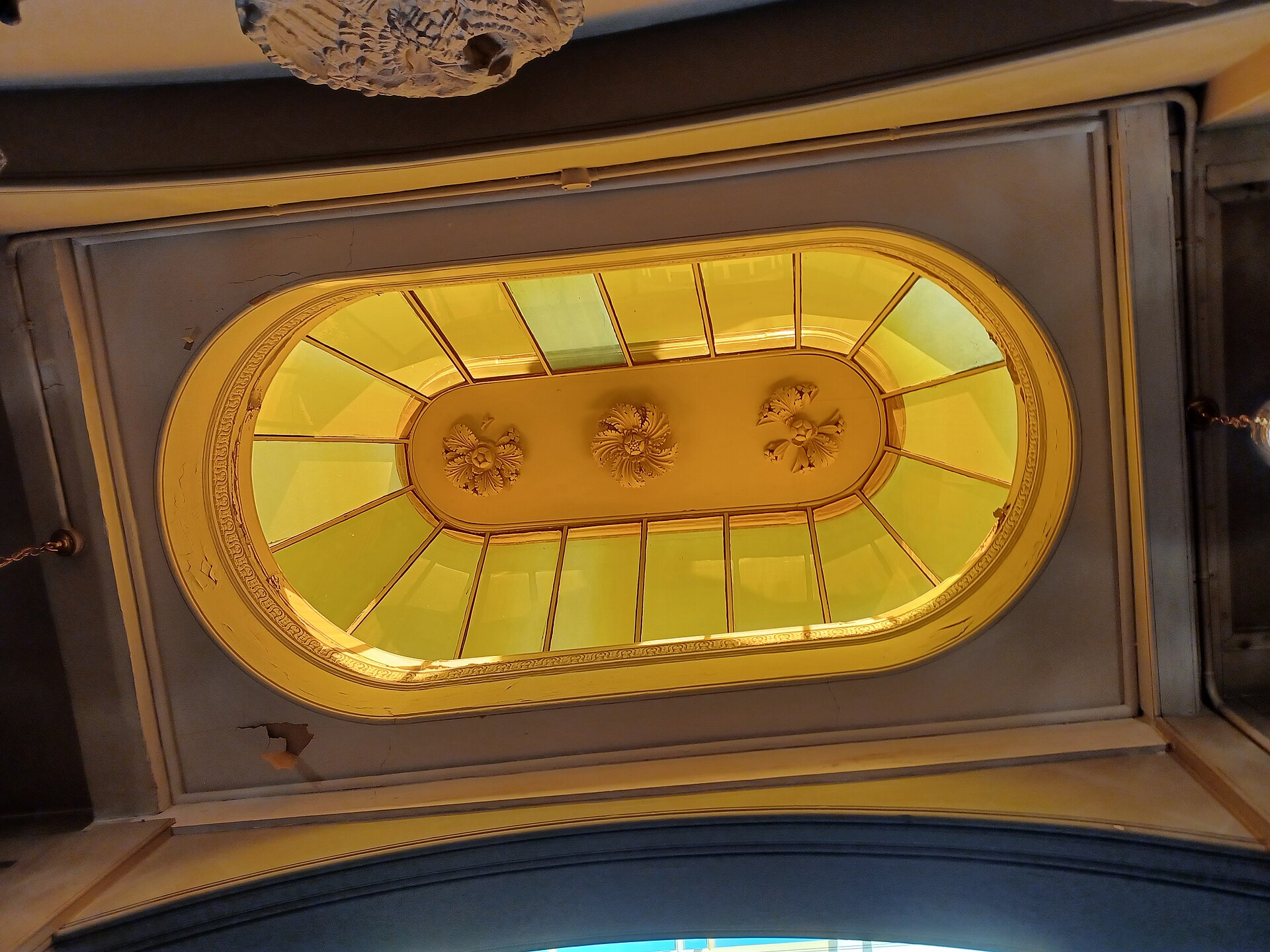
Light: Sir John Soane’s Museum, London
Sir John Soane’s Museum offers examples of top lighting and carefully composed views through a dense interior. The photograph here shows a skylight; it is not identified as a particular room. For your own layout, examine where daylight enters, where glare appears and how surfaces redirect or absorb light before adding artificial lighting.
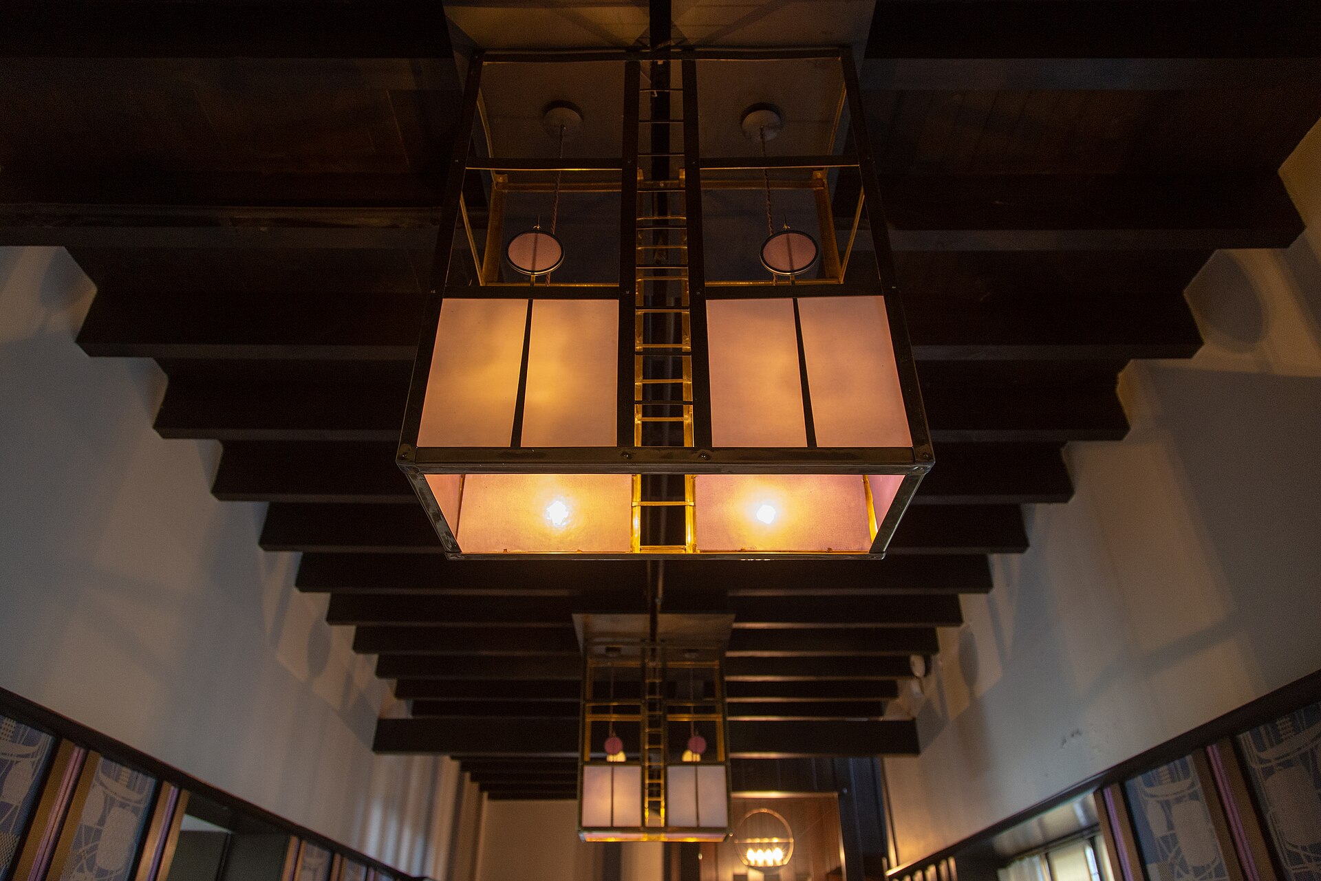
Contrast and hierarchy: The Hill House, Helensburgh
Charles Rennie Mackintosh and Margaret Macdonald designed the interiors of The Hill House for the publisher Walter Blackie, whose family moved into the house in 1904. Rooms were finished either in dark tones or in light, bright colours, and in the hall, dark timber panelling, screens with coloured glass and designed light fittings control the light, according to Historic Environment Scotland. Moving from the darker hall into lighter rooms gives each space a clear character. In a single room, contrast in tone, texture or scale picks out the focal point.
Scale and proportion: measuring the room
Scale is the principle that historic interiors show least directly and floor plans test most. A room feels right when furniture leaves clear routes and when people can sit, stand and pass without turning sideways. Test the activities of the actual users as well as the applicable local requirements.
Test the layout before ordering furniture
Start with a measured plan showing door swings, windows, radiators and fixed services. Add furniture at its actual size, including open drawers, pulled-out chairs and appliance doors. Mark the routes used simultaneously by different people.
Use tape or temporary objects to test critical spaces at full scale. Check accessibility and circulation requirements for your jurisdiction and the people who will use the room. Do not substitute a generic internet clearance for an applicable regulation or a user-specific access requirement.
For each pinch point, record the dimension, the activity and the applicable source. A useful test describes what someone can do there, not simply whether the furniture fits on the plan.
Lighting and materials checklist
- Map daylight first. Note which way each window faces and when the room is used. Put desks and reading chairs where daylight falls from the side, not from behind the screen or the page.
- Layer three kinds of light. General (ambient) light for moving around, task light where people read, cook or work, and accent light for objects or textures. Our guide to mood lighting covers the first layer in more detail.
- Control glare. Shield bright sources from direct view, and avoid glossy surfaces opposite windows or screens.
- Match colour temperature. Keep lamps in one room within a similar colour temperature, unless a contrast is deliberate.
- Use reflectance. Pale ceilings and walls spread light; dark surfaces absorb it and need more lamps for the same effect.
- Check materials in the real light. Look at samples on site, in daylight and under the planned lamps, before ordering.
- Plan durability. Use harder-wearing, easy-clean finishes on floors and walls in entrances, kitchens and other busy zones.
Test the principles in a compact workspace
Wood and Stone Studio places the desk at a deep garden-facing window. Read the seating position, light and storage together, then compare that arrangement with the circulation and material hierarchy in your own plan.
Mistakes to avoid
- Furniture against every wall. It leaves an empty centre and long distances between seats; group seating around a focal point instead.
- One ceiling light per room. It flattens the space and casts shadows on tasks.
- Ignoring circulation. A beautiful layout fails if routes do not support the required activities and access needs.
- Too many focal points. When everything is emphasised, nothing is.
- Copying dimensions across borders. A clearance that is standard practice in one country may be below the legal minimum in another.
To apply these interior design principles, start with a measured plan: draw routes and clearances first, then place the focal point, then plan light, and only then choose finishes and decoration.

Luca Moretti is a content strategist with a foundation in urban design and architecture. Based in Milan, he focuses on writing that bridges aesthetics, material culture, and everyday spatial experiences.