Ever felt depressed in your own room without knowing why? We may not realize it, but we are unconsciously affected by our surroundings. If you are surrounded by light and airy colors, you may feel more relaxed and positive. If your colors are bright and aggressive, you may feel motivated or possibly annoyed and have no idea why. A conscious color choice can make you have more control over how you feel at home.
Some basic color theory knowledge will help you understand what each color means, and, accordingly, you could create and choose successful color schemes for your home. The good news is, colors do not necessarily translate to paint on the walls. They can be displayed using different materials and textures. Here, we give you the information you need on how to use color therapy in your home.
What is Colour therapy and how does it work?
Despite multiple controversies, researchers and healers continued to demonstrate that the mood-changing effect of color is evident. Architects and interior designers have been using this effect for the benefit of their designs since ancient times. However, an important thing to remember is that the variations of the color can look different depending on the lights used in the room.
It is very helpful to determine the mood of the room first. This will indicate whether you need cool or warm tones. For instance, if you are choosing a color scheme for one of the colder rooms in your house, remember to use some warm tones (i.e. variations of the warm colors of yellow, orange, and red). This will help you avoid making the room feel even colder.
So, from where can you start?
The first step is to consider the primary function of each room. Think what exactly is the main activity going on in this and that space.
Next, pick a predominant color. Although it can’t be proven scientifically, color consultants say that some hues work better than others at encouraging certain activities. Accordingly, choose a color scheme.
Afterward, decide on which material would be best to display this main color. Then comes the fun part; settle on the little bits and pieces such as accessories, curtains, decorative items, and artwork. For these, you might want to use different shades of the same color to compliment it.
Color vs Mood:
While the perception of color may be subjective, some colors have a universal influence on most people. Colors in the red area of the color spectrum (red, pink, orange, yellow) are known as warm tones evoking emotions ranging from warmth and comfort to feelings of anger. Colors on the blue side of the spectrum (blue, purple, green) are cool colors. Cool tones demonstrate calmness, but can also call to mind feelings of sadness and indifference.
Colors and their Emotional Effect
Here are some colors and their emotional effect on most people:
1. Blue
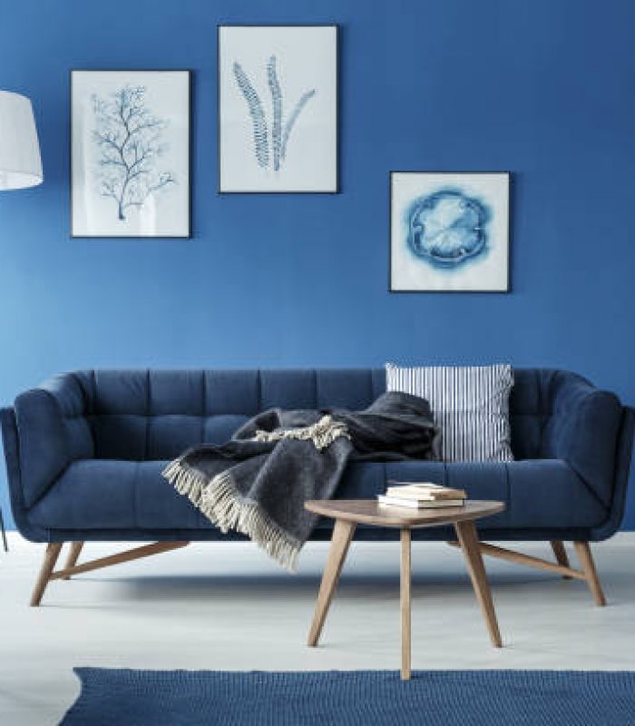
Blue stylish elegant retro living room with sofa
Blues are always calming, relaxing, and healing. They are a great choice for places where you want a mood of serenity. Blues are for quiet and soothing spaces. Therefore, they work for most rooms, including spaces with high physical activity like kids’ play areas. Shades of blue and especially indigo work in prayer rooms, meditative spaces, and bathrooms. You can incorporate blue tones into your bathroom by using these elegant mosaic floor tiles made of ceramic.
Additionally, for a serene and tranquil bedroom, you can use blue satin duvet sheets and rugs, while complementing them with white accessories. Using neutral tones of white and grey around the blue pieces will allow the cool blue tones to be more dominant and effective.
2. Green
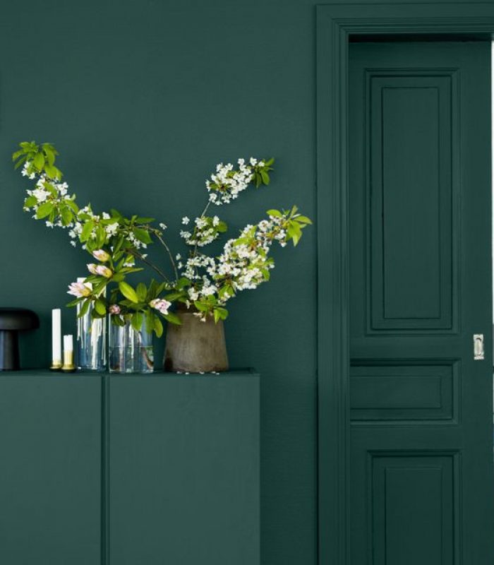
Green has a balancing power. Not only is it because the green color is in the center of the spectrum, but it also provides this sense of healing and balance due to its direct connection to nature. It restores spiritual balance and reconnects body and soul. Color therapy also links it with the circulatory system including the heart, the lungs, and the thymus gland. It is good in rooms where you wish to relax such as conservatories and bedrooms.
Don’t worry you do not have to paint your walls in a crazy lime green color to enjoy its benefits. A chamois leather couch paired with light mahogany wood makes a very elegant living room. An even better approach is to integrate natural greens from plants. Having indoor plants in your house is very much preferable. For example, you can integrate a green wall into the interior of your home to enjoy the sight of the refreshing color and the benefits of getting immersed in nature.
3. Yellow
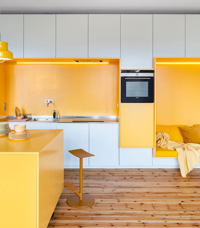
Yellow is one of the most impactful colors and also very practical and elegant in most interiors. It stimulates mental activity and promotes a feeling of confidence. Also, it is very helpful for studying as it enhances focus and keeps you attentive. Many experiments in classrooms concluded that yellows stimulate a person’s memory and concentration as well. In common with red, yellow boosts energy levels and promotes a feeling of well-being.
The color of sunshine yellow has a positive influence on mental activity, boosting concentration, and memory. Accordingly, yellow accessories, chairs, desks can be a good choice for an office or a study. Installing some citrus yellow semi-translucent chiffon curtains will brighten up both your space and your mood.
4. Orange
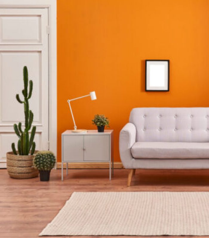
Orange exudes warmth and energy. It creates an atmosphere of sociability, outgoingness, and fun. It can also stimulate creativity. Accordingly, it is the best choice for children’s play areas, art rooms, gym rooms, and any highly active area. Do not use for bedrooms or areas where you want calmness or solitude. As a rule of thumb, the color combination becomes more harmonized just by using dabs of natural wood and white.
This restores a sense of balance. Also, warm tones can be complimented when matched with opposing cold colors. Check out this bold contrast between warm energetic orange and cool aqua blue in the tiled wool carpet. The blue gypsum board wall tones and the neutral colors tool down the bright orange. Also, practical orange bean bags are made of waterproof polyester which is crazy easy to clean.
Tone down the orange so it still looks elegant by alternating orange organic cotton pillows with monochromatic shades of gray. The neutral color will allow the orange to have an impact without going over the top. An orange gypsum board wall in your gym room may be just what you need for some workout motivation.
5. Red
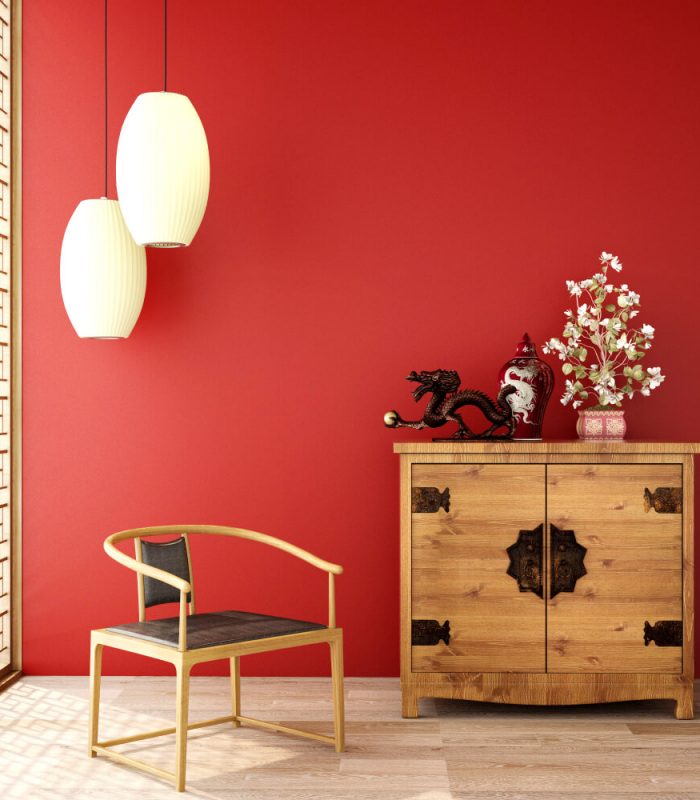
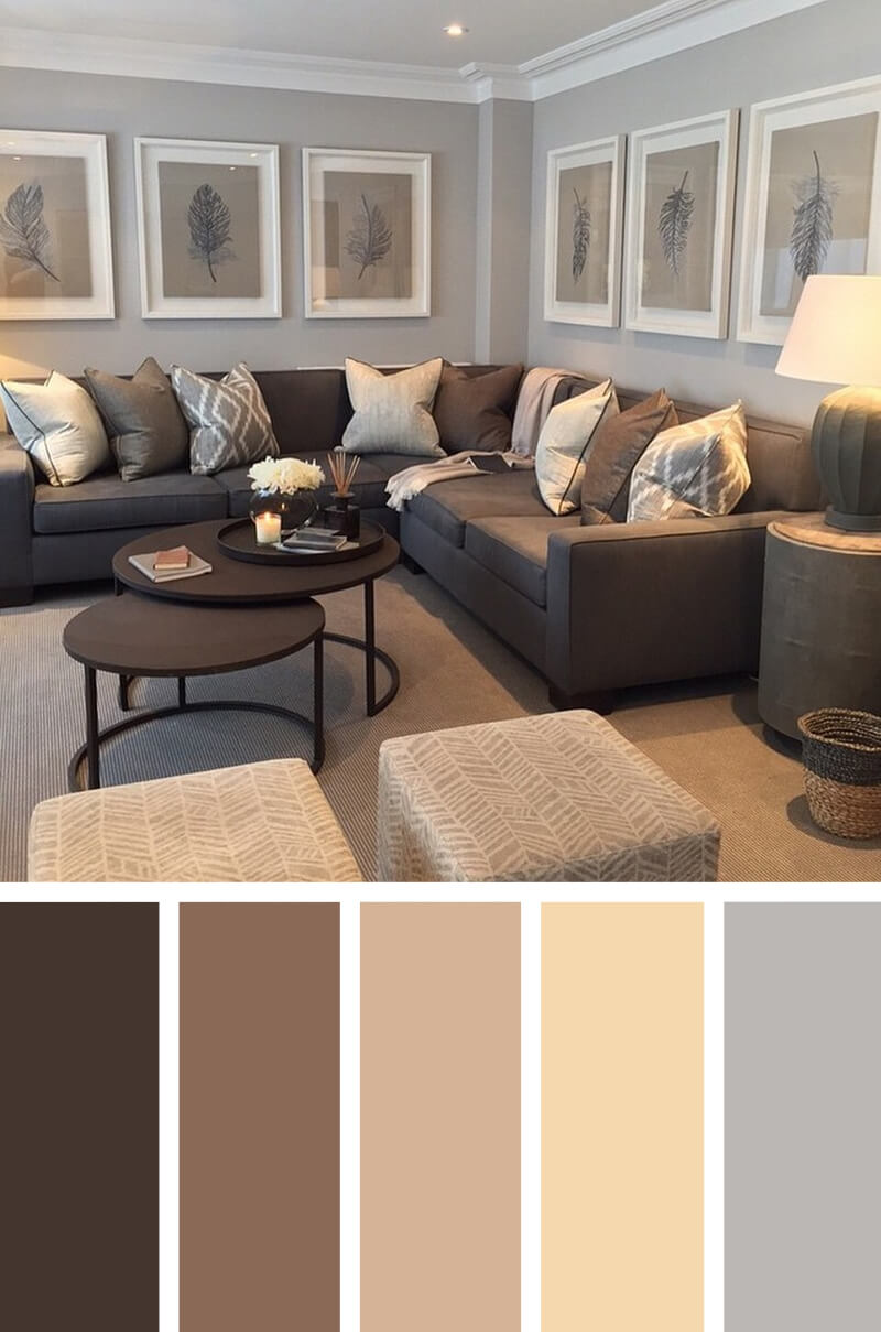
Warm tones like reds, yellows, and oranges, and earth tones like brown and beige often work well in both the living room and foyer, because they stimulate conversation. Red, in particular, is extremely popular in the fast-food industry. It stimulates appetite and encourages movement so that guests leave and more come. Do not use it in a nursery bedroom as this powerful color can cause aggression, inability to focus, and headaches.
Too much of any color is overwhelming. This is especially true of red. Over-using it can result in overeating. In order to have a balanced result, limited use of red can be somewhat subtle yet still quite effective in the kitchen. For a crisp clean look that is not overdone, use white walls and ebony worktops made of plywood. An example of a white yet creative kitchen, check out this white high-tech kitchen designed by Culimaat High-End Kitchens.
A subtle transparent goldenrod suspension lamp along with a red glass vase accent the red and make it pop out. Looking for a bolder look? Use red shiny stainless steel cabinets that are easier to clean than traditional wood cabinets.
"Nour is a Cairo based architect who has an obsession with Landscape Architecture, nature and meditation. She considers writing as a powerful tool to send her ideas to the community and make this world a better place. She is addicted to traveling and teaching. Her international exposure gives her a unique and well-rounded perspective that keeps her articles fresh and interesting."