Animated Subway Maps Transforms into Actual Geography Reveal Astonishing Gaps, Transit maps are schematic diagrams which illustrate the routes and stations covered by a public transport system using simplified colored lines and symbols. Subway maps users are definitely familiar with such maps with a different color per each line and dots for stations. The network of intersected lines may be good for indicative purposes but they are not actually quite similar to the actual geography they represent, which is way more complicated. To get the idea, you might need to take a look at the animated subway maps created by members of the “DataIsBeautiful” community on Reddit.
The “DataIsBeautiful” is an open discussion thread on Reddit which is dedicated for “visualizations that effectively convey information”. Some members of this community decided to make GIFs which compare the subway maps of world cities to the actual geography, and the results were quite interesting. The idea was triggered by one member who utilized data from Google Maps, Wikipedia, and the official Subway Map from Berlin, to create an animation of Berlin Subway map converting into the city’s actual geographical map using Adobe After Effects. Then other members followed with similar animated maps of Paris, London, New York, and Tokyo, among other cities. Here, check them for yourself.
Berlin

Created by vinnivinnivinni
Paris
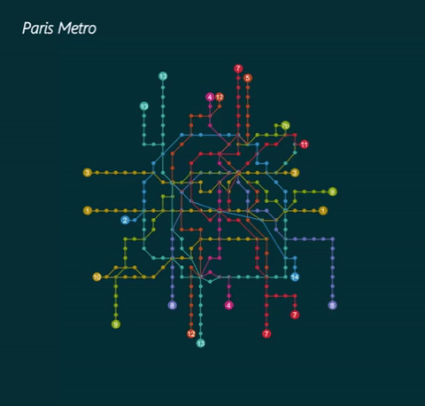
Created by hlake
London
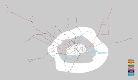
Created by Pham_Trinli
Tokyo
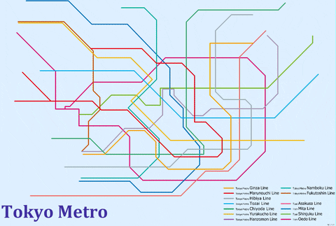
Created by –Ninja-
Shanghai
Created by KailoB6
Montreal
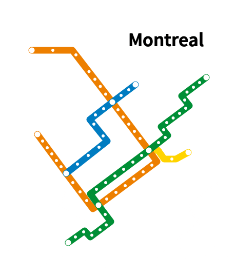
Created by weilian82
Oslo
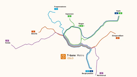
Created by iamthedestroyer
Singapore
Created by wrcyn
New York

Created by playhouse_animation
Vienna

Created by p6788
Washington Dc

Created by stupidgit
São Paulo

Created by sweedishfishoreo
Rotterdam

Created by Ghorich
Barcelona

Created by MightyMiami
Austin

Created by MrMason007
Yosra is an architect, writer, and teacher. She is always into learning something new. Her life motto is: "A jack of all trades is a master of none, but oftentimes better than a master of one.” One day she will travel the world and visit its architectural wonders. In the meanwhile, she contends herself with reading and writing about them.