Architectural illustrations can be a difficult subject to master due to their demand for proficiency in many types of software and workflows as well as needing comfort for both the technical and artistic side of things. Furthermore, what makes a “good” image is both vague and broad. What will work for one image may not work for another. It is dependent first and foremost on the architectural design, but also on the environment, narrative, presentation context, etc.
Over the years, I have noticed certain concepts of architectural illustrations that influence the success of an image more than others. There are essential photoshop tutorials and tips for architects to produce good renderings, but there are some fundamentals that we all need to go through. Below is a list of 5 concepts that deserve some more time and if properly implemented can lead to more successful and engaging images.
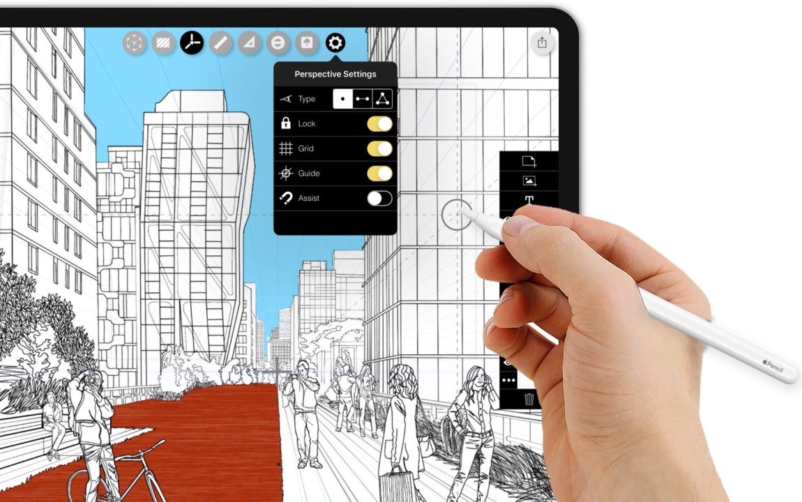
List of 5 fundamental concepts for architectural illustrations
1. Skies: 6 Tips for a Perfect Sky
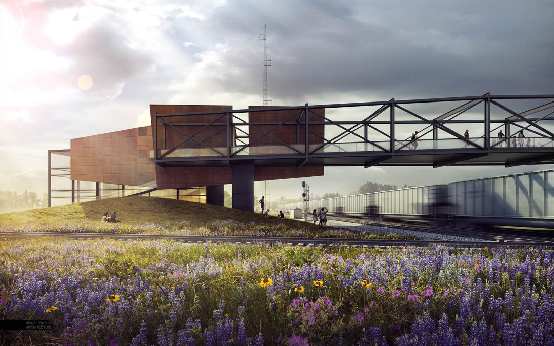
More than anything, the sky sets the tone of the image. This is usually the first thing that I set up and something that I spend a lot of time fine-tuning. People tend to over-do-it with skies using extremely strong colors with aggressive cloud formations. It is important that skies do not overpower the image and distract from the architecture but instead complements the scene and add to the story. This tutorial walks through some key ideas to think about when inserting your sky.
2. Depth through Atmospheric Fog
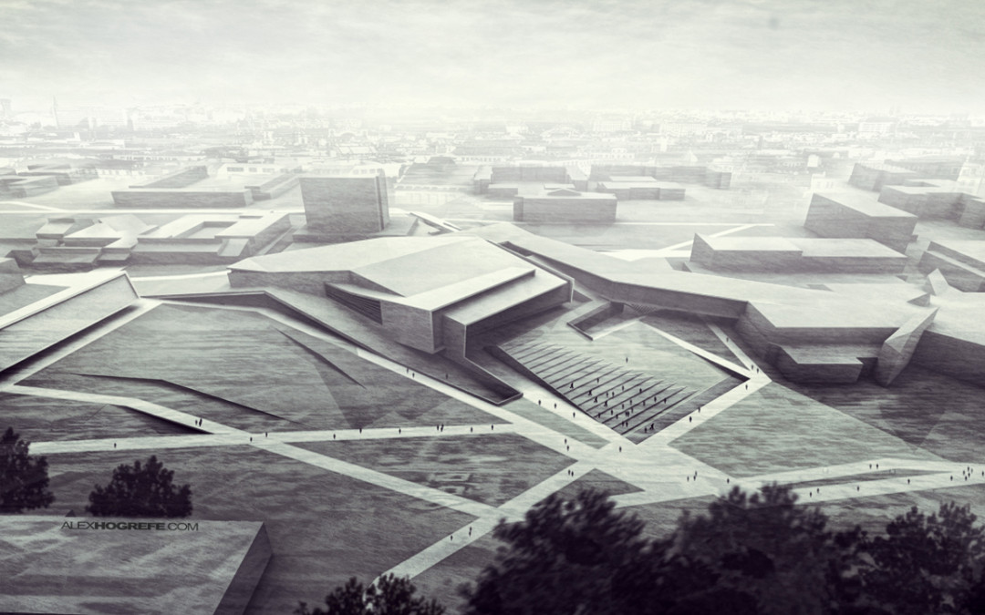
Architectural images are all about revealing space and thus depth. Most people have a good grasp of light and shadow since most rendering programs automatically generate this, however atmospheric fog is often lost or forgotten in many images that I see. Adding a haze or fog to an image, even if done very subtly, can go a long way in creating depth in an image. This tutorial walks through some simple steps to add some depth to your illustrations.
3. Composition
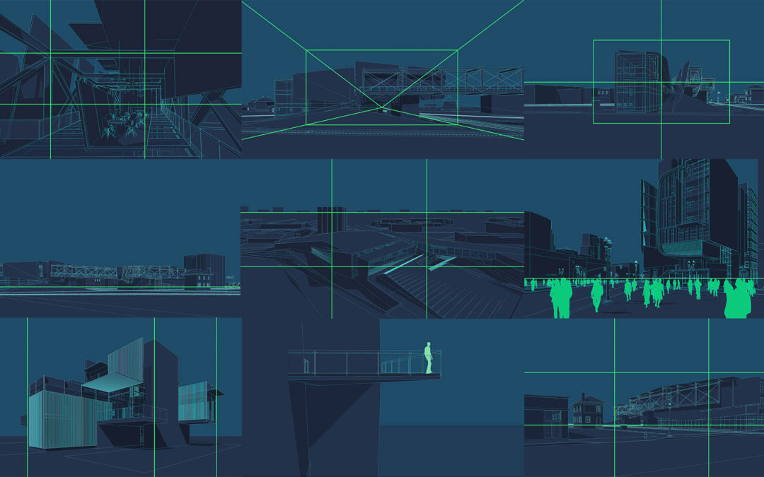
Just like photography, composition plays a big role in the success of an image. Even if the render settings are perfect, and the light, textures, and atmosphere, a bad composition can really hurt the final product. Simple photography ideas such as the rule of thirds can help to set up a good base for composing your images to generate good eye movement and build a proper hierarchy. This tutorial describes some fundamental tips for composing your architectural shots.
4. Imperfection: Quick Tips: Grunge and Sketches: Part 2 Extended
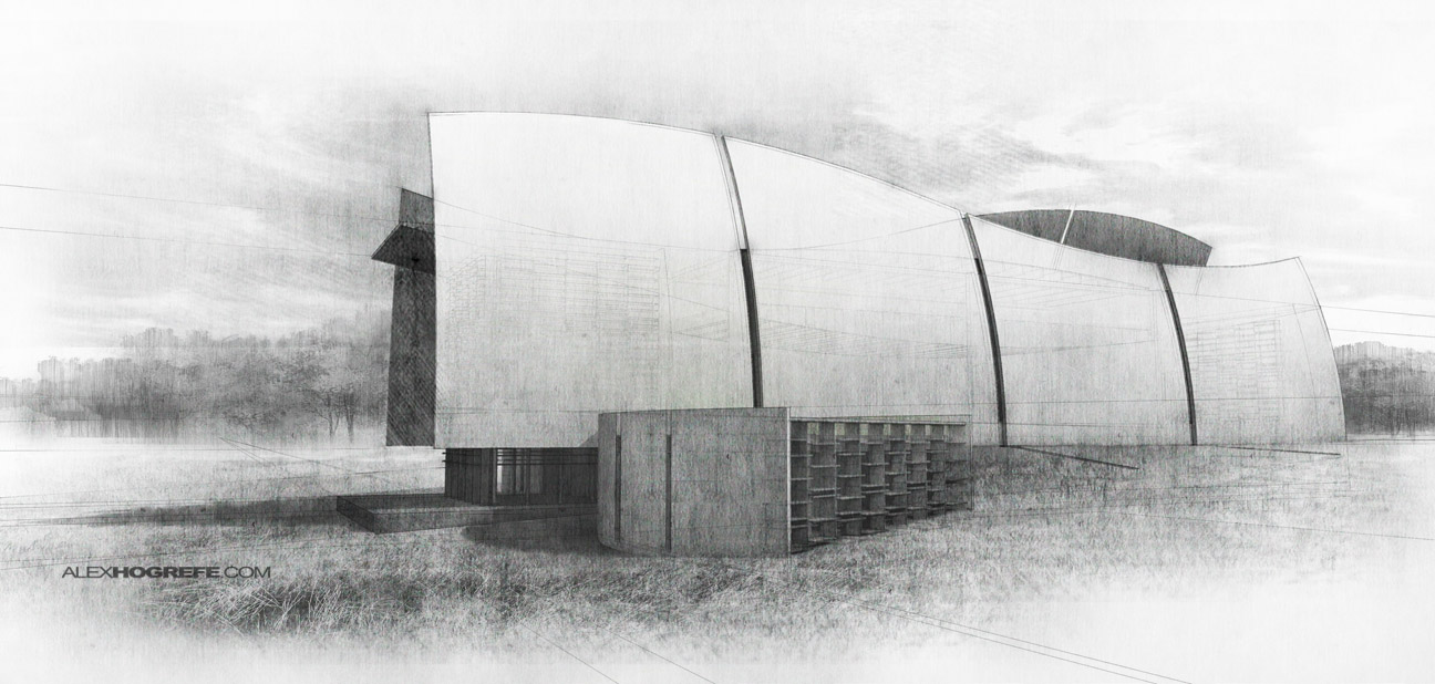
One of the reasons why I like to spend more time in Photoshop is because adding textures in Photoshop instead of 3d brings with it imperfections that are hard to create in 3d. Thinking about these imperfections and where they occur can help an illustration escape the “3d computer-generated” look and instead insert a human touch. You can even use the idea of imperfection to push the image further into the abstract to generate images that have an analog look. These two tutorials explain different ways of inserting imperfection into your images.
5. Controlling Light: Painting Light: Exterior Glass and No-Render Night Illustration
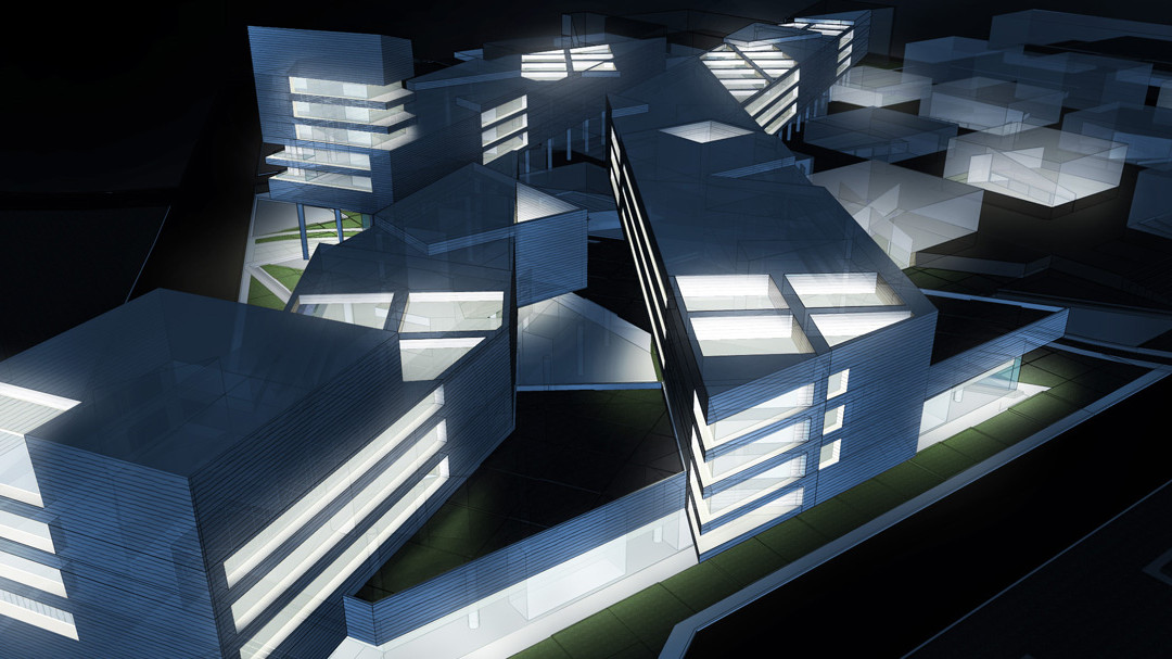
Knowing how to manage light during all times of day can be one of the most important parts of architecture visualization. However, many people often rely too much on 3d settings. Whether it is time, resources, or both, there will be situations where you need to move a rendering slightly more dusk or more towards the middle of the day. Knowing how to manually shift the time of day in Photoshop means full control over the final image and offers the option of really dialing into a sensitivity that is tough to get from 3D. These two tutorials explain how to manipulate light in your architectural illustrations.


